Pythonパンダ-視覚化
基本的なプロット:プロット
SeriesとDataFrameのこの機能は、 matplotlib libraries plot() 方法。
import pandas as pd
import numpy as np

df = pd.DataFrame(np.random.randn(10,4),index=pd.date_range('1/1/2000',
   periods=10), columns=list('ABCD'))

df.plot()
その output 次のとおりです-
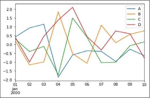
インデックスが日付で構成されている場合は、 gct().autofmt_xdate() 上の図に示すようにx軸をフォーマットします。
を使用して、ある列と別の列をプロットできます。 x そして y キーワード。
プロット方法では、デフォルトの折れ線グラフ以外のいくつかのプロットスタイルを使用できます。これらのメソッドは、kindキーワード引数として提供できます。plot()。これらには以下が含まれます-
- 棒グラフのbarまたはbarh
- ヒストグラムの履歴
- 箱ひげ図のボックス
- エリアプロットの「エリア」
- 散布図の「散布図」
棒グラフ
棒グラフを作成して、棒グラフとは何かを見てみましょう。棒グラフは次の方法で作成できます-
import pandas as pd
import numpy as np

df = pd.DataFrame(np.random.rand(10,4),columns=['a','b','c','d')
df.plot.bar()
その output 次のとおりです-
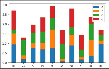
積み上げ棒グラフを作成するには、 pass stacked=True −
import pandas as pd
df = pd.DataFrame(np.random.rand(10,4),columns=['a','b','c','d')
df.plot.bar(stacked=True)
その output 次のとおりです-

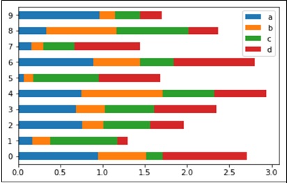
水平棒グラフを取得するには、 barh 方法−
import pandas as pd
import numpy as np

df = pd.DataFrame(np.random.rand(10,4),columns=['a','b','c','d')

df.plot.barh(stacked=True)
その output 次のとおりです-
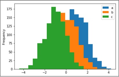
ヒストグラム
ヒストグラムは、 plot.hist()方法。ビンの数を指定できます。
import pandas as pd
import numpy as np

df = pd.DataFrame({'a':np.random.randn(1000)+1,'b':np.random.randn(1000),'c':
np.random.randn(1000) - 1}, columns=['a', 'b', 'c'])

df.plot.hist(bins=20)
その output 次のとおりです-
列ごとに異なるヒストグラムをプロットするには、次のコードを使用します-
import pandas as pd
import numpy as np

df=pd.DataFrame({'a':np.random.randn(1000)+1,'b':np.random.randn(1000),'c':
np.random.randn(1000) - 1}, columns=['a', 'b', 'c'])

df.diff.hist(bins=20)
その output 次のとおりです-
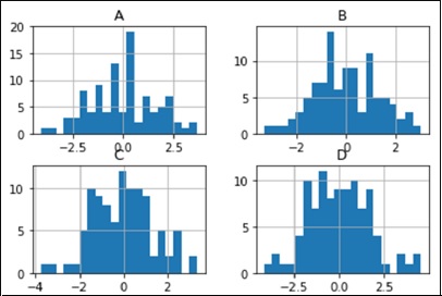
箱ひげ図
箱ひげ図は呼び出して描くことができます Series.box.plot() そして DataFrame.box.plot()、または DataFrame.boxplot() 各列内の値の分布を視覚化します。
たとえば、これは[0,1)の一様確率変数の10回の観測の5回の試行を表す箱ひげ図です。
import pandas as pd
import numpy as np
df = pd.DataFrame(np.random.rand(10, 5), columns=['A', 'B', 'C', 'D', 'E'])
df.plot.box()
その output 次のとおりです-

エリアプロット
面積プロットは、 Series.plot.area() または DataFrame.plot.area() メソッド。
import pandas as pd
import numpy as np

df = pd.DataFrame(np.random.rand(10, 4), columns=['a', 'b', 'c', 'd'])
df.plot.area()
その output 次のとおりです-

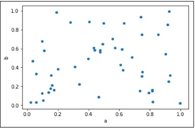
散布図
散布図は、を使用して作成できます。 DataFrame.plot.scatter() メソッド。
import pandas as pd
import numpy as np
df = pd.DataFrame(np.random.rand(50, 4), columns=['a', 'b', 'c', 'd'])
df.plot.scatter(x='a', y='b')
その output 次のとおりです-
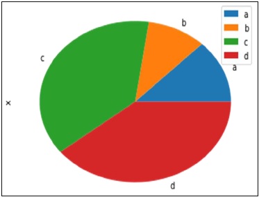
円グラフ
円グラフは、 DataFrame.plot.pie() 方法。
import pandas as pd
import numpy as np

df = pd.DataFrame(3 * np.random.rand(4), index=['a', 'b', 'c', 'd'], columns=['x'])
df.plot.pie(subplots=True)
その output 次のとおりです-