GWT Highcharts-구성 구문
이 장에서는 GWT에서 Highcharts API를 사용하여 차트를 그리는 데 필요한 구성을 보여줍니다.
1 단계 : GWT 애플리케이션 생성
다음 단계에 따라 GWT에서 생성 한 GWT 애플리케이션을 업데이트합니다 -애플리케이션 생성 장-
| 단계 | 기술 |
|---|---|
| 1 | GWT- 애플리케이션 만들기 장에 설명 된대로 com.tutorialspoint 패키지 아래에 HelloWorld 라는 이름으로 프로젝트를 만듭니다 . |
| 2 | 아래 설명과 같이 HelloWorld.gwt.xml , HelloWorld.html 및 HelloWorld.java 를 수정 합니다. 나머지 파일은 변경하지 마십시오. |
| 삼 | 애플리케이션을 컴파일하고 실행하여 구현 된 논리의 결과를 확인합니다. |
다음은 수정 된 모듈 설명 자의 내용입니다. src/com.tutorialspoint/HelloWorld.gwt.xml.
<?xml version = "1.0" encoding = "UTF-8"?>
<module rename-to = 'helloworld'>
   <inherits name = 'com.google.gwt.user.User'/>
   <inherits name = 'com.google.gwt.user.theme.clean.Clean'/>
   <entry-point class = 'com.tutorialspoint.client.HelloWorld'/>
   <inherits name="org.moxieapps.gwt.highcharts.Highcharts"/>
   <source path = 'client'/>
   <source path = 'shared'/>
</module>
다음은 수정 된 HTML 호스트 파일의 내용입니다. war/HelloWorld.html.
<html>
   <head>
      <title>GWT Highcharts Showcase</title>
      <link rel = "stylesheet" href = "HelloWorld.css"/>
      <script language = "javascript" src = "helloworld/helloworld.nocache.js">
         <script src = "https://ajax.googleapis.com/ajax/libs/jquery/2.1.3/jquery.min.js" />
         <script src = "https://code.highcharts.com/highcharts.js" />
      </script>
   </head>
   <body>
   </body>
</html>
구성을 이해 한 후 마지막에 업데이트 된 HelloWorld.java를 볼 수 있습니다.
2 단계 : 구성 만들기
차트 생성
차트의 유형, 제목 및 부제를 구성합니다.
Chart chart = new Chart()
   .setType(Type.SPLINE)
   .setChartTitleText("Monthly Average Temperature")
   .setChartSubtitleText("Source: WorldClimate.com");
x 축
X 축에 표시 할 티커를 구성합니다.
XAxis xAxis = chart.getXAxis();
xAxis.setCategories("Jan", "Feb", "Mar", "Apr", "May", "Jun",
   "Jul", "Aug", "Sep", "Oct", "Nov", "Dec");
y 축
Y 축에 표시 할 제목, 플롯 라인을 구성합니다.
YAxis yAxis = chart.getYAxis();
yAxis.setAxisTitleText("Temperature °C");
yAxis.createPlotLine()
   .setValue(0)
   .setWidth(1)
   .setColor("#808080");
툴팁
툴팁을 구성합니다. 값 (y 축) 뒤에 추가 할 접미사를 입력합니다.
ToolTip toolTip = new ToolTip();
toolTip.setValueSuffix("°C");
chart.setToolTip(toolTip);
전설
다른 속성과 함께 차트 오른쪽에 표시 할 범례를 구성합니다.
legend.setLayout(Legend.Layout.VERTICAL)
   .setAlign(Legend.Align.RIGHT)
   .setVerticalAlign(Legend.VerticalAlign.TOP)
   .setX(-10)
   .setY(100)
   .setBorderWidth(0);
chart.setLegend(legend);
시리즈
차트에 표시 할 데이터를 구성합니다. 계열은이 배열의 각 요소가 차트의 단일 선을 나타내는 배열입니다.
chart.addSeries(chart.createSeries()
   .setName("Tokyo")
   .setPoints(new Number[] {
      7.0, 6.9, 9.5, 14.5, 18.2, 21.5, 25.2,
      26.5, 23.3, 18.3, 13.9, 9.6
   })
);

chart.addSeries(chart.createSeries()
   .setName("New York")
   .setPoints(new Number[] {
      -0.2, 0.8, 5.7, 11.3, 17.0, 22.0, 24.8,
      24.1, 20.1, 14.1, 8.6, 2.5
   })
);

chart.addSeries(chart.createSeries()
   .setName("Berlin")
   .setPoints(new Number[] {
      -0.9, 0.6, 3.5, 8.4, 13.5, 17.0, 18.6,
      17.9, 14.3, 9.0, 3.9, 1.0
   })
);

chart.addSeries(chart.createSeries()
   .setName("London")
   .setPoints(new Number[] {
      3.9, 4.2, 5.7, 8.5, 11.9, 15.2, 17.0,
      16.6, 14.2, 10.3, 6.6, 4.8
   })
);
3 단계 : 상위 패널에 차트를 추가합니다.
루트 패널에 차트를 추가하고 있습니다.
RootPanel.get().add(chart);예
구성 구문을 더 이해하려면 다음 예제를 고려하십시오.
HelloWorld.java
package com.tutorialspoint.client;
import org.moxieapps.gwt.highcharts.client.Chart;
import org.moxieapps.gwt.highcharts.client.Legend;
import org.moxieapps.gwt.highcharts.client.Series.Type;
import org.moxieapps.gwt.highcharts.client.ToolTip;
import org.moxieapps.gwt.highcharts.client.XAxis;
import org.moxieapps.gwt.highcharts.client.YAxis;
import com.google.gwt.core.client.EntryPoint;
import com.google.gwt.user.client.ui.RootPanel;
public class HelloWorld implements EntryPoint {
public void onModuleLoad() {
Chart chart = new Chart()
.setType(Type.SPLINE)
.setChartTitleText("Monthly Average Temperature")
.setChartSubtitleText("Source: WorldClimate.com");
XAxis xAxis = chart.getXAxis();
xAxis.setCategories("Jan", "Feb", "Mar", "Apr", "May", "Jun",
"Jul", "Aug", "Sep", "Oct", "Nov", "Dec");
YAxis yAxis = chart.getYAxis();
yAxis.setAxisTitleText("Temperature °C");
yAxis.createPlotLine()
.setValue(0)
.setWidth(1)
.setColor("#808080");
ToolTip toolTip = new ToolTip();
toolTip.setValueSuffix("°C");
chart.setToolTip(toolTip);
Legend legend = new Legend();
legend.setLayout(Legend.Layout.VERTICAL)
.setAlign(Legend.Align.RIGHT)
.setVerticalAlign(Legend.VerticalAlign.TOP)
.setX(-10)
.setY(100)
.setBorderWidth(0);
chart.setLegend(legend);
chart.addSeries(chart.createSeries()
.setName("Tokyo")
.setPoints(new Number[] {
7.0, 6.9, 9.5, 14.5, 18.2, 21.5, 25.2,
26.5, 23.3, 18.3, 13.9, 9.6
})
);
chart.addSeries(chart.createSeries()
.setName("New York")
.setPoints(new Number[] {
-0.2, 0.8, 5.7, 11.3, 17.0, 22.0, 24.8,
24.1, 20.1, 14.1, 8.6, 2.5
})
);
chart.addSeries(chart.createSeries()
.setName("Berlin")
.setPoints(new Number[] {
-0.9, 0.6, 3.5, 8.4, 13.5, 17.0, 18.6,
17.9, 14.3, 9.0, 3.9, 1.0
})
);
chart.addSeries(chart.createSeries()
.setName("London")
.setPoints(new Number[] {
3.9, 4.2, 5.7, 8.5, 11.9, 15.2, 17.0,
16.6, 14.2, 10.3, 6.6, 4.8
})
);
RootPanel.get().add(chart);
}
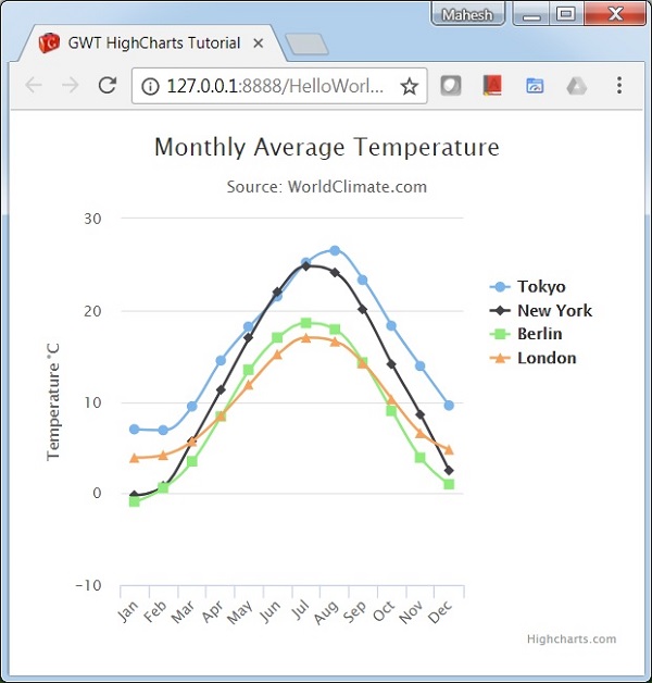
}결과
결과를 확인하십시오.