R-散布図
散布図は、デカルト平面にプロットされた多くの点を示しています。各点は、2つの変数の値を表します。1つの変数が横軸で選択され、別の変数が縦軸で選択されます。
単純な散布図は、 plot() 関数。
構文
Rで散布図を作成するための基本的な構文は次のとおりです。
plot(x, y, main, xlab, ylab, xlim, ylim, axes)以下は、使用されるパラメーターの説明です-
x は、値が水平座標であるデータセットです。
y は、値が垂直座標であるデータセットです。
main グラフのタイルです。
xlab 横軸のラベルです。
ylab 縦軸のラベルです。
xlim プロットに使用されるxの値の限界です。
ylim プロットに使用されるyの値の限界です。
axes 両方の軸をプロットに描画する必要があるかどうかを示します。
例
データセットを使用します "mtcars"基本的な散布図を作成するためにR環境で利用できます。mtcarsの列「wt」と「mpg」を使用してみましょう。
input <- mtcars[,c('wt','mpg')]
print(head(input))
上記のコードを実行すると、次の結果が生成されます-
wt mpg
Mazda RX4 2.620 21.0
Mazda RX4 Wag 2.875 21.0
Datsun 710 2.320 22.8
Hornet 4 Drive 3.215 21.4
Hornet Sportabout 3.440 18.7
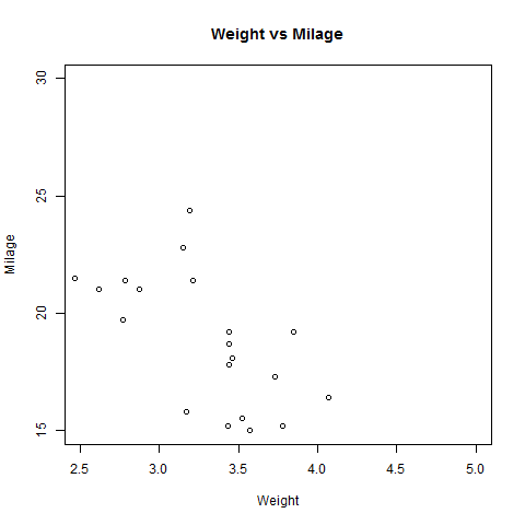
Valiant 3.460 18.1散布図の作成
以下のスクリプトは、wt(重量)とmpg(マイル/ガロン)の関係の散布図グラフを作成します。
# Get the input values.
input <- mtcars[,c('wt','mpg')]

# Give the chart file a name.
png(file = "scatterplot.png")

# Plot the chart for cars with weight between 2.5 to 5 and mileage between 15 and 30.
plot(x = input$wt,y = input$mpg,
   xlab = "Weight",
   ylab = "Milage",
   xlim = c(2.5,5),
   ylim = c(15,30),
   main = "Weight vs Milage"
)

# Save the file.
dev.off()
上記のコードを実行すると、次の結果が生成されます-
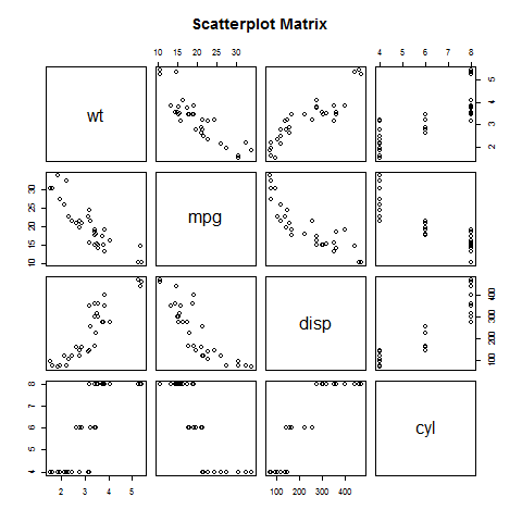
散布図行列
3つ以上の変数があり、1つの変数と残りの変数の相関関係を見つけたい場合は、散布図行列を使用します。を使用しておりますpairs() 散布図の行列を作成する関数。
構文
Rで散布図行列を作成するための基本的な構文は次のとおりです。
pairs(formula, data)以下は、使用されるパラメーターの説明です-
formula ペアで使用される一連の変数を表します。
data 変数が取得されるデータセットを表します。
例
各変数は、残りの各変数とペアになっています。ペアごとに散布図がプロットされます。
# Give the chart file a name.
png(file = "scatterplot_matrices.png")

# Plot the matrices between 4 variables giving 12 plots.

# One variable with 3 others and total 4 variables.

pairs(~wt+mpg+disp+cyl,data = mtcars,
   main = "Scatterplot Matrix")

# Save the file.
dev.off()
上記のコードを実行すると、次の出力が得られます。