빅 데이터 분석-차트 및 그래프
데이터를 분석하는 첫 번째 방법은 시각적으로 분석하는 것입니다. 이를 수행하는 목적은 일반적으로 변수 간의 관계와 변수의 일 변량 설명을 찾는 것입니다. 우리는 이러한 전략을 다음과 같이 나눌 수 있습니다.
- 일 변량 분석
- 다변량 분석
일 변량 그래픽 방법
Univariate통계 용어입니다. 실제로는 나머지 데이터와 독립적으로 변수를 분석하고자 함을 의미합니다. 이를 효율적으로 수행 할 수있는 플롯은 다음과 같습니다.
상자 도표
상자 그림은 일반적으로 분포를 비교하는 데 사용됩니다. 분포간에 차이가 있는지 시각적으로 검사하는 좋은 방법입니다. 컷에 따라 다이아몬드 가격에 차이가 있는지 확인할 수 있습니다.
# We will be using the ggplot2 library for plotting
library(ggplot2)
data("diamonds")

# We will be using the diamonds dataset to analyze distributions of numeric variables
head(diamonds)

#    carat   cut       color  clarity  depth  table   price    x     y     z
# 1  0.23    Ideal       E      SI2    61.5    55     326     3.95  3.98  2.43
# 2  0.21    Premium     E      SI1    59.8    61     326     3.89  3.84  2.31
# 3  0.23    Good        E      VS1    56.9    65     327     4.05  4.07  2.31
# 4  0.29    Premium     I      VS2    62.4    58     334     4.20  4.23  2.63
# 5  0.31    Good        J      SI2    63.3    58     335     4.34  4.35  2.75
# 6  0.24    Very Good   J      VVS2   62.8    57     336     3.94  3.96  2.48

### Box-Plots
p = ggplot(diamonds, aes(x = cut, y = price, fill = cut)) +
   geom_box-plot() +
   theme_bw()
print(p)
줄거리에서 다이아몬드 가격 분포가 다른 유형의 컷에서 차이가 있음을 알 수 있습니다.

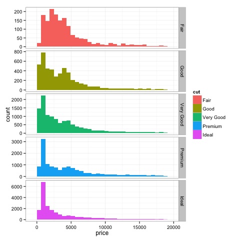
히스토그램
source('01_box_plots.R')

# We can plot histograms for each level of the cut factor variable using
facet_grid
p = ggplot(diamonds, aes(x = price, fill = cut)) +
   geom_histogram() +
   facet_grid(cut ~ .) +
   theme_bw()

p
# the previous plot doesn’t allow to visuallize correctly the data because of
the differences in scale
# we can turn this off using the scales argument of facet_grid

p = ggplot(diamonds, aes(x = price, fill = cut)) +
   geom_histogram() +
   facet_grid(cut ~ ., scales = 'free') +
   theme_bw()
p

png('02_histogram_diamonds_cut.png')
print(p)
dev.off()
위 코드의 출력은 다음과 같습니다.
다변량 그래픽 방법
탐색 적 데이터 분석의 다변량 그래픽 방법은 서로 다른 변수 간의 관계를 찾는 목적을 가지고 있습니다. 일반적으로 사용되는 두 가지 방법이 있습니다. 숫자 변수의 상관 행렬을 플로팅하거나 단순히 원시 데이터를 산점도 행렬로 플로팅하는 것입니다.
이를 증명하기 위해 diamonds 데이터 셋을 사용할 것입니다. 코드를 따르려면 스크립트를 엽니 다.bda/part2/charts/03_multivariate_analysis.R.
library(ggplot2)
data(diamonds)

# Correlation matrix plots
keep_vars = c('carat', 'depth', 'price', 'table')
df = diamonds[, keep_vars]
# compute the correlation matrix
M_cor = cor(df)

#          carat       depth      price      table
# carat 1.00000000  0.02822431  0.9215913  0.1816175
# depth 0.02822431  1.00000000 -0.0106474 -0.2957785
# price 0.92159130 -0.01064740  1.0000000  0.1271339
# table 0.18161755 -0.29577852  0.1271339  1.0000000

# plots
heat-map(M_cor)
코드는 다음 출력을 생성합니다.

이것은 요약이며 가격과 캐럿 사이에 강한 상관 관계가 있으며 다른 변수들 사이에는 그다지 많지 않다는 것을 알려줍니다.
상관 행렬은 원시 데이터를 그리는 것이 실용적이지 않은 변수가 많을 때 유용 할 수 있습니다. 언급했듯이 원시 데이터도 표시 할 수 있습니다.
library(GGally)
ggpairs(df)
히트 맵에 표시된 결과가 확인 된 플롯에서 가격과 캐럿 변수 사이에 0.922의 상관 관계가 있음을 알 수 있습니다.
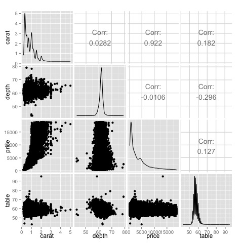
산점도 행렬의 (3, 1) 인덱스에있는 가격-캐럿 산점도에서이 관계를 시각화 할 수 있습니다.