GWT - Özel Widget'lar
GWT, özel kullanıcı arabirimi öğeleri oluşturmak için üç yol sağlar. İzlenecek üç genel strateji vardır -
Create a widget by extending Composite Class- Bu, özel widget oluşturmanın en yaygın ve en kolay yoludur. Burada, özel özelliklerle bileşik görünüm oluşturmak için mevcut widget'ları kullanabilirsiniz.
Create a widget using GWT DOM API in JAVA- GWT temel widget'ları bu şekilde oluşturulur. Yine de özel widget oluşturmanın çok karmaşık bir yoludur ve dikkatli kullanılmalıdır.
Use JavaScript and wrap it in a widget using JSNI- Bu genellikle yalnızca son çare olarak yapılmalıdır. Yerel yöntemlerin tarayıcılar arası etkileri göz önüne alındığında, çok karmaşık hale gelir ve ayrıca hata ayıklaması daha zor hale gelir.
Kompozit Sınıf ile Özel Widget Oluşturun
Bu örnek, GWT'de Özel Pencere Öğesi oluşturmayı göstermek için sizi basit adımlardan geçirecektir. GWT - Basic Widgets bölümünde oluşturduğumuz GWT uygulamasını güncellemek için aşağıdaki adımları izleyin -
Burada, özel pencere öğeleri oluşturmanın en kolay yolu olan Kompozit sınıfını genişleterek özel bir pencere öğesi oluşturacağız.
| Adım | Açıklama |
|---|---|
| 1 | GWT - Uygulama Oluştur bölümünde açıklandığı gibi com.tutorialspoint paketinin altında HelloWorld adıyla bir proje oluşturun . |
| 2 | Değiştir HelloWorld.gwt.xml , HelloWorld.css , HelloWorld.html ve HelloWorld.java olarak aşağıda açıklanmıştır. Geri kalan dosyaları değiştirmeden tutun. |
| 3 | Uygulanan mantığın sonucunu doğrulamak için uygulamayı derleyin ve çalıştırın. |
Değiştirilmiş modül tanımlayıcısının içeriği aşağıdadır src/com.tutorialspoint/HelloWorld.gwt.xml.
<?xml version = "1.0" encoding = "UTF-8"?>
<module rename-to = 'helloworld'>
   <!-- Inherit the core Web Toolkit stuff.                        -->
   <inherits name = 'com.google.gwt.user.User'/>

   <!-- Inherit the default GWT style sheet.                       -->
   <inherits name = 'com.google.gwt.user.theme.clean.Clean'/>

   <!-- Specify the app entry point class.                         -->
   <entry-point class = 'com.tutorialspoint.client.HelloWorld'/>

   <!-- Specify the paths for translatable code                    -->
   <source path = 'client'/>
   <source path = 'shared'/>

</module>
Değiştirilen Stil Sayfası dosyasının içeriği aşağıdadır war/HelloWorld.css.
body {
   text-align: center;
   font-family: verdana, sans-serif;
}

h1 {
   font-size: 2em;
   font-weight: bold;
   color: #777777;
   margin: 40px 0px 70px;
   text-align: center;
}
Aşağıda, değiştirilmiş HTML ana bilgisayar dosyasının içeriği verilmiştir war/HelloWorld.html.
<html>
   <head>
      <title>Hello World</title>
      <link rel = "stylesheet" href = "HelloWorld.css"/>
      <script language = "javascript" src = "helloworld/helloworld.nocache.js">
      </script>
   </head>

   <body>
      <h1>Custom Widget Demonstration</h1>
      <div id = "gwtContainer"></div>
   </body>
</html>
Aşağıdaki Java dosyası içeriğine sahip olalım src/com.tutorialspoint/HelloWorld.java Özel bir parçacığın oluşturulmasını gösterecektir.
package com.tutorialspoint.client;

import com.google.gwt.core.client.EntryPoint;
import com.google.gwt.event.dom.client.ClickEvent;
import com.google.gwt.event.dom.client.ClickHandler;
import com.google.gwt.user.client.ui.CheckBox;
import com.google.gwt.user.client.ui.Composite;
import com.google.gwt.user.client.ui.HorizontalPanel;
import com.google.gwt.user.client.ui.RootPanel;
import com.google.gwt.user.client.ui.TextBox;

public class HelloWorld implements EntryPoint {

   /**
    * A composite of a TextBox and a CheckBox that optionally enables it.
    */
   private static class OptionalTextBox extends Composite implements
   ClickHandler {

      private TextBox textBox = new TextBox();
      private CheckBox checkBox = new CheckBox();
      private boolean enabled = true;

      public boolean isEnabled() {
         return enabled;
      }

      public void setEnabled(boolean enabled) {
         this.enabled = enabled;
      }

      /**
       * Style this widget using .optionalTextWidget CSS class.<br/>
       * Style textbox using .optionalTextBox CSS class.<br/>
       * Style checkbox using .optionalCheckBox CSS class.<br/>
       * Constructs an OptionalTextBox with the given caption
       * on the check.
       * @param caption the caption to be displayed with the check box
       */
      public OptionalTextBox(String caption) {
         // place the check above the text box using a vertical panel.
         HorizontalPanel panel = new HorizontalPanel();
         // panel.setBorderWidth(1);
         panel.setSpacing(10);
         panel.add(checkBox);
         panel.add(textBox);

         // all composites must call initWidget() in their constructors.
         initWidget(panel);

         //set style name for entire widget
         setStyleName("optionalTextWidget");

         //set style name for text box
         textBox.setStyleName("optionalTextBox");

         //set style name for check box
         checkBox.setStyleName("optionalCheckBox");
         textBox.setWidth("200");

         // Set the check box's caption, and check it by default.
         checkBox.setText(caption);
         checkBox.setValue(enabled);
         checkBox.addClickHandler(this);
         enableTextBox(enabled,checkBox.getValue());
      }

      public void onClick(ClickEvent event) {
         if (event.getSource() == checkBox) {
            // When the check box is clicked,
            //update the text box's enabled state.
            enableTextBox(enabled,checkBox.getValue());
         }
      }

      private void enableTextBox(boolean enable,boolean isChecked){
         enable = (enable && isChecked) || (!enable && !isChecked);
         textBox.setStyleDependentName("disabled", !enable);
         textBox.setEnabled(enable);
      }
   }

   public void onModuleLoad() {
      // Create an optional text box and add it to the root panel.
      OptionalTextBox otb = new OptionalTextBox(
         "Want to explain the solution?");
      otb.setEnabled(true);
      RootPanel.get().add(otb);
   }
}
Yapılan tüm değişikliklere hazır olduğunuzda, uygulamayı GWT - Uygulama Oluştur bölümünde yaptığımız gibi geliştirme modunda derleyip çalıştıralım . Başvurunuzda her şey yolundaysa, bu aşağıdaki sonucu verecektir -
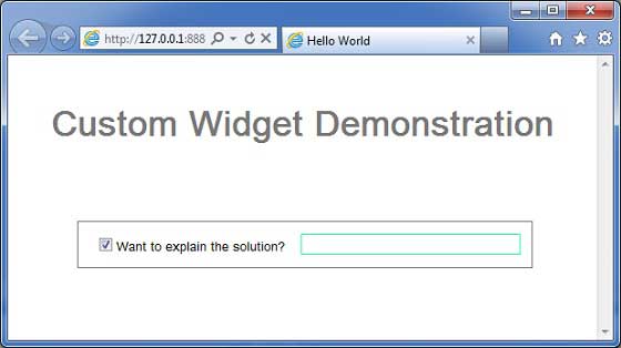
You can notice following points
Kompozit widget'ı genişleterek Özel Widget oluşturmak oldukça kolaydır.
GWT dahili widget'ları, TextBox ve CheckBox ile yeniden kullanılabilirlik kavramını kullanarak bir widget oluşturduk.
Onay kutusunun durumuna bağlı olarak TextBox devre dışı bırakılır / etkinleştirilir. Kontrolü etkinleştirmek / devre dışı bırakmak için bir API sağladık.
Dahili widget stillerini, belgelenmiş CSS stilleri aracılığıyla ortaya çıkardık.