Drupal-テーマとレイアウト
この章では、について勉強しましょう Themes and Layouts。DrupalがインストールされますBartikインストール中のデフォルトテーマとしてのテーマ。Drupalの公式サイトから有料または無料のテーマを選択できます。一般に、レイアウトはテキストとグラフィックの配置です。サイトで使用するさまざまなレイアウトを念頭に置いて、テーマを選択することをお勧めします。
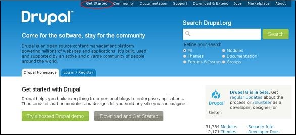
Step 1− Drupalの公式サイトにアクセスして、Get Started。
Step 2 −をクリックします All Themes 次の画面に示すように。

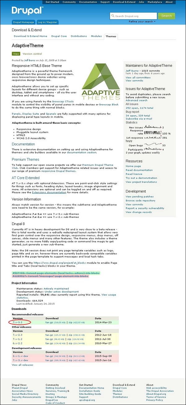
Step 3−テーマのリストが表示されます。お好みのテーマを選択してください(選択しましょうAdaptive theme それが構成されているように Layout & General Settings、この章の後半で説明します)をクリックします Version 次の画面に示すように。
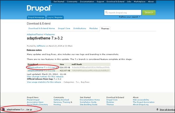
Step 4 −次に、右クリック Download file 次の画面に示すように、リンクアドレスをコピーします。

Step 5 −をクリックしてテーマを直接ダウンロードすることもできます archive file 次の画面に示すように、モジュールはコンピュータにローカルにダウンロードされます。
Step 6 −に移動 Appearance をクリックします Install new theme 次の画面に示すように。

Step 7 −コピーしたリンクアドレスを貼り付けることができます step (4) 次の画面に示すように、インストールボタンをクリックします。
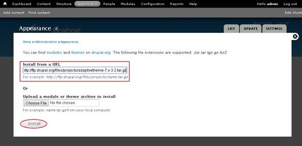
Step 8 −リンクアドレスをダウンロードしてクリックした場合は、リンクアドレスをコピーする代わりに、テーマアーカイブをアップロードすることもできます。 Install 次の画面に示すように。

Step 9 −次の画面が表示されたら、インストールが完了するまで待ちます。

Step 10 −次に、をクリックします Enable newly added themes 次の画面に示すように。

Step 11−デフォルトでは、テーマは無効になっています。それらを有効にするには、をクリックしますEnable and set default 次の画面に示すように。

Step 12 −をクリックします Settings 次の画面に示すように、サイトの外観を設定します。

Step 13 − Layout & General Settings オプションが画面にポップアップします、これで Adaptive theme で構成されています Standard layout, Tablet Layout, Smalltouch layout そして Panels & Gpanels。これらのオプションは、すでに使用されている現在のAT管理テーマの表示設定を制御します。サイトにテーマが表示されると、これらの設定が使用されます。それでは、これらのレイアウトについて1つずつ説明しましょう。

Step 14 −で Standard layout デスクトップ、ラップトップ、その他の大画面デバイスのレイアウトを選択できます。

Choose sidebar positions −ラジオボタンをクリックしてサイドバーの位置を選択できます。
Set the width of each sidebar −最初のサイドバーと2番目のサイドバーの幅と単位を%、px、またはemで設定できます。
Set the page width −ページの幅を設定できます。
Set a max width −最大幅を設定するには、チェックをオンまたはオフにすることができます。
Media query for this layout −メディアクエリは、メディアデバイスごとに異なるスタイルルールを定義し、このレイアウトのデフォルトは次のようになります。 1025px。
Step 15 −次に、をクリックします Tablet Layout次の画面に示すように。タブレットデバイスには2つの向きがありますLandscape そして Portrait。方向ごとに異なるレイアウトを構成できます。
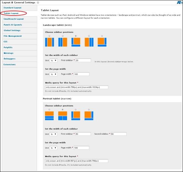
下 Landscape tablet そして Portrait tabletサイドバーの位置、各サイドバーの幅、ページ幅を選択できます。メディアクエリLandscape tabletmin-width:769pxとmax-width:1024pxになります。にとってPortrait tablet min-width:581pxとmax-width:768pxになります
Step 16 −次に、をクリックします Smalltouch Layout 次の画面に示すように。 Smalltouch layout また、2つの方向性があります Landscape そして Portrait。方向ごとに異なるレイアウトを構成できます。
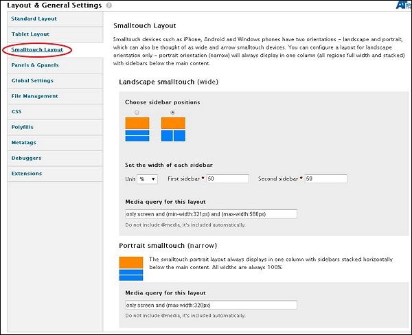
に Landscape Smalltouchサイドバーの位置を選択し、幅を設定できます。ザ・Portrait Smalltouchサイドバーがメインコンテンツの下に水平に積み重ねられた状態で、常に1列に表示されます。メディアクエリLandscape Smalltouch min-width:321pxおよびmax-width:580pxになります。 Portrait Smalltouch max-width:320pxになります。
Step 17 −次に、をクリックします Panels & Gpanels次の画面に示すように。アダプティブテーマは、レスポンシブパネルとGpanelレイアウトをサポートします。この機能を使用するには、Panelsモジュール、Display Suite(Panels付き)、またはアダプティブテーマのネイティブGpanelsレイアウトを使用できます。

各デバイス範囲のオプションを選択し、それらのタイプをレイアウトできます。一つずつ見ていきましょう。
下 Standard layoutサイトが標準レイアウトで表示されているときに使用するレイアウトを選択できます。をクリックしてTWO, THREE, FOUR, FIVE, SIX or INSET、次の画面に示すように、列の配置を選択できます。
.jpg)
と同じ手順に従います TABLET LANDSCAPE, TABLET PORTRAIT そして SMALLTOUCH LANDSCAPE レイアウト。
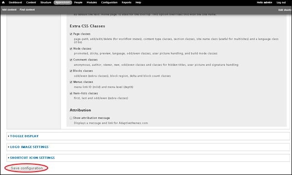
Step 18 −すべての構成が完了したら、をクリックします Save configurations 次の画面に示すように。