Flex - Özel Kontroller
Flex, özel bileşenler oluşturmak için iki yol sağlar.
- ActionScript kullanma
- MXML'yi kullanma
ActionScript kullanma
Mevcut bileşeni genişleterek bir bileşen oluşturabilirsiniz. Flash Builder kullanarak bir bileşen oluşturmak için,File > New > ActionScript Class.
Ayrıntıları aşağıda gösterildiği gibi girin -
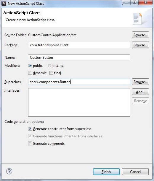
Flash Builder, aşağıdaki CustomButton.as dosyasını oluşturacaktır.
package com.tutorialspoint.client {
   import spark.components.Button;

   public class CustomButton extends Button {
      public function CustomButton() {
         super();
      }
   }
}
MXML'yi kullanma
Mevcut bileşeni genişleterek bir bileşen oluşturabilirsiniz. Flash Builder kullanarak bir bileşen oluşturmak için,File > New > MXML Component.
Ayrıntıları aşağıda gösterildiği gibi girin.
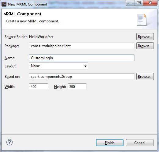
Flash Builder, aşağıdaki CustomLogin.mxml dosyasını oluşturacaktır.
<?xml version = "1.0" encoding = "utf-8"?>
<s:Group xmlns:fx = "http://ns.adobe.com/mxml/2009"
   xmlns:s = "library://ns.adobe.com/flex/spark"
   xmlns:mx = "library://ns.adobe.com/flex/mx"
   width = "400" height = "300">
</s:Group>
Bir Flex uygulamasında özel kontrolleri test etmek için aşağıdaki adımları takip edelim -
| Adım | Açıklama |
|---|---|
| 1 | Flex - Uygulama Oluştur bölümünde açıklandığı gibi com.tutorialspoint.client paketinin altında HelloWorld adıyla bir proje oluşturun . |
| 2 | HelloWorld.mxml'yi aşağıda açıklandığı gibi değiştirin . Geri kalan dosyaları değiştirmeden tutun. |
| 3 | Oluşturma CustomLogin.mxml ve CustomButton.as yukarıda açıklandığı gibi bileşeni. Bu dosyaları aşağıda açıklandığı gibi değiştirin. Geri kalan dosyaları değiştirmeden tutun. |
| 4 | İş mantığının gereksinimlere göre çalıştığından emin olmak için uygulamayı derleyin ve çalıştırın. |
Değiştirilen mxml dosyasının içeriği aşağıdadır src/com.tutorialspoint/client/CustomLogin.mxml.
<?xml version = "1.0" encoding = "utf-8"?>
<s:Group xmlns:fx = "http://ns.adobe.com/mxml/2009"
   xmlns:s = "library://ns.adobe.com/flex/spark"
   xmlns:mx = "library://ns.adobe.com/flex/mx" width = "400" height = "300">

   <s:Form>
      <s:FormItem label = "UserName:">
         <s:TextInput width = "200" />
      </s:FormItem>

      <s:FormItem label = "Password:">
         <s:TextInput width = "200" displayAsPassword = "true" />
      </s:FormItem>

      <s:FormItem>
         <s:Button label = "Login" />
      </s:FormItem>
   </s:Form>
</s:Group>
Değiştirilen mxml dosyasının içeriği aşağıdadır src/com.tutorialspoint/client/CustomButton.as.
package com.tutorialspoint.client {
   import spark.components.Button;

   public class CustomButton extends Button {

      public function CustomButton() {
         super();
         this.setStyle("color","green");
         this.label = "Submit";
      }
   }
}
Değiştirilen mxml dosyasının içeriği aşağıdadır src/com.tutorialspoint/client/HelloWorld.mxml.
<?xml version = "1.0" encoding = "utf-8"?>
<s:Application xmlns:fx = "http://ns.adobe.com/mxml/2009"
   xmlns:s = "library://ns.adobe.com/flex/spark"
   xmlns:mx = "library://ns.adobe.com/flex/mx"
   xmlns:client = "com.tutorialspoint.client.*"
   initialize = "application_initializeHandler(event)">

   <fx:Style source = "/com/tutorialspoint/client/Style.css" />
   <fx:Script>
      <![CDATA[
        import mx.events.FlexEvent;

        protected function application_initializeHandler(event:FlexEvent):void {
           //create a new custom button
           var customButton: CustomButton = new CustomButton();
           asPanel.addElement(customButton);
        }

      ]]>
   </fx:Script>

   <s:BorderContainer width = "630" height = "480" id = "mainContainer"
      styleName = "container">
      <s:VGroup width = "100%" height = "100%" gap = "10"
         horizontalAlign = "center" verticalAlign = "middle">
         <s:Label id = "lblHeader" text = "Custom Controls Demonstration"
            fontSize = "40" color = "0x777777" styleName = "heading" />

         <s:Panel title = "Using MXML Component" width = "400" height = "200">
            <client:CustomLogin>
            </client:CustomLogin>
         </s:Panel>

         <s:Panel  title = "Using AS Component" width = "400" height = "100">
            <s:VGroup id = "asPanel" width = "100%" height = "100%" gap = "10"
               horizontalAlign = "center" verticalAlign = "middle">
            </s:VGroup>
         </s:Panel>
      </s:VGroup>
   </s:BorderContainer>
</s:Application>
Yapılan tüm değişikliklere hazır olduğunuzda, Flex - Create Application bölümünde yaptığımız gibi uygulamayı normal modda derleyip çalıştırmamıza izin verin . Başvurunuzla ilgili her şey yolundaysa, şu sonucu verecektir: [ Çevrimiçi deneyin ]
