Angular Material7-クイックガイド
Angular Material 7は、Angular開発者向けのUIコンポーネントライブラリです。Angular Materialの再利用可能なUIコンポーネントは、ブラウザの移植性、デバイスの独立性、優雅な劣化などの最新のWebデザイン原則を遵守しながら、魅力的で一貫性のある機能的なWebページとWebアプリケーションの構築に役立ちます。
以下は、AngularMaterialのいくつかの顕著な特徴です-
組み込みのレスポンシブデザイン。
フットプリントが最小限の標準CSS。
マテリアルデザインの概念に従うように適合された、ボタン、チェックボックス、テキストフィールドなどの一般的なユーザーインターフェイスコントロールの新しいバージョンが含まれています。
カード、ツールバー、スピードダイヤル、サイドナビゲーション、スワイプなどの拡張された特殊な機能が含まれています。
クロスブラウザであり、再利用可能なWebコンポーネントを作成するために使用できます。
レスポンシブデザイン
Angular Materialにはレスポンシブデザインが組み込まれているため、Angular Materialを使用して作成されたWebサイトは、デバイスのサイズに応じて再設計されます。
Angular Materialクラスは、Webサイトが任意の画面サイズに収まるように作成されます。
Angular Materialを使用して作成されたWebサイトは、PC、タブレット、およびモバイルデバイスと完全に互換性があります。
拡張可能
Angular Materialは、設計上、非常に最小限でフラットです。
これは、既存のCSSルールを上書きするよりも新しいCSSルールを追加する方がはるかに簡単であるという事実を考慮して設計されています。
影と大胆な色をサポートします。
色と色合いは、さまざまなプラットフォームやデバイス間で均一のままです。
そして何よりも重要なのは、AngularMaterialは完全に無料で使用できることです。
このチュートリアルでは、AngularFrameworkとAngularMaterialを使用して作業を開始するための開発環境を準備する方法について説明します。この章では、Angular 6に必要な環境設定について説明します。Angular6をインストールするには、次のものが必要です。
- Nodejs
- Npm
- Angular CLI
- コードを書くためのIDE
Nodejsは8.11より大きく、npmは5.6より大きくなければなりません。
Nodejs
nodejsがシステムにインストールされているかどうかを確認するには、次のように入力します node -vターミナルで。これは、システムに現在インストールされているnodejsのバージョンを確認するのに役立ちます。
C:\>node -v
v8.11.3
何も出力されない場合は、nodejsをシステムにインストールしてください。nodejsをインストールするには、ホームページにアクセスしてくださいhttps://nodejs.org/en/download/ nodejsを使用して、OSに基づいてパッケージをインストールします。
nodejsのホームページは次のようになります-
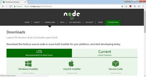
OSに基づいて、必要なパッケージをインストールします。nodejsがインストールされると、npmも一緒にインストールされます。npmがインストールされているかどうかを確認するには、ターミナルでnpm-vと入力します。npmのバージョンが表示されます。
C:\>npm -v
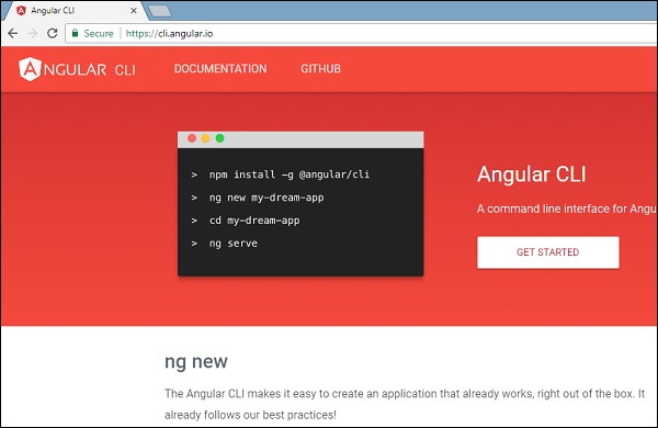
5.6.0Angular 6のインストールは、AngularCLIの助けを借りて非常に簡単です。ホームページにアクセスhttps://cli.angular.io/ コマンドの参照を取得するための角度の。
タイプ npm install -g @angular/cli、システムにangularcliをインストールします。
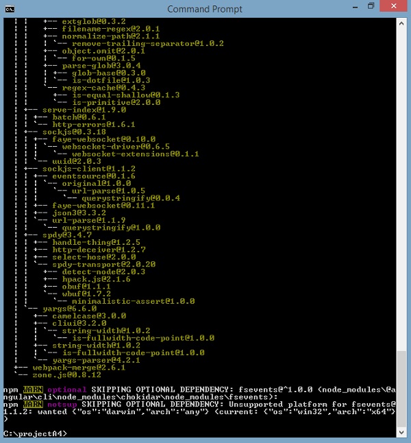
Angular CLIがインストールされると、ターミナルに上記のインストールが行われます。WebStorm、Atom、Visual StudioCodeなどの任意のIDEを使用できます。
AngularMaterialをインストールする
次のコマンドを実行して、作成されたプロジェクトにAngularMaterialモジュールとその関連コンポーネントをインストールします。
materialApp>npm install --save @angular/material @angular/cdk @angular/animations hammerjs

+ @angular/[email protected]
+ @angular/[email protected]
+ @angular/[email protected]
+ [email protected]
added 4 packages and updated 1 package in 39.699s
app.module.tsファイルに次のエントリを追加します
import {BrowserAnimationsModule} from '@angular/platform-browser/animations';
import {FormsModule, ReactiveFormsModule} from '@angular/forms';

imports: [
    ...
	FormsModule,
	ReactiveFormsModule,
    BrowserAnimationsModule
],
テーマを取得するには、styles.cssファイルに次のエントリを追加します。
@import "~@angular/material/prebuilt-themes/indigo-pink.css";index.htmファイルに次のエントリを追加して、マテリアルアイコンのサポートを取得します。
<link href="https://fonts.googleapis.com/icon?family=Material+Icons" rel="stylesheet">ザ・ <mat-autocomplete>Angularディレクティブは、カスタムクエリへのすべての可能な一致を表示するための組み込みのドロップダウンを備えた特別な入力コントロールとして使用されます。このコントロールは、ユーザーが入力領域に入力するとすぐに、リアルタイムの提案ボックスとして機能します。<mat-autocomplete> ローカルまたはリモートのデータソースからの検索結果を提供するために使用できます。
この章では、AngularMaterialを使用してオートコンプリートコントロールを描画するために必要な構成を紹介します。
Angularアプリケーションを作成する
次の手順に従って、Angular 6で作成したAngularアプリケーションを更新します-プロジェクトセットアップの章-
| ステップ | 説明 |
|---|---|
| 1 | Angular 6-プロジェクトセットアップの章で説明されているように、materialAppという名前のプロジェクトを作成します。 |
| 2 | 変更app.module.ts、app.component.ts、app.component.cssをしてapp.component.htmlとして以下に説明します。残りのファイルは変更しないでください。 |
| 3 | アプリケーションをコンパイルして実行し、実装されたロジックの結果を確認します。 |
変更されたモジュール記述子の内容は次のとおりです app.module.ts。
import { BrowserModule } from '@angular/platform-browser';
import { NgModule } from '@angular/core';
import { AppComponent } from './app.component';
import {BrowserAnimationsModule} from '@angular/platform-browser/animations';
import {MatAutocompleteModule,MatInputModule} from '@angular/material';
import {FormsModule, ReactiveFormsModule} from '@angular/forms';
@NgModule({
   declarations: [
      AppComponent
   ],
   imports: [
      BrowserModule,
      BrowserAnimationsModule,
      MatAutocompleteModule,
      MatInputModule,
      FormsModule,
      ReactiveFormsModule
   ],
   providers: [],
   bootstrap: [AppComponent]
})
export class AppModule { }
以下は、変更されたHTMLホストファイルの内容です。 app.component.html。
<form class="tp-form">
   <mat-form-field class="tp-full-width">
      <input type="text"
         placeholder="US State"
         aria-label="Number"
         matInput
         [formControl]="myControl"
         [matAutocomplete]="auto">
         <mat-autocomplete #auto="matAutocomplete">
            <mat-option *ngFor="let state of states" [value]="state.value">
            {{state.display}}
         </mat-option>
      </mat-autocomplete>
   </mat-form-field>
</form>
変更されたCSSファイルの内容は次のとおりです app.component.css。
.tp-form {
   min-width: 150px;
   max-width: 500px;
   width: 100%;
}
.tp-full-width {
   width: 100%;
}
以下は、変更されたtsファイルの内容です。 app.component.ts。
import { Component } from '@angular/core';
import { FormControl } from "@angular/forms";
@Component({
   selector: 'app-root',
   templateUrl: './app.component.html',
   styleUrls: ['./app.component.css']
})
export class AppComponent {
   title = 'materialApp';
   myControl = new FormControl();
   states;
   constructor(){
      this.loadStates();
   }
   //build list of states as map of key-value pairs
   loadStates() {
      var allStates = 'Alabama, Alaska, Arizona, Arkansas, California, Colorado, Connecticut, Delaware,\
         Florida, Georgia, Hawaii, Idaho, Illinois, Indiana, Iowa, Kansas, Kentucky, Louisiana,\
         Maine, Maryland, Massachusetts, Michigan, Minnesota, Mississippi, Missouri, Montana,\
         Nebraska, Nevada, New Hampshire, New Jersey, New Mexico, New York, North Carolina,\
         North Dakota, Ohio, Oklahoma, Oregon, Pennsylvania, Rhode Island, South Carolina,\
         South Dakota, Tennessee, Texas, Utah, Vermont, Virginia, Washington, West Virginia,\
         Wisconsin, Wyoming';
      this.states =  allStates.split(/, +/g).map( function (state) {
         return {
            value: state.toUpperCase(),
            display: state
         };
      });
   }
}
結果
結果を確認します。
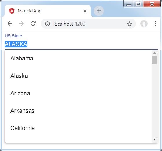
詳細
最初に、入力ボックスを作成し、名前の付いたオートコンプリートをバインドしました auto [matAutocomplete]属性を使用します。
次に、という名前のオートコンプリートを作成しました auto mat-autocompleteタグを使用します。
次に、* ngForループを使用して、オプションが作成されます。
ザ・ <mat-checkbox>Angular Directiveは、マテリアルデザインのスタイリングとアニメーション機能を備えた拡張チェックボックスとして使用されます。
この章では、AngularMaterialを使用してチェックボックスコントロールを描画するために必要な構成を紹介します。
Angularアプリケーションを作成する
次の手順に従って、Angular 6で作成したAngularアプリケーションを更新します-プロジェクトセットアップの章-
| ステップ | 説明 |
|---|---|
| 1 | Angular 6-プロジェクトセットアップの章で説明されているように、materialAppという名前のプロジェクトを作成します。 |
| 2 | 変更app.module.ts、app.component.ts、app.component.cssをしてapp.component.htmlとして以下に説明します。残りのファイルは変更しないでください。 |
| 3 | アプリケーションをコンパイルして実行し、実装されたロジックの結果を確認します。 |
変更されたモジュール記述子の内容は次のとおりです app.module.ts。
import { BrowserModule } from '@angular/platform-browser';
import { NgModule } from '@angular/core';
import { AppComponent } from './app.component';
import {BrowserAnimationsModule} from '@angular/platform-browser/animations';
import {MatCheckboxModule} from '@angular/material';
import {FormsModule, ReactiveFormsModule} from '@angular/forms';
@NgModule({
   declarations: [
      AppComponent
   ],
   imports: [
      BrowserModule,
      BrowserAnimationsModule,
      MatCheckboxModule,
      FormsModule,
      ReactiveFormsModule
   ],
   providers: [],
   bootstrap: [AppComponent]
})
export class AppModule { }
以下は、変更されたHTMLホストファイルの内容です。 app.component.html。
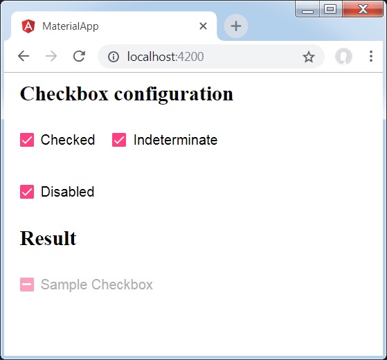
<h2 class="tp-h2">Checkbox configuration</h2>
<section class="tp-section">
   <mat-checkbox class="tp-margin" [(ngModel)]="checked">Checked</mat-checkbox>
   <mat-checkbox class="tp-margin" [(ngModel)]="indeterminate">Indeterminate</mat-checkbox>
</section>
<section class="tp-section">
   <mat-checkbox class="tp-margin" [(ngModel)]="disabled">Disabled</mat-checkbox>
</section>
<h2 class="tp-h2">Result</h2>
<section class="tp-section">
   <mat-checkbox
      class="tp-margin"
      [(ngModel)]="checked"
      [(indeterminate)]="indeterminate"
      [labelPosition]="labelPosition"
      [disabled]="disabled">
      Sample Checkbox
   </mat-checkbox>
</section>
変更されたCSSファイルの内容は次のとおりです app.component.css。
.tp-h2 {
   margin: 10px;
}
.tp-section {
   display: flex;
   align-content: center;
   align-items: center;
   height: 60px;
}
.tp-margin {
   margin: 0 10px;
}
以下は、変更されたtsファイルの内容です。 app.component.ts。
import { Component } from '@angular/core';
import { FormControl } from "@angular/forms";
@Component({
   selector: 'app-root',
   templateUrl: './app.component.html',
   styleUrls: ['./app.component.css']
})
export class AppComponent {
   title = 'materialApp';
   checked = false;
   indeterminate = false;
   labelPosition = 'after';
   disabled = false;
}
結果
結果を確認します。
詳細
最初に、mat-checkboxを使用して3つのチェックボックスを作成し、ngModelと変数を使用してそれらをバインドしました。
次に、別のチェックボックスを作成し、.tsファイルの変数にバインドされたさまざまな属性を紹介しました。
ザ・ <mat-datepicker>Angularディレクティブは、カレンダーから日付を選択したり、入力ボックスを使用して直接入力したりできる日付ピッカーコントロールを作成するために使用されます。
この章では、AngularMaterialを使用して日付ピッカーコントロールを描画するために必要な構成を紹介します。
Angularアプリケーションを作成する
次の手順に従って、Angular 6で作成したAngularアプリケーションを更新します-プロジェクトセットアップの章-
| ステップ | 説明 |
|---|---|
| 1 | Angular 6-プロジェクトセットアップの章で説明されているように、materialAppという名前のプロジェクトを作成します。 |
| 2 | 変更app.module.ts、app.component.ts、app.component.cssをしてapp.component.htmlとして以下に説明します。残りのファイルは変更しないでください。 |
| 3 | アプリケーションをコンパイルして実行し、実装されたロジックの結果を確認します。 |
変更されたモジュール記述子の内容は次のとおりです app.module.ts。
import { BrowserModule } from '@angular/platform-browser';
import { NgModule } from '@angular/core';
import { AppComponent } from './app.component';
import {BrowserAnimationsModule} from '@angular/platform-browser/animations';
import {MatDatepickerModule, MatInputModule,MatNativeDateModule} from '@angular/material';
import {FormsModule, ReactiveFormsModule} from '@angular/forms';
@NgModule({
   declarations: [
      AppComponent
   ],
   imports: [
      BrowserModule,
      BrowserAnimationsModule,
      MatDatepickerModule, MatInputModule,MatNativeDateModule,
      FormsModule,
      ReactiveFormsModule
   ],
   providers: [],
   bootstrap: [AppComponent]
})
export class AppModule { }
以下は、変更されたHTMLホストファイルの内容です。 app.component.html。
<mat-form-field>
   <input matInput [matDatepicker]="picker" placeholder="Choose a date">
   <mat-datepicker-toggle matSuffix [for]="picker"></mat-datepicker-toggle>
   <mat-datepicker #picker></mat-datepicker>
</mat-form-field>
結果
結果を確認します。
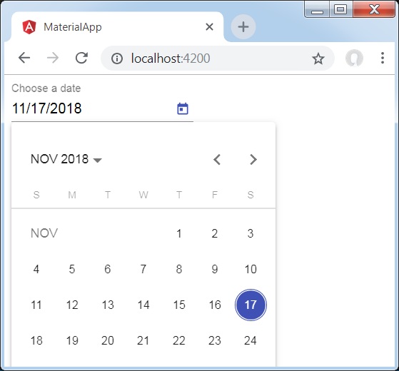
詳細
最初に、入力ボックスを作成し、という名前の日付ピッカーをバインドしました picker [matDatepicker]属性を使用します。
次に、という名前の日付ピッカーを作成しました picker mat-datepickerタグを使用します。
ザ・ <mat-form-field>、Angularディレクティブは、Angularコンポーネントのラッパーを作成するために使用され、下線、太字、ヒントなどのテキストスタイルを適用するために使用されます。
以下の角度成分は、 <mat-form-field>。
<入力matNativeControl>
<textarea matNativeControl>
<matNativeControlを選択>
<mat-select>
<mat-chip-list>
この章では、AngularMaterialでマットフォームフィールドコントロールを使用するために必要な構成を紹介します。
Angularアプリケーションを作成する
次の手順に従って、Angular 6で作成したAngularアプリケーションを更新します-プロジェクトセットアップの章-
| ステップ | 説明 |
|---|---|
| 1 | Angular 6-プロジェクトセットアップの章で説明されているように、materialAppという名前のプロジェクトを作成します。 |
| 2 | 変更app.module.ts、app.component.ts、app.component.cssをしてapp.component.htmlとして以下に説明します。残りのファイルは変更しないでください。 |
| 3 | アプリケーションをコンパイルして実行し、実装されたロジックの結果を確認します。 |
変更されたモジュール記述子の内容は次のとおりです app.module.ts。
import { BrowserModule } from '@angular/platform-browser';
import { NgModule } from '@angular/core';
import { AppComponent } from './app.component';
import {BrowserAnimationsModule} from '@angular/platform-browser/animations';
import {MatInputModule,MatOptionModule, MatSelectModule, MatIconModule} from '@angular/material'
import {FormsModule, ReactiveFormsModule} from '@angular/forms';
@NgModule({
   declarations: [
      AppComponent
   ],
   imports: [
      BrowserModule,
      BrowserAnimationsModule,
      MatInputModule,MatOptionModule, MatSelectModule, MatIconModule,
      FormsModule,
      ReactiveFormsModule
   ],
   providers: [],
   bootstrap: [AppComponent]
})
export class AppModule { }
変更されたCSSファイルの内容は次のとおりです app.component.css。
.tp-container {
   display: flex;
   flex-direction: column;
}
.tp-container > * {
   width: 100%;
}
以下は、変更されたHTMLホストファイルの内容です。 app.component.html。
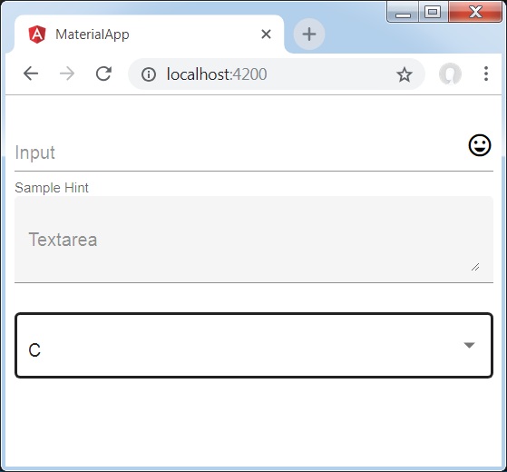
<div class="tp-container">
   <mat-form-field appearance="standard">
      <input matInput placeholder="Input">
      <mat-icon matSuffix>sentiment_very_satisfied</mat-icon>
      <mat-hint>Sample Hint</mat-hint>
   </mat-form-field>
   <mat-form-field appearance="fill">
      <textarea matInput placeholder="Textarea"></textarea>
   </mat-form-field>
   <mat-form-field appearance="outline">
      <mat-select placeholder="Select">
         <mat-option value="A">A</mat-option>
         <mat-option value="B">B</mat-option>
         <mat-option value="C">C</mat-option>
      </mat-select>
   </mat-form-field>
</div>
結果
結果を確認します。
詳細
最初に、mat-form-fieldラッパーを使用してフォームフィールドを作成しました。外観属性を使用してフォームフィールドの外観を変更しました。
次に、フォームコントロールがフォームフィールドに追加されます。
ザ・ <mat-input>、Angularディレクティブは、<input>要素と<textarea>要素が機能するために使用されます <mat-form-field>。
以下の入力タイプは、 <mat-input>。
- color
- date
- datetime-local
- month
- number
- password
- search
- tel
- text
- time
- url
- week
この章では、AngularMaterialでマット入力コントロールを使用するために必要な構成を紹介します。
Angularアプリケーションを作成する
次の手順に従って、Angular 6で作成したAngularアプリケーションを更新します-プロジェクトセットアップの章-
| ステップ | 説明 |
|---|---|
| 1 | Angular 6-プロジェクトセットアップの章で説明されているように、materialAppという名前のプロジェクトを作成します。 |
| 2 | 変更app.module.ts、app.component.ts、app.component.cssをしてapp.component.htmlとして以下に説明します。残りのファイルは変更しないでください。 |
| 3 | アプリケーションをコンパイルして実行し、実装されたロジックの結果を確認します。 |
変更されたモジュール記述子の内容は次のとおりです app.module.ts。
import { BrowserModule } from '@angular/platform-browser';
import { NgModule } from '@angular/core';
import { AppComponent } from './app.component';
import {BrowserAnimationsModule} from '@angular/platform-browser/animations';
import {MatInputModule} from '@angular/material'
import {FormsModule, ReactiveFormsModule} from '@angular/forms';
@NgModule({
   declarations: [
      AppComponent
   ],
   imports: [
      BrowserModule,
      BrowserAnimationsModule,
      MatInputModule,
      FormsModule,
      ReactiveFormsModule
   ],
   providers: [],
   bootstrap: [AppComponent]
})
export class AppModule { }
変更されたCSSファイルの内容は次のとおりです app.component.css。
.tp-form {
   min-width: 150px;
   max-width: 500px;
   width: 100%;
}
.tp-full-width {
   width: 100%;
}
以下は、変更されたtsファイルの内容です。 app.component.ts。
import { Component } from '@angular/core';
import { FormControl } from "@angular/forms";
import {Validators} from '@angular/forms';
@Component({
   selector: 'app-root',
   templateUrl: './app.component.html',
   styleUrls: ['./app.component.css']
})
export class AppComponent {
   title = 'materialApp';
   emailFormControl = new FormControl('', [
      Validators.required,
      Validators.email,
  ]);
}
以下は、変更されたHTMLホストファイルの内容です。 app.component.html。
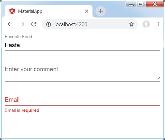
<form class="tp-form">
   <mat-form-field class="tp-full-width">
      <input matInput placeholder="Favorite Food" value="Pasta">
   </mat-form-field>
   <mat-form-field class="tp-full-width">
      <textarea matInput placeholder="Enter your comment"></textarea>
   </mat-form-field>
   <mat-form-field class="tp-full-width">
      <input matInput placeholder="Email" [formControl]="emailFormControl">
      <mat-error *ngIf="emailFormControl.hasError('email')
         && !emailFormControl.hasError('required')">
         Please enter a valid email address
      </mat-error>
      <mat-error *ngIf="emailFormControl.hasError('required')">
         Email is <strong>required</strong>
      </mat-error>
   </mat-form-field>
</form>
結果
結果を確認します。
詳細
最初に、mat-form-fieldラッパーを使用してフォームフィールドを作成しました。
次に、input属性とmatInput属性を使用して、フォームコントロールがフォームフィールドに追加されます。
ザ・ <mat-radiobutton>、Angular Directiveは、マテリアルデザインベースのスタイリングを強化するために<input type = "radio">に使用されます。
この章では、AngularMaterialを使用してラジオボタンコントロールを描画するために必要な構成を紹介します。
Angularアプリケーションを作成する
次の手順に従って、Angular 6で作成したAngularアプリケーションを更新します-プロジェクトセットアップの章-
| ステップ | 説明 |
|---|---|
| 1 | Angular 6-プロジェクトセットアップの章で説明されているように、materialAppという名前のプロジェクトを作成します。 |
| 2 | 変更app.module.ts、app.component.ts、app.component.cssをしてapp.component.htmlとして以下に説明します。残りのファイルは変更しないでください。 |
| 3 | アプリケーションをコンパイルして実行し、実装されたロジックの結果を確認します。 |
変更されたモジュール記述子の内容は次のとおりです app.module.ts。
import { BrowserModule } from '@angular/platform-browser';
import { NgModule } from '@angular/core';
import { AppComponent } from './app.component';
import {BrowserAnimationsModule} from '@angular/platform-browser/animations';
import {MatRadioModule} from '@angular/material'
import {FormsModule, ReactiveFormsModule} from '@angular/forms';
@NgModule({
   declarations: [
      AppComponent
   ],
   imports: [
      BrowserModule,
      BrowserAnimationsModule,
      MatRadioModule,
      FormsModule,
      ReactiveFormsModule
   ],
   providers: [],
   bootstrap: [AppComponent]
})
export class AppModule { }
変更されたCSSファイルの内容は次のとおりです app.component.css。
.tp-radio-group {
   display: inline-flex;
   flex-direction: column;
}
.tp-radio-button {
   margin: 5px;
}
.tp-selected-value {
   margin: 15px 0;
}
以下は、変更されたtsファイルの内容です。 app.component.ts。
import { Component } from '@angular/core';
import { FormControl } from "@angular/forms";
import { Validators } from "@angular/forms";
@Component({
   selector: 'app-root',
   templateUrl: './app.component.html',
   styleUrls: ['./app.component.css']
})
export class AppComponent {
   title = 'materialApp';
   favoriteSeason: string;
   seasons: string[] = ['Winter', 'Spring', 'Summer', 'Autumn'];
}
以下は、変更されたHTMLホストファイルの内容です。 app.component.html。
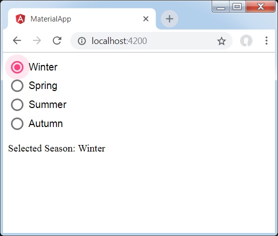
<mat-radio-group class="tp-radio-group" [(ngModel)]="favoriteSeason">
   <mat-radio-button class="tp-radio-button"
      *ngFor="let season of seasons" [value]="season">
      {{season}}
   </mat-radio-button>
</mat-radio-group>
<div class="tp-selected-value">
  Selected Season: {{favoriteSeason}}
</div>
結果
結果を確認します。
詳細
最初に、ngModelでバインドされたmat-radio-groupを使用してラジオボタングループを作成しました。
次に、mat-radio-buttonを使用してラジオボタンを追加しました。
ザ・ <mat-select>、Angular Directiveは、マテリアルデザインベースのスタイリングを強化するための<select>に使用されます。
この章では、AngularMaterialを使用して選択コントロールを描画するために必要な構成を紹介します。
Angularアプリケーションを作成する
次の手順に従って、Angular 6で作成したAngularアプリケーションを更新します-プロジェクトセットアップの章-
| ステップ | 説明 |
|---|---|
| 1 | Angular 6-プロジェクトセットアップの章で説明されているように、materialAppという名前のプロジェクトを作成します。 |
| 2 | 変更app.module.ts、app.component.ts、app.component.cssをしてapp.component.htmlとして以下に説明します。残りのファイルは変更しないでください。 |
| 3 | アプリケーションをコンパイルして実行し、実装されたロジックの結果を確認します。 |
変更されたモジュール記述子の内容は次のとおりです app.module.ts。
import { BrowserModule } from '@angular/platform-browser';
import { NgModule } from '@angular/core';
import { AppComponent } from './app.component';
import {BrowserAnimationsModule} from '@angular/platform-browser/animations';
import {MatSelectModule} from '@angular/material'
import {FormsModule, ReactiveFormsModule} from '@angular/forms';
@NgModule({
   declarations: [
      AppComponent
   ],
   imports: [
      BrowserModule,
      BrowserAnimationsModule,
      MatSelectModule,
      FormsModule,
      ReactiveFormsModule
   ],
   providers: [],
   bootstrap: [AppComponent]
})
export class AppModule { }
以下は、変更されたtsファイルの内容です。 app.component.ts。
import { Component } from '@angular/core';
import { FormControl } from "@angular/forms";
export interface Food {
  value: string;
  display: string;
}
@Component({
   selector: 'app-root',
   templateUrl: './app.component.html',
   styleUrls: ['./app.component.css']
})
export class AppComponent {
   title = 'materialApp';
   selectedValue: string;
   foods: Food[] = [
      {value: 'steak', display: 'Steak'},
      {value: 'pizza', display: 'Pizza'},
      {value: 'tacos', display: 'Tacos'}
   ];
}
以下は、変更されたHTMLホストファイルの内容です。 app.component.html。
<form>
   <h4>mat-select</h4>
   <mat-form-field>
      <mat-select placeholder="Favorite food"
         [(ngModel)]="selectedValue" name="food">
         <mat-option *ngFor="let food of foods"
            [value]="food.value">
            {{food.display}}
         </mat-option>
      </mat-select>
   </mat-form-field>
   <p> Selected food: {{selectedValue}} </p>
</form>
結果
結果を確認します。
詳細
最初に、ngModelでバインドされたmat-selectを使用してselectを作成しました。
次に、mat-optionを使用してオプションを追加しました。
ザ・ <mat-slider>Angular Directiveは、マテリアルデザインのスタイリングとアニメーション機能を備えた拡張範囲セレクターとして使用されます。
この章では、AngularMaterialを使用してスライダーコントロールを描画するために必要な構成を紹介します。
Angularアプリケーションを作成する
次の手順に従って、Angular 6で作成したAngularアプリケーションを更新します-プロジェクトセットアップの章-
| ステップ | 説明 |
|---|---|
| 1 | Angular 6-プロジェクトセットアップの章で説明されているように、materialAppという名前のプロジェクトを作成します。 |
| 2 | 変更app.module.ts、app.component.ts、app.component.cssをしてapp.component.htmlとして以下に説明します。残りのファイルは変更しないでください。 |
| 3 | アプリケーションをコンパイルして実行し、実装されたロジックの結果を確認します。 |
変更されたモジュール記述子の内容は次のとおりです app.module.ts。
import { BrowserModule } from '@angular/platform-browser';
import { NgModule } from '@angular/core';
import { AppComponent } from './app.component';
import {BrowserAnimationsModule} from '@angular/platform-browser/animations';
import {MatSliderModule, MatCheckboxModule} from '@angular/material'
import {FormsModule, ReactiveFormsModule} from '@angular/forms';
@NgModule({
   declarations: [
      AppComponent
   ],
   imports: [
      BrowserModule,
      BrowserAnimationsModule,
      MatSliderModule, MatCheckboxModule,
      FormsModule,
      ReactiveFormsModule
   ],
   providers: [],
   bootstrap: [AppComponent]
})
export class AppModule { }
以下は、変更されたHTMLホストファイルの内容です。 app.component.html。
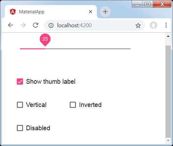
<mat-slider
   class = "tp-margin"
   [disabled] = "disabled"
   [invert] = "invert"
   [thumbLabel] = "thumbLabel"
   [(ngModel)] = "value"
   [vertical] = "vertical">
</mat-slider>
<section class = "tp-section">
   <mat-checkbox class = "tp-margin" [(ngModel)] = "thumbLabel">Show thumb label</mat-checkbox>
</section>
<section class = "tp-section">
   <mat-checkbox class = "tp-margin" [(ngModel)] = "vertical">Vertical</mat-checkbox>
   <mat-checkbox class = "tp-margin" [(ngModel)] = "invert">Inverted</mat-checkbox>
</section>
<section class = "tp-section">
   <mat-checkbox class = "tp-margin" [(ngModel)] = "disabled">Disabled</mat-checkbox>
</section>
変更されたCSSファイルの内容は次のとおりです app.component.css。
.tp-section {
   display: flex;
   align-content: center;
   align-items: center;
   height: 60px;
}
.tp-margin {
   margin: 30px;
}

.mat-slider-horizontal {
   width: 300px;
}
.mat-slider-vertical {
   height: 300px;
}
以下は、変更されたtsファイルの内容です。 app.component.ts。
import { Component } from '@angular/core';
@Component({
   selector: 'app-root',
   templateUrl: './app.component.html',
   styleUrls: ['./app.component.css']
})
export class AppComponent {
   title = 'materialApp';
   disabled = false;
   invert = false;
   thumbLabel = false;
   value = 0;
   vertical = false;
}
結果
結果を確認します。
詳細
最初に、mat-checkboxを使用して4つのチェックボックスを作成し、ngModelと変数を使用してそれらをバインドしました。これらのプロパティは、スライダーをカスタマイズするために使用されます。
次に、スライダーを作成し、.tsファイルの変数にバインドされたさまざまな属性を紹介しました。
ザ・ <mat-slide-toggle>Angular Directiveは、マテリアルデザインのスタイリングとアニメーション機能を備えたオン/オフスイッチとして使用されます。
この章では、AngularMaterialを使用してスライドトグルコントロールを描画するために必要な構成を紹介します。
Angularアプリケーションを作成する
次の手順に従って、Angular 6で作成したAngularアプリケーションを更新します-プロジェクトセットアップの章-
| ステップ | 説明 |
|---|---|
| 1 | Angular 6-プロジェクトセットアップの章で説明されているように、materialAppという名前のプロジェクトを作成します。 |
| 2 | 変更app.module.ts、app.component.ts、app.component.cssをしてapp.component.htmlとして以下に説明します。残りのファイルは変更しないでください。 |
| 3 | アプリケーションをコンパイルして実行し、実装されたロジックの結果を確認します。 |
変更されたモジュール記述子の内容は次のとおりです app.module.ts。
import { BrowserModule } from '@angular/platform-browser';
import { NgModule } from '@angular/core';
import { AppComponent } from './app.component';
import {BrowserAnimationsModule} from '@angular/platform-browser/animations';
import {MatSlideToggleModule, MatCheckboxModule} from '@angular/material'
@NgModule({
   declarations: [
      AppComponent
   ],
   imports: [
      BrowserModule,
      BrowserAnimationsModule,
      MatSlideToggleModule, MatCheckboxModule,
      FormsModule,
      ReactiveFormsModule
   ],
   providers: [],
   bootstrap: [AppComponent]
})
export class AppModule { }
以下は、変更されたHTMLホストファイルの内容です。 app.component.html。
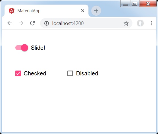
<mat-slide-toggle
   class = "tp-margin"
   [checked] = "checked"
   [disabled] = "disabled">
   Slide!
</mat-slide-toggle>
<section class = "tp-section">
   <mat-checkbox class = "tp-margin" [(ngModel)] = "checked">Checked</mat-checkbox>
   <mat-checkbox class = "tp-margin" [(ngModel)] = "disabled">Disabled</mat-checkbox>
</section>
変更されたCSSファイルの内容は次のとおりです app.component.css。
.tp-section {
   display: flex;
   align-content: center;
   align-items: center;
   height: 60px;
}
.tp-margin {
   margin: 30px;
}
以下は、変更されたtsファイルの内容です。 app.component.ts。
import { Component } from '@angular/core';
@Component({
   selector: 'app-root',
   templateUrl: './app.component.html',
   styleUrls: ['./app.component.css']
})
export class AppComponent {
   title = 'materialApp';
   disabled = false;
   checked = false;
}
結果
結果を確認します。
詳細
最初に、mat-checkboxを使用して2つのチェックボックスを作成し、ngModelと変数を使用してそれらをバインドしました。これらのプロパティは、スライドの切り替えを処理するために使用されます。
次に、スライドトグルを作成し、.tsファイルの変数にバインドされたさまざまな属性を紹介しました。
ザ・ <mat-menu>Angularディレクティブは、メニューを作成し、マテリアルデザインのスタイリングとアニメーション機能を備えたコントロールにアタッチするために使用されます。
この章では、AngularMaterialを使用してメニューコントロールを描画するために必要な構成を紹介します。
Angularアプリケーションを作成する
次の手順に従って、Angular 6で作成したAngularアプリケーションを更新します-プロジェクトセットアップの章-
| ステップ | 説明 |
|---|---|
| 1 | Angular 6-プロジェクトセットアップの章で説明されているように、materialAppという名前のプロジェクトを作成します。 |
| 2 | 変更app.module.ts、app.component.ts、app.component.cssをしてapp.component.htmlとして以下に説明します。残りのファイルは変更しないでください。 |
| 3 | アプリケーションをコンパイルして実行し、実装されたロジックの結果を確認します。 |
変更されたモジュール記述子の内容は次のとおりです app.module.ts。
import { BrowserModule } from '@angular/platform-browser';
import { NgModule } from '@angular/core';
import { AppComponent } from './app.component';
import {BrowserAnimationsModule} from '@angular/platform-browser/animations';
import {MatMenuModule, MatButtonModule} from '@angular/material'
import {FormsModule, ReactiveFormsModule} from '@angular/forms';
@NgModule({
   declarations: [
      AppComponent
   ],
   imports: [
      BrowserModule,
      BrowserAnimationsModule,
      MatMenuModule, MatButtonModule,
      FormsModule,
      ReactiveFormsModule
   ],
   providers: [],
   bootstrap: [AppComponent]
})
export class AppModule { }
以下は、変更されたHTMLホストファイルの内容です。 app.component.html。
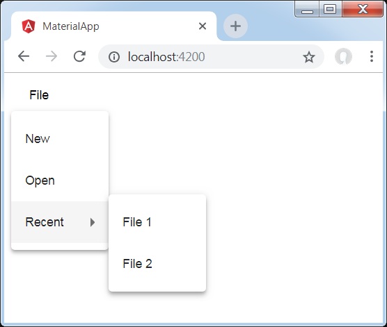
<button mat-button [matMenuTriggerFor] = "menu">File</button>
<mat-menu #menu = "matMenu">
   <button mat-menu-item>New</button>
   <button mat-menu-item>Open</button>
   <button mat-menu-item [matMenuTriggerFor] = "recent">Recent</button>
</mat-menu>
<mat-menu #recent = "matMenu">
   <button mat-menu-item>File 1</button>
   <button mat-menu-item>File 2</button>
</mat-menu>
結果
結果を確認します。
詳細
最初に、mat-menuを使用して2つのメニューを作成し、matMenuTriggerForを使用してそれらをボタンにバインドしました。
matMenuTriggerForには、メニューを添付するためのメニュー識別子が渡されます。
ザ・ <mat-sidenav>Angular Directiveは、マテリアルデザインのスタイリングとアニメーション機能を備えたサイドナビゲーションバーとメインコンテンツパネルを作成するために使用されます。
<mat-sidenav-container> -メインコンテナを表します。
<mat-sidenav-content> -コンテンツパネルを表します。
<mat-sidenav> -サイドパネルを表します。
この章では、AngularMaterialを使用してsidenavコントロールを描画するために必要な構成を紹介します。
Angularアプリケーションを作成する
次の手順に従って、Angular 6で作成したAngularアプリケーションを更新します-プロジェクトセットアップの章-
| ステップ | 説明 |
|---|---|
| 1 | Angular 6-プロジェクトセットアップの章で説明されているように、materialAppという名前のプロジェクトを作成します。 |
| 2 | 変更app.module.ts、app.component.ts、app.component.cssをしてapp.component.htmlとして以下に説明します。残りのファイルは変更しないでください。 |
| 3 | アプリケーションをコンパイルして実行し、実装されたロジックの結果を確認します。 |
変更されたモジュール記述子の内容は次のとおりです app.module.ts。
import { BrowserModule } from '@angular/platform-browser';
import { NgModule } from '@angular/core';
import { AppComponent } from './app.component';
import {BrowserAnimationsModule} from '@angular/platform-browser/animations';
import {MatSidenavModule} from '@angular/material'
import {FormsModule, ReactiveFormsModule} from '@angular/forms';
@NgModule({
   declarations: [
      AppComponent
   ],
   imports: [
      BrowserModule,
      BrowserAnimationsModule,
      MatSidenavModule,
      FormsModule,
      ReactiveFormsModule
   ],
   providers: [],
   bootstrap: [AppComponent]
})
export class AppModule { }
変更されたCSSファイルの内容は次のとおりです app.component.css。
.tp-container {
   position: absolute;
   top: 0;
   bottom: 0;
   left: 0;
   right: 0;
   background: #eee;
}
.tp-section {
   display: flex;
   align-content: center;
   align-items: center;
   height: 60px;
   width:100px;
}
以下は、変更されたHTMLホストファイルの内容です。 app.component.html。
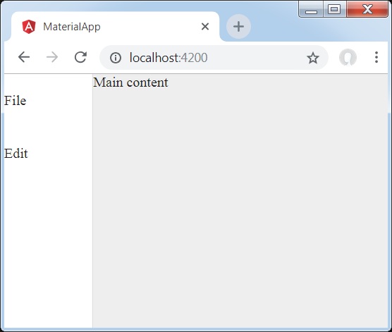
<mat-sidenav-container class = "tp-container">
   <mat-sidenav mode = "side" opened>
      <section class = "tp-section">
         <span>File</span>
      </section>
      <section class = "tp-section">
         <span>Edit</span>
      </section>
   </mat-sidenav>
   <mat-sidenav-content>Main content</mat-sidenav-content>
</mat-sidenav-container>
結果
結果を確認します。
詳細
最初に、ページ全体にまたがるメインコンテナを作成しました。
次に、mat-sidenavを使用してサイドナビゲーションを作成し、mat-sidenav-contentを使用してコンテンツパネルを作成します。
ザ・ <mat-toolbar>Angular Directiveは、タイトル、ヘッダー、または任意のアクションボタンを表示するツールバーを作成するために使用されます。
<mat-toolbar> -メインコンテナを表します。
<mat-toolbar-row> -新しい行を追加します。
この章では、AngularMaterialを使用してツールバーコントロールを描画するために必要な構成を紹介します。
Angularアプリケーションを作成する
次の手順に従って、Angular 6で作成したAngularアプリケーションを更新します-プロジェクトセットアップの章-
| ステップ | 説明 |
|---|---|
| 1 | Angular 6-プロジェクトセットアップの章で説明されているように、materialAppという名前のプロジェクトを作成します。 |
| 2 | 変更app.module.ts、app.component.ts、app.component.cssをしてapp.component.htmlとして以下に説明します。残りのファイルは変更しないでください。 |
| 3 | アプリケーションをコンパイルして実行し、実装されたロジックの結果を確認します。 |
変更されたモジュール記述子の内容は次のとおりです app.module.ts。
import { BrowserModule } from '@angular/platform-browser';
import { NgModule } from '@angular/core';
import { AppComponent } from './app.component';
import {BrowserAnimationsModule} from '@angular/platform-browser/animations';
import {MatToolbarModule} from '@angular/material'
import {FormsModule, ReactiveFormsModule} from '@angular/forms';
@NgModule({
   declarations: [
      AppComponent
   ],
   imports: [
      BrowserModule,
      BrowserAnimationsModule,
      MatToolbarModule,
      FormsModule,
      ReactiveFormsModule
   ],
   providers: [],
   bootstrap: [AppComponent]
})
export class AppModule { }
変更されたCSSファイルの内容は次のとおりです app.component.css。
.filler {
   flex: 1 1 auto;
}
.gap {
   margin-right: 10px;
}
以下は、変更されたHTMLホストファイルの内容です。 app.component.html。
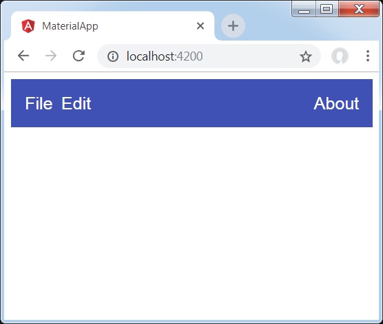
<mat-toolbar color = "primary">
   <span class = "gap">File</span>
   <span>Edit</span>
   <span class = "filler"></span>
   <span>About</span>
</mat-toolbar>
結果
結果を確認します。
詳細
- 最初に、ページ全体にまたがるツールバーを作成しました。
- 次に、ラベルが追加されます。
ザ・ <mat-card>Angular Directiveは、マテリアルデザインのスタイリングとアニメーション機能を備えたカードを作成するために使用されます。一般的なカードセクションのプリセットスタイルを提供します。
<mat-card-title> −タイトルのセクションを表します。
<mat-card-subtitle> −字幕のセクションを表します。
<mat-card-content> −コンテンツのセクションを表します。
<mat-card-actions> −アクションのセクションを表します。
<mat-card-footer> −フッターのセクションを表します。
この章では、AngularMaterialを使用してカードコントロールを描画するために必要な構成を紹介します。
Angularアプリケーションを作成する
次の手順に従って、Angular 6で作成したAngularアプリケーションを更新します-プロジェクトセットアップの章-
| ステップ | 説明 |
|---|---|
| 1 | Angular 6-プロジェクトセットアップの章で説明されているように、materialAppという名前のプロジェクトを作成します。 |
| 2 | 変更app.module.ts、app.component.ts、app.component.cssをしてapp.component.htmlとして以下に説明します。残りのファイルは変更しないでください。 |
| 3 | アプリケーションをコンパイルして実行し、実装されたロジックの結果を確認します。 |
変更されたモジュール記述子の内容は次のとおりです app.module.ts。
import { BrowserModule } from '@angular/platform-browser';
import { NgModule } from '@angular/core';
import { AppComponent } from './app.component';
import {BrowserAnimationsModule} from '@angular/platform-browser/animations';
import {MatCardModule, MatButtonModule} from '@angular/material'
import {FormsModule, ReactiveFormsModule} from '@angular/forms';
@NgModule({
   declarations: [
      AppComponent
   ],
   imports: [
      BrowserModule,
      BrowserAnimationsModule,
      MatCardModule, MatButtonModule,
      FormsModule,
      ReactiveFormsModule
   ],
   providers: [],
   bootstrap: [AppComponent]
})
export class AppModule { }
変更されたCSSファイルの内容は次のとおりです app.component.css。
.tp-card {
   max-width: 400px;
}
.tp-header-image {
   background-image: url('https://www.tutorialspoint.com/materialize/src/html5-mini-logo.jpg');
   background-size: cover;
}
以下は、変更されたHTMLホストファイルの内容です。 app.component.html。
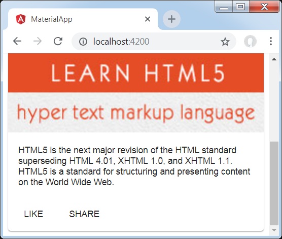
<mat-card class = "tp-card">
   <mat-card-header>
      <div mat-card-avatar class = "tp-header-image"></div>
      <mat-card-title>HTML5</mat-card-title>
      <mat-card-subtitle>HTML Basics</mat-card-subtitle>
   </mat-card-header>
   <img mat-card-image src = "https://www.tutorialspoint.com/materialize/src/html5-mini-logo.jpg" alt = "Learn HTML5">
   <mat-card-content>
      <p>
         HTML5 is the next major revision of the HTML standard superseding
         HTML 4.01, XHTML 1.0, and XHTML 1.1. HTML5 is a standard for
         structuring and presenting content on the World Wide Web.
      </p>
   </mat-card-content>
   <mat-card-actions>
      <button mat-button>LIKE</button>
      <button mat-button>SHARE</button>
   </mat-card-actions>
</mat-card>
結果
結果を確認します。
詳細
- ここでは、マットカードを使用してカードを作成しました。
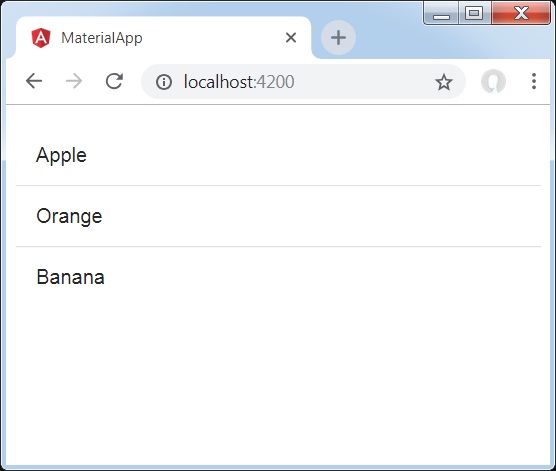
ザ・ <mat-divider>Angular Directiveは、マテリアルデザインのスタイリングとアニメーション機能を備えた仕切りを作成するために使用されます。2つのアイテムの間にセパレータを提供します。
この章では、AngularMaterialを使用してディバイダーコントロールを描画するために必要な構成を紹介します。
Angularアプリケーションを作成する
次の手順に従って、Angular 6で作成したAngularアプリケーションを更新します-プロジェクトセットアップの章-
| ステップ | 説明 |
|---|---|
| 1 | Angular 6-プロジェクトセットアップの章で説明されているように、materialAppという名前のプロジェクトを作成します。 |
| 2 | 変更app.module.ts、app.component.ts、app.component.cssをしてapp.component.htmlとして以下に説明します。残りのファイルは変更しないでください。 |
| 3 | アプリケーションをコンパイルして実行し、実装されたロジックの結果を確認します。 |
変更されたモジュール記述子の内容は次のとおりです app.module.ts。
import { BrowserModule } from '@angular/platform-browser';
import { NgModule } from '@angular/core';
import { AppComponent } from './app.component';
import {BrowserAnimationsModule} from '@angular/platform-browser/animations';
import {MatDividerModule, MatListModule} from '@angular/material'
import {FormsModule, ReactiveFormsModule} from '@angular/forms';
@NgModule({
   declarations: [
      AppComponent
   ],
   imports: [
      BrowserModule,
      BrowserAnimationsModule,
      MatDividerModule, MatListModule,
      FormsModule,
      ReactiveFormsModule
   ],
   providers: [],
   bootstrap: [AppComponent]
})
export class AppModule { }
以下は、変更されたHTMLホストファイルの内容です。 app.component.html。
<mat-list>
   <mat-list-item>Apple</mat-list-item>
   <mat-divider></mat-divider>
   <mat-list-item>Orange</mat-list-item>
   <mat-divider></mat-divider>
   <mat-list-item>Banana</mat-list-item>
</mat-list>
結果
結果を確認します。
詳細
- まず、mat-listを使用してリストを作成しました。
- 次に、mat-dividerを使用してリストアイテム間に仕切りを追加しました。
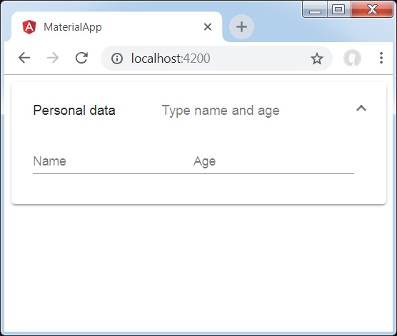
ザ・ <mat-expansion-panel>、Angular Directiveは、拡張可能な詳細v / sサマリービューを作成するために使用されます。
<mat-expansion-panel-header>−ヘッダーセクションを表します。パネルの概要が含まれ、パネルを展開または折りたたむためのコントロールとして機能します。
<mat-panel-title> −パネルのタイトルを表します。
<mat-panel-description> −パネルの要約を表します。
<mat-action-row> −下部のアクションパネルを表します。
この章では、AngularMaterialを使用して拡張コントロールを描画するために必要な構成を紹介します。
Angularアプリケーションを作成する
次の手順に従って、Angular 6で作成したAngularアプリケーションを更新します-プロジェクトセットアップの章-
| ステップ | 説明 |
|---|---|
| 1 | Angular 6-プロジェクトセットアップの章で説明されているように、materialAppという名前のプロジェクトを作成します。 |
| 2 | 変更app.module.ts、app.component.ts、app.component.cssをしてapp.component.htmlとして以下に説明します。残りのファイルは変更しないでください。 |
| 3 | アプリケーションをコンパイルして実行し、実装されたロジックの結果を確認します。 |
変更されたモジュール記述子の内容は次のとおりです app.module.ts。
import { BrowserModule } from '@angular/platform-browser';
import { NgModule } from '@angular/core';
import { AppComponent } from './app.component';
import {BrowserAnimationsModule} from '@angular/platform-browser/animations';
import {MatExpansionModule, MatInputModule} from '@angular/material'
import {FormsModule, ReactiveFormsModule} from '@angular/forms';
@NgModule({
   declarations: [
      AppComponent
   ],
   imports: [
      BrowserModule,
      BrowserAnimationsModule,
      MatExpansionModule, MatInputModule,
      FormsModule,
      ReactiveFormsModule
   ],
   providers: [],
   bootstrap: [AppComponent]
})
export class AppModule { }
以下は、変更されたHTMLホストファイルの内容です。 app.component.html。
<mat-expansion-panel>
   <mat-expansion-panel-header>
      <mat-panel-title>
         Personal data
      </mat-panel-title>
      <mat-panel-description>
         Type name and age
      </mat-panel-description>
   </mat-expansion-panel-header>
   <mat-form-field>
      <input matInput placeholder="Name">
   </mat-form-field>
   <mat-form-field>
      <input matInput placeholder="Age">
   </mat-form-field>
</mat-expansion-panel>
結果
結果を確認します。
詳細
- まず、mat-expansion-panelを使用して拡張パネルを作成しました。
- 次に、タイトル、サブタイトル、コンテンツを追加しました。
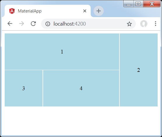
ザ・ <mat-grid-list>角度ディレクティブは、セルをグリッドベースのレイアウトに配置する2次元ビューを作成するために使用されます。
この章では、AngularMaterialを使用してグリッドリストコントロールを描画するために必要な構成を紹介します。
Angularアプリケーションを作成する
次の手順に従って、Angular 6で作成したAngularアプリケーションを更新します-プロジェクトセットアップの章-
| ステップ | 説明 |
|---|---|
| 1 | Angular 6-プロジェクトセットアップの章で説明されているように、materialAppという名前のプロジェクトを作成します。 |
| 2 | 変更app.module.ts、app.component.ts、app.component.cssをしてapp.component.htmlとして以下に説明します。残りのファイルは変更しないでください。 |
| 3 | アプリケーションをコンパイルして実行し、実装されたロジックの結果を確認します。 |
変更されたモジュール記述子の内容は次のとおりです app.module.ts。
import { BrowserModule } from '@angular/platform-browser';
import { NgModule } from '@angular/core';
import { AppComponent } from './app.component';
import {BrowserAnimationsModule} from '@angular/platform-browser/animations';
import {MatGridListModule} from '@angular/material'
import {FormsModule, ReactiveFormsModule} from '@angular/forms';
@NgModule({
   declarations: [
      AppComponent
   ],
   imports: [
      BrowserModule,
      BrowserAnimationsModule,
      MatGridListModule,
      FormsModule,
      ReactiveFormsModule
   ],
   providers: [],
   bootstrap: [AppComponent]
})
export class AppModule { }
変更されたCSSファイルの内容は次のとおりです app.component.css。
mat-grid-tile {
   background: lightblue;
}
以下は、変更されたHTMLホストファイルの内容です。 app.component.html。
<mat-grid-list cols = "4" rowHeight = "100px">
   <mat-grid-tile
   [colspan] = "3"
   [rowspan] = "1">1
   </mat-grid-tile>
   <mat-grid-tile
   [colspan] = "1"
   [rowspan] = "2">2
   </mat-grid-tile>
   <mat-grid-tile
   [colspan] = "1"
   [rowspan] = "1">3
   </mat-grid-tile>
   <mat-grid-tile
   [colspan] = "2"
   [rowspan] = "1">4
   </mat-grid-tile>
</mat-grid-list>
結果
結果を確認します。
詳細
- まず、mat-grid-listを使用してグリッドリストを作成しました。
- 次に、mat-grid-tileを使用してコンテンツを追加しました。
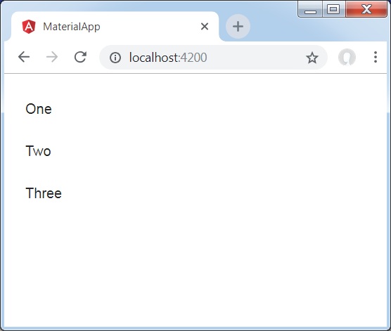
ザ・ <mat-list>Angularディレクティブは、一連のアイテムを運び、フォーマットするためのコンテナーを作成するために使用されます。
この章では、AngularMaterialを使用してリストコントロールを描画するために必要な構成を紹介します。
Angularアプリケーションを作成する
次の手順に従って、Angular 6で作成したAngularアプリケーションを更新します-プロジェクトセットアップの章-
| ステップ | 説明 |
|---|---|
| 1 | Angular 6-プロジェクトセットアップの章で説明されているように、materialAppという名前のプロジェクトを作成します。 |
| 2 | 変更app.module.ts、app.component.ts、app.component.cssをしてapp.component.htmlとして以下に説明します。残りのファイルは変更しないでください。 |
| 3 | アプリケーションをコンパイルして実行し、実装されたロジックの結果を確認します。 |
変更されたモジュール記述子の内容は次のとおりです app.module.ts。
import { BrowserModule } from '@angular/platform-browser';
import { NgModule } from '@angular/core';
import { AppComponent } from './app.component';
import {BrowserAnimationsModule} from '@angular/platform-browser/animations';
import {MatListModule} from '@angular/material'
import {FormsModule, ReactiveFormsModule} from '@angular/forms';
@NgModule({
   declarations: [
      AppComponent
   ],
   imports: [
      BrowserModule,
      BrowserAnimationsModule,
      MatListModule,
      FormsModule,
      ReactiveFormsModule
   ],
   providers: [],
   bootstrap: [AppComponent]
})
export class AppModule { }
以下は、変更されたHTMLホストファイルの内容です。 app.component.html。
<mat-list role = "list">
   <mat-list-item role = "listitem">One</mat-list-item>
   <mat-list-item role = "listitem">Two</mat-list-item>
   <mat-list-item role = "listitem">Three</mat-list-item>
</mat-list>
結果
結果を確認します。
詳細
- まず、mat-listを使用してリストを作成しました。
- 次に、mat-list-itemを使用してコンテンツを追加しました。
ザ・ <mat-stepper>Angularディレクティブは、ワークフローステップのようなウィザードを作成するために使用されます。
この章では、AngularMaterialを使用してステッパーコントロールを描画するために必要な構成を紹介します。
Angularアプリケーションを作成する
次の手順に従って、Angular 6で作成したAngularアプリケーションを更新します-プロジェクトセットアップの章-
| ステップ | 説明 |
|---|---|
| 1 | Angular 6-プロジェクトセットアップの章で説明されているように、materialAppという名前のプロジェクトを作成します。 |
| 2 | 変更app.module.ts、app.component.ts、app.component.cssをしてapp.component.htmlとして以下に説明します。残りのファイルは変更しないでください。 |
| 3 | アプリケーションをコンパイルして実行し、実装されたロジックの結果を確認します。 |
変更されたモジュール記述子の内容は次のとおりです app.module.ts。
import { BrowserModule } from '@angular/platform-browser';
import { NgModule } from '@angular/core';
import { AppComponent } from './app.component';
import {BrowserAnimationsModule} from '@angular/platform-browser/animations';
import {MatStepperModule, MatInputModule, MatButtonModule} from '@angular/material'
import {FormsModule, ReactiveFormsModule} from '@angular/forms';
@NgModule({
   declarations: [
      AppComponent
   ],
   imports: [
      BrowserModule,
      BrowserAnimationsModule,
      MatStepperModule, MatInputModule, MatButtonModule,
      FormsModule,
      ReactiveFormsModule
   ],
   providers: [],
   bootstrap: [AppComponent]
})
export class AppModule { }
以下は、変更されたHTMLホストファイルの内容です。 app.component.html。
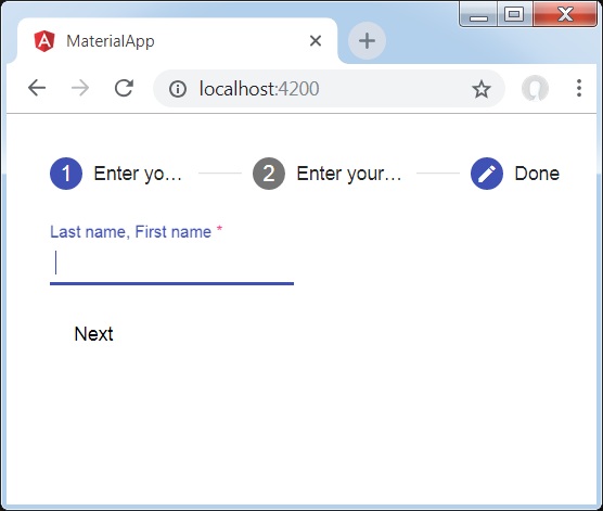
<mat-horizontal-stepper [linear] = "isLinear" #stepper>
   <mat-step [stepControl] = "firstFormGroup">
      <form [formGroup] = "firstFormGroup">
         <ng-template matStepLabel>Enter your name</ng-template>
         <mat-form-field>
            <input matInput placeholder = "Last name, First name" formControlName = "firstCtrl" required>
         </mat-form-field>
         <div>
           <button mat-button matStepperNext>Next</button>
         </div>
      </form>
   </mat-step>
   <mat-step [stepControl] = "secondFormGroup">
      <form [formGroup] = "secondFormGroup">
         <ng-template matStepLabel>Enter your address</ng-template>
         <mat-form-field>
           <input matInput placeholder = "Address" formControlName = "secondCtrl" required>
         </mat-form-field>
         <div>
           <button mat-button matStepperPrevious>Back</button>
           <button mat-button matStepperNext>Next</button>
         </div>
      </form>
   </mat-step>
   <mat-step>
      <ng-template matStepLabel>Done</ng-template>
         Details taken.
      <div>
         <button mat-button matStepperPrevious>Back</button>
         <button mat-button (click) = "stepper.reset()">Reset</button>
      </div>
   </mat-step>
</mat-horizontal-stepper>
以下は、変更されたtsファイルの内容です。 app.component.ts。
import { Component } from '@angular/core';
import { FormControl } from "@angular/forms";
import { FormGroup } from "@angular/forms";
import { FormBuilder } from "@angular/forms";
import { Validators } from "@angular/forms";
export interface Food {
   value: string;
   display: string;
}
@Component({
   selector: 'app-root',
   templateUrl: './app.component.html',
   styleUrls: ['./app.component.css']
})
export class AppComponent {
   title = 'materialApp';
   firstFormGroup: FormGroup;
   secondFormGroup: FormGroup;
   constructor(private _formBuilder: FormBuilder) {}
   ngOnInit() {
      this.firstFormGroup = this._formBuilder.group({
         firstCtrl: ['', Validators.required]
      });
      this.secondFormGroup = this._formBuilder.group({
         secondCtrl: ['', Validators.required]
      });
   }
}
結果
結果を確認します。
詳細
- まず、マットステッパーを使用してステッパーを作成しました。
- 次に、mat-stepを使用してコンテンツを追加しました。
ザ・ <mat-tab-group>Angular Directiveは、タブ付きレイアウトを作成するために使用されます。
この章では、AngularMaterialを使用してタブコントロールを描画するために必要な構成を紹介します。
Angularアプリケーションを作成する
次の手順に従って、Angular 6で作成したAngularアプリケーションを更新します-プロジェクトセットアップの章-
| ステップ | 説明 |
|---|---|
| 1 | Angular 6-プロジェクトセットアップの章で説明されているように、materialAppという名前のプロジェクトを作成します。 |
| 2 | 変更app.module.ts、app.component.ts、app.component.cssをしてapp.component.htmlとして以下に説明します。残りのファイルは変更しないでください。 |
| 3 | アプリケーションをコンパイルして実行し、実装されたロジックの結果を確認します。 |
変更されたモジュール記述子の内容は次のとおりです app.module.ts。
import { BrowserModule } from '@angular/platform-browser';
import { NgModule } from '@angular/core';
import { AppComponent } from './app.component';
import {BrowserAnimationsModule} from '@angular/platform-browser/animations';
import {MatTabsModule} from '@angular/material'
import {FormsModule, ReactiveFormsModule} from '@angular/forms';
@NgModule({
   declarations: [
      AppComponent
   ],
   imports: [
      BrowserModule,
      BrowserAnimationsModule,
      MatTabsModule,
      FormsModule,
      ReactiveFormsModule
   ],
   providers: [],
   bootstrap: [AppComponent]
})
export class AppModule { }
以下は、変更されたHTMLホストファイルの内容です。 app.component.html。
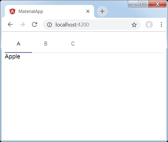
<mat-tab-group>
   <mat-tab label = "A"> Apple </mat-tab>
   <mat-tab label = "B"> Banana </mat-tab>
   <mat-tab label = "C"> Carrot </mat-tab>
</mat-tab-group>
結果
結果を確認します。
詳細
- 最初に、mat-tab-groupを使用してタブを作成しました。
- 次に、mat-tabを使用してコンテンツを追加しました。各mat-tabは異なるタブを表します。
ザ・ <mat-tree>Angular Directiveは、階層データを表示するためのマテリアルスタイルのツリーを作成するために使用されます。
この章では、AngularMaterialを使用してツリーを描画するために必要な構成を紹介します。
変更されたモジュール記述子の内容は次のとおりです app.module.ts。
import { BrowserModule } from '@angular/platform-browser';
import { NgModule } from '@angular/core';
import { AppComponent } from './app.component';
import {BrowserAnimationsModule} from '@angular/platform-browser/animations';
import {MatTreeModule, MatIconModule, MatButtonModule} from '@angular/material'
import {FormsModule, ReactiveFormsModule} from '@angular/forms';
@NgModule({
   declarations: [
      AppComponent
   ],
   imports: [
      BrowserModule,
      BrowserAnimationsModule,
      MatTreeModule, MatIconModule, MatButtonModule,
      FormsModule,
      ReactiveFormsModule
   ],
   providers: [],
   bootstrap: [AppComponent]
})
export class AppModule { }
以下は、変更されたHTMLホストファイルの内容です。 app.component.html。
<mat-tree [dataSource] = "dataSource" [treeControl] = "treeControl">
   <mat-tree-node *matTreeNodeDef = "let node" matTreeNodeToggle matTreeNodePadding>
      <button mat-icon-button disabled></button>
      {{node.filename}} : {{node.type}}
   </mat-tree-node>
   <mat-tree-node *matTreeNodeDef = "let node;when: hasChild" matTreeNodePadding>
      <button mat-icon-button matTreeNodeToggle [attr.aria-label] = "'toggle ' + node.filename">
         <mat-icon class = "mat-icon-rtl-mirror">
            {{treeControl.isExpanded(node) ? 'expand_more' : 'chevron_right'}}
         </mat-icon>
      </button>
      {{node.filename}}
   </mat-tree-node>
</mat-tree>
以下は、変更されたtsファイルの内容です。 app.component.ts。
import {FlatTreeControl} from '@angular/cdk/tree';
import {Component, Injectable} from '@angular/core';
import {MatTreeFlatDataSource, MatTreeFlattener} from '@angular/material/tree';
import {BehaviorSubject, Observable, of as observableOf} from 'rxjs';
export class FileNode {
   children: FileNode[];
   filename: string;
   type: any;
}
export class FileFlatNode {
   constructor(
      public expandable: boolean, public filename: string, public level: number, public type: any) {}
}
const TREE_DATA = JSON.stringify({
   Documents: {
      angular: {
         src: {
            compiler: 'ts',
            core: 'ts'
         }
      },
      material2: {
         src: {
            button: 'ts',
            checkbox: 'ts',
            input: 'ts'
         }
      }
   }
});
@Injectable()
export class FileDatabase {
   dataChange = new BehaviorSubject<FileNode[]>([]);
   get data(): FileNode[] { return this.dataChange.value; }
   constructor() {
      this.initialize();
   }
   initialize() {
      const dataObject = JSON.parse(TREE_DATA);
      const data = this.buildFileTree(dataObject, 0);
      this.dataChange.next(data);
   }
   buildFileTree(obj: {[key: string]: any}, level: number): FileNode[] {
      return Object.keys(obj).reduce<FileNode[]>((accumulator, key) => {
         const value = obj[key];
         const node = new FileNode();
         node.filename = key;
         if (value != null) {
            if (typeof value === 'object') {
               node.children = this.buildFileTree(value, level + 1);
            } else {
               node.type = value;
            }
         }
         return accumulator.concat(node);
      }, []);
   }
}
@Component({
   selector: 'app-root',
   templateUrl: 'app.component.html',
   styleUrls: ['app.component.css'],
   providers: [FileDatabase]
})
export class AppComponent {
   treeControl: FlatTreeControl<FileFlatNode>;
   treeFlattener: MatTreeFlattener<FileNode, FileFlatNode>;
   dataSource: MatTreeFlatDataSource<FileNode, FileFlatNode>;
   constructor(database: FileDatabase) {
      this.treeFlattener = new MatTreeFlattener(this.transformer, this._getLevel,
      this._isExpandable, this._getChildren);
      this.treeControl = new FlatTreeControl<FileFlatNode>(this._getLevel, this._isExpandable);
      this.dataSource = new MatTreeFlatDataSource(this.treeControl, this.treeFlattener);
      database.dataChange.subscribe(data => this.dataSource.data = data);
   }
   transformer = (node: FileNode, level: number) => {
      return new FileFlatNode(!!node.children, node.filename, level, node.type);
   }
   private _getLevel = (node: FileFlatNode) => node.level;
   private _isExpandable = (node: FileFlatNode) => node.expandable;
   private _getChildren = (node: FileNode): Observable<FileNode[]> => observableOf(node.children);
   hasChild = (_: number, _nodeData: FileFlatNode) => _nodeData.expandable;
}
結果
結果を確認します。

詳細
- 最初に、mat-treeとmat-tree-nodeを使用してツリーを作成しました。
- 次に、tsファイルにデータソースを作成し、マットツリーでバインドしました。
ザ・ <mat-button>Angular Directiveは、マテリアルのスタイリングとアニメーションを備えたボタンを作成するために使用されます。
この章では、AngularMaterialを使用してボタンコントロールを描画するために必要な構成を紹介します。
Angularアプリケーションを作成する
次の手順に従って、Angular 6で作成したAngularアプリケーションを更新します-プロジェクトセットアップの章-
| ステップ | 説明 |
|---|---|
| 1 | Angular 6-プロジェクトセットアップの章で説明されているように、materialAppという名前のプロジェクトを作成します。 |
| 2 | 変更app.module.ts、app.component.ts、app.component.cssをしてapp.component.htmlとして以下に説明します。残りのファイルは変更しないでください。 |
| 3 | アプリケーションをコンパイルして実行し、実装されたロジックの結果を確認します。 |
変更されたモジュール記述子の内容は次のとおりです app.module.ts。
import { BrowserModule } from '@angular/platform-browser';
import { NgModule } from '@angular/core';
import { AppComponent } from './app.component';
import {BrowserAnimationsModule} from '@angular/platform-browser/animations';
import {MatButtonModule,MatIconModule} from '@angular/material'
import {FormsModule, ReactiveFormsModule} from '@angular/forms';
@NgModule({
   declarations: [
      AppComponent
   ],
   imports: [
      BrowserModule,
      BrowserAnimationsModule,
      MatButtonModule,MatIconModule,
      FormsModule,
      ReactiveFormsModule
   ],
   providers: [],
   bootstrap: [AppComponent]
})
export class AppModule { }
変更されたCSSファイルの内容は次のとおりです app.component.css。
.tp-button-row button,
.tp-button-row a {
   margin-right: 8px;
}
以下は、変更されたHTMLホストファイルの内容です。 app.component.html。
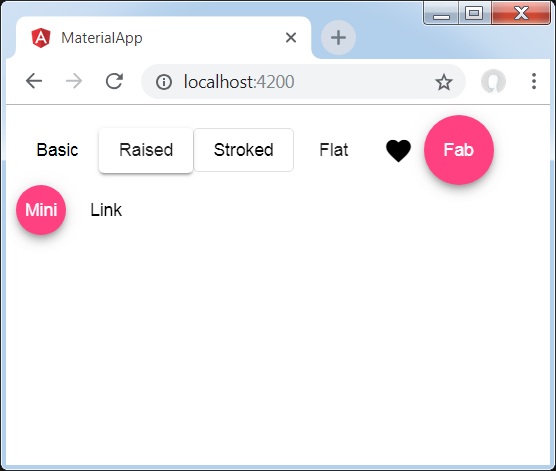
<div class = "example-button-row">
   <button mat-button>Basic</button>
   <button mat-raised-button>Raised</button>
   <button mat-stroked-button>Stroked</button>
   <button mat-flat-button>Flat</button>
   <button mat-icon-button>
      <mat-icon aria-label="Heart">favorite</mat-icon>
   </button>
   <button mat-fab>Fab</button>
   <button mat-mini-fab>Mini</button>
   <a mat-button routerLink = ".">Link</a>
</div>
結果
結果を確認します。
詳細
- ここでは、マットボタンのさまざまなバリエーションを使用してボタンを作成しました。
ザ・ <mat-button-toggle>Angular Directiveは、マテリアルのスタイリングとアニメーションを使用してトグルボタンまたはオン/オフボタンを作成するために使用されます。mat-button-toggleボタンは、ラジオボタンまたはチェックボックスとして動作するように構成できます。通常、それらはの一部です<mat-button-toggle-group>。
この章では、AngularMaterialを使用してボタントグルコントロールを描画するために必要な構成を紹介します。
Angularアプリケーションを作成する
次の手順に従って、Angular 6で作成したAngularアプリケーションを更新します-プロジェクトセットアップの章-
| ステップ | 説明 |
|---|---|
| 1 | Angular 6-プロジェクトセットアップの章で説明されているように、materialAppという名前のプロジェクトを作成します。 |
| 2 | 変更app.module.ts、app.component.ts、app.component.cssをしてapp.component.htmlとして以下に説明します。残りのファイルは変更しないでください。 |
| 3 | アプリケーションをコンパイルして実行し、実装されたロジックの結果を確認します。 |
変更されたモジュール記述子の内容は次のとおりです app.module.ts。
import { BrowserModule } from '@angular/platform-browser';
import { NgModule } from '@angular/core';
import { AppComponent } from './app.component';
import {BrowserAnimationsModule} from '@angular/platform-browser/animations';
import {MatButtonToggleModule, MatIconModule} from '@angular/material'
import {FormsModule, ReactiveFormsModule} from '@angular/forms';
@NgModule({
   declarations: [
      AppComponent
   ],
   imports: [
      BrowserModule,
      BrowserAnimationsModule,
      MatButtonToggleModule, MatIconModule,
      FormsModule,
      ReactiveFormsModule
   ],
   providers: [],
   bootstrap: [AppComponent]
})
export class AppModule { }
変更されたCSSファイルの内容は次のとおりです app.component.css。
.tp-selected-value {
   margin: 15px 0;
}
以下は、変更されたHTMLホストファイルの内容です。 app.component.html。
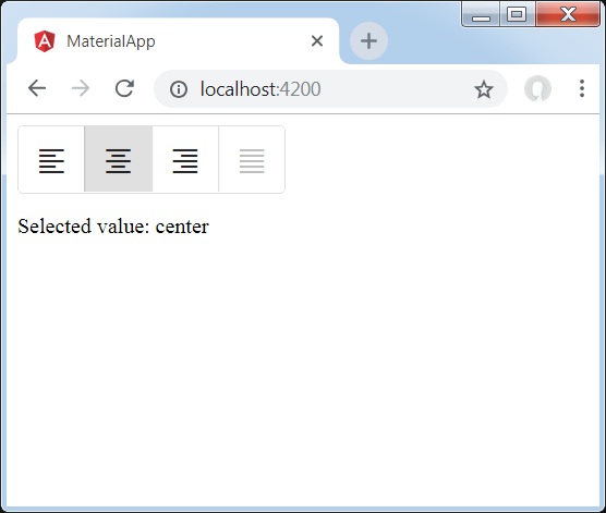
<mat-button-toggle-group #group = "matButtonToggleGroup">
   <mat-button-toggle value = "left">
      <mat-icon>format_align_left</mat-icon>
   </mat-button-toggle>
   <mat-button-toggle value = "center">
      <mat-icon>format_align_center</mat-icon>
   </mat-button-toggle>
   <mat-button-toggle value = "right">
      <mat-icon>format_align_right</mat-icon>
   </mat-button-toggle>
   <mat-button-toggle value = "justify" disabled>
      <mat-icon>format_align_justify</mat-icon>
   </mat-button-toggle>
</mat-button-toggle-group>
<div class = "tp-selected-value">Selected value: {{group.value}}</div>
結果
結果を確認します。
詳細
- 最初に、mat-button-toggle-groupを使用してトグルボタングループを作成しました。
- 次に、mat-button-toggleを使用してグループにトグルボタンを追加しました。
ザ・ <mat-badge>Angularディレクティブは、UI要素の小さなステータス記述子であるバッジを作成するために使用されます。バッジには通常、別のUI要素の近くに表示される数字またはその他の短い文字セットが含まれています。
この章では、AngularMaterialを使用してバッジコントロールを描画するために必要な構成を紹介します。
Angularアプリケーションを作成する
次の手順に従って、Angular 6で作成したAngularアプリケーションを更新します-プロジェクトセットアップの章-
| ステップ | 説明 |
|---|---|
| 1 | Angular 6-プロジェクトセットアップの章で説明されているように、materialAppという名前のプロジェクトを作成します。 |
| 2 | 変更app.module.ts、app.component.ts、app.component.cssをしてapp.component.htmlとして以下に説明します。残りのファイルは変更しないでください。 |
| 3 | アプリケーションをコンパイルして実行し、実装されたロジックの結果を確認します。 |
変更されたモジュール記述子の内容は次のとおりです app.module.ts。
import { BrowserModule } from '@angular/platform-browser';
import { NgModule } from '@angular/core';
import { AppComponent } from './app.component';
import {BrowserAnimationsModule} from '@angular/platform-browser/animations';
import {MatBadgeModule, MatButtonModule, MatIconModule} from '@angular/material'
import {FormsModule, ReactiveFormsModule} from '@angular/forms';
@NgModule({
   declarations: [
      AppComponent
   ],
   imports: [
      BrowserModule,
      BrowserAnimationsModule,
      MatBadgeModule, MatButtonModule, MatIconModule,
      FormsModule,
      ReactiveFormsModule
   ],
   providers: [],
   bootstrap: [AppComponent]
})
export class AppModule { }
以下は、変更されたHTMLホストファイルの内容です。 app.component.html。
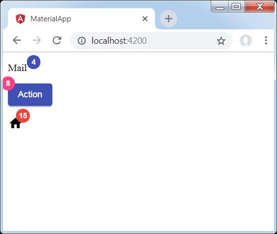
<p><span matBadge = "4" matBadgeOverlap = "false">Mail</span></p>
<p>
   <button mat-raised-button color = "primary"
      matBadge = "8" matBadgePosition = "before" matBadgeColor = "accent">
      Action
   </button>
</p>
<p><mat-icon matBadge = "15" matBadgeColor = "warn">home</mat-icon></p>
結果
結果を確認します。
詳細
- 最初に、スパン、ボタン、アイコンを作成しました。
- 次に、mat-badge属性を使用して各要素にバッジを追加しました。
ザ・ <mat-chip-list>Angularディレクティブは、チップとしての値のリストに使用されます。
この章では、AngularMaterialを使用してチップコントロールを描画するために必要な構成を紹介します。
Angularアプリケーションを作成する
次の手順に従って、Angular 6で作成したAngularアプリケーションを更新します-プロジェクトセットアップの章-
| ステップ | 説明 |
|---|---|
| 1 | Angular 6-プロジェクトセットアップの章で説明されているように、materialAppという名前のプロジェクトを作成します。 |
| 2 | 変更app.module.ts、app.component.ts、app.component.cssをしてapp.component.htmlとして以下に説明します。残りのファイルは変更しないでください。 |
| 3 | アプリケーションをコンパイルして実行し、実装されたロジックの結果を確認します。 |
変更されたモジュール記述子の内容は次のとおりです app.module.ts。
import { BrowserModule } from '@angular/platform-browser';
import { NgModule } from '@angular/core';
import { AppComponent } from './app.component';
import {BrowserAnimationsModule} from '@angular/platform-browser/animations';
import {MatChipsModule} from '@angular/material'
import {FormsModule, ReactiveFormsModule} from '@angular/forms';
@NgModule({
   declarations: [
      AppComponent
   ],
   imports: [
      BrowserModule,
      BrowserAnimationsModule,
      MatChipsModule,
      FormsModule,
      ReactiveFormsModule
   ],
   providers: [],
   bootstrap: [AppComponent]
})
export class AppModule { }
以下は、変更されたHTMLホストファイルの内容です。 app.component.html。
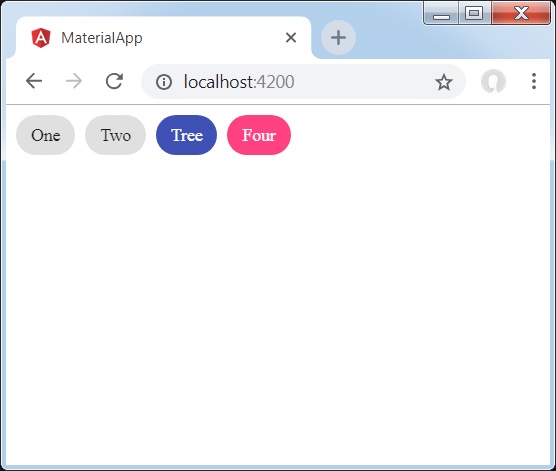
<mat-chip-list>
   <mat-chip>One</mat-chip>
   <mat-chip>Two</mat-chip>
   <mat-chip color = "primary" selected>Tree</mat-chip>
   <mat-chip color = "accent" selected>Four</mat-chip>
</mat-chip-list>
結果
結果を確認します。
詳細
- まず、mat-chip-listを使用してチップリストを作成しました。
- 次に、マットチップを使用して各チップリストにチップを追加しました。
ザ・ <mat-icon>Angular Directiveは、マテリアルスタイルのvector / svgベースのアイコンを追加するために使用されます。
この章では、AngularMaterialを使用してアイコンコントロールを描画するために必要な構成を紹介します。
Angularアプリケーションを作成する
次の手順に従って、Angular 6で作成したAngularアプリケーションを更新します-プロジェクトセットアップの章-
| ステップ | 説明 |
|---|---|
| 1 | Angular 6-プロジェクトセットアップの章で説明されているように、materialAppという名前のプロジェクトを作成します。 |
| 2 | 変更app.module.ts、app.component.ts、app.component.cssをしてapp.component.htmlとして以下に説明します。残りのファイルは変更しないでください。 |
| 3 | アプリケーションをコンパイルして実行し、実装されたロジックの結果を確認します。 |
変更されたモジュール記述子の内容は次のとおりです app.module.ts。
import { BrowserModule } from '@angular/platform-browser';
import { NgModule } from '@angular/core';
import { AppComponent } from './app.component';
import {BrowserAnimationsModule} from '@angular/platform-browser/animations';
import {MatIconModule} from '@angular/material'
import {FormsModule, ReactiveFormsModule} from '@angular/forms';
@NgModule({
   declarations: [
      AppComponent
   ],
   imports: [
      BrowserModule,
      BrowserAnimationsModule,
      MatIconModule,
      FormsModule,
      ReactiveFormsModule
   ],
   providers: [],
   bootstrap: [AppComponent]
})
export class AppModule { }
以下は、変更されたHTMLホストファイルの内容です。 app.component.html。
<mat-icon>home</mat-icon>結果
結果を確認します。
詳細
- ここでは、mat-iconを使用してホームアイコンを作成しました。Googleのマテリアルアイコンを使用しています。
ザ・ <mat-progress-spinner>Angular Directiveは、マテリアルスタイリングを備えたプログレススピナーを表示するために使用されます。
この章では、AngularMaterialを使用して決定論的および非決定論的な進行スピナーを描画するために必要な構成を紹介します。
Angularアプリケーションを作成する
次の手順に従って、Angular 6で作成したAngularアプリケーションを更新します-プロジェクトセットアップの章-
| ステップ | 説明 |
|---|---|
| 1 | Angular 6-プロジェクトセットアップの章で説明されているように、materialAppという名前のプロジェクトを作成します。 |
| 2 | 変更app.module.ts、app.component.ts、app.component.cssをしてapp.component.htmlとして以下に説明します。残りのファイルは変更しないでください。 |
| 3 | アプリケーションをコンパイルして実行し、実装されたロジックの結果を確認します。 |
変更されたモジュール記述子の内容は次のとおりです app.module.ts。
import { BrowserModule } from '@angular/platform-browser';
import { NgModule } from '@angular/core';
import { AppComponent } from './app.component';
import {BrowserAnimationsModule} from '@angular/platform-browser/animations';
import {MatProgressSpinnerModule, MatRadioModule, MatSliderModule} from '@angular/material'
import {FormsModule, ReactiveFormsModule} from '@angular/forms';
@NgModule({
   declarations: [
      AppComponent
   ],
   imports: [
      BrowserModule,
      BrowserAnimationsModule,
      MatProgressSpinnerModule, MatRadioModule, MatSliderModule,
      FormsModule,
      ReactiveFormsModule
   ],
   providers: [],
   bootstrap: [AppComponent]
})
export class AppModule { }
以下は、変更されたtsファイルの内容です。 app.component.css。
.tp-section {
   display: flex;
   align-content: center;
   align-items: center;
   height: 60px;
}
.tp-margin {
   margin: 0 10px;
}
以下は、変更されたHTMLホストファイルの内容です。 app.component.html。
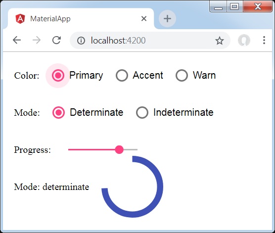
<section class = "tp-section">
   <label class = "tp-margin">Color:</label>
   <mat-radio-group [(ngModel)] = "color">
      <mat-radio-button class = "tp-margin" value = "primary">
         Primary
      </mat-radio-button>
      <mat-radio-button class = "tp-margin" value = "accent">
         Accent
      </mat-radio-button>
      <mat-radio-button class = "tp-margin" value = "warn">
         Warn
      </mat-radio-button>
   </mat-radio-group>
</section>
<section class = "tp-section">
   <label class = "tp-margin">Mode:</label>
   <mat-radio-group [(ngModel)] = "mode">
      <mat-radio-button class = "tp-margin" value = "determinate">
         Determinate
      </mat-radio-button>
      <mat-radio-button class = "tp-margin" value = "indeterminate">
         Indeterminate
      </mat-radio-button>
   </mat-radio-group>
</section>
<section class = "tp-section" *ngIf = "mode === 'determinate'">
   <label class = "tp-margin">Progress:</label>
   <mat-slider class = "tp-margin" [(ngModel)] = "value"></mat-slider>
</section>
<section class = "tp-section">
   <label class = "tp-margin">Mode: {{mode}}</label>
   <mat-progress-spinner
      class = "tp-margin"
      [color] = "color"
      [mode] = "mode"
      [value] = "value">
   </mat-progress-spinner>
</section>
以下は、変更されたtsファイルの内容です。 app.component.ts。
import { Component } from '@angular/core';
@Component({
   selector: 'app-root',
   templateUrl: './app.component.html',
   styleUrls: ['./app.component.css']
})
export class AppComponent {
   title = 'materialApp';
   color = 'primary';
   mode = 'determinate';
   value = 50;

}
結果
結果を確認します。
詳細
- ここでは、mat-progress-spinnerを使用してプログレススピナーを作成しました。
ザ・ <mat-progress-bar>Angular Directiveは、マテリアルスタイルのプログレスバーを表示するために使用されます。
この章では、AngularMaterialを使用して決定論的および非決定論的なプログレスバーを描画するために必要な構成を紹介します。
Angularアプリケーションを作成する
次の手順に従って、Angular 6で作成したAngularアプリケーションを更新します-プロジェクトセットアップの章-
| ステップ | 説明 |
|---|---|
| 1 | Angular 6-プロジェクトセットアップの章で説明されているように、materialAppという名前のプロジェクトを作成します。 |
| 2 | 変更app.module.ts、app.component.ts、app.component.cssをしてapp.component.htmlとして以下に説明します。残りのファイルは変更しないでください。 |
| 3 | アプリケーションをコンパイルして実行し、実装されたロジックの結果を確認します。 |
変更されたモジュール記述子の内容は次のとおりです app.module.ts。
import { BrowserModule } from '@angular/platform-browser';
import { NgModule } from '@angular/core';
import { AppComponent } from './app.component';
import {BrowserAnimationsModule} from '@angular/platform-browser/animations';
import {MatProgressBarModule, MatRadioModule, MatSliderModule} from '@angular/material'
import {FormsModule, ReactiveFormsModule} from '@angular/forms';
@NgModule({
   declarations: [
      AppComponent
   ],
   imports: [
      BrowserModule,
      BrowserAnimationsModule,
      MatProgressBarModule, MatRadioModule, MatSliderModule,
      FormsModule,
      ReactiveFormsModule
   ],
   providers: [],
   bootstrap: [AppComponent]
})
export class AppModule { }
以下は、変更されたtsファイルの内容です。 app.component.css。
.tp-section {
   display: flex;
   align-content: center;
   align-items: center;
   height: 60px;
}
.tp-margin {
   margin: 0 10px;
}
以下は、変更されたHTMLホストファイルの内容です。 app.component.html。
<section class = "tp-section">
   <label class = "tp-margin">Color:</label>
   <mat-radio-group [(ngModel)] = "color">
      <mat-radio-button class = "tp-margin" value = "primary">
         Primary
      </mat-radio-button>
      <mat-radio-button class = "tp-margin" value = "accent">
         Accent
      </mat-radio-button>
      <mat-radio-button class = "tp-margin" value = "warn">
         Warn
      </mat-radio-button>
   </mat-radio-group>
</section>
<section class = "tp-section">
   <label class = "tp-margin">Mode:</label>
   <mat-radio-group [(ngModel)] = "mode">
      <mat-radio-button class = "tp-margin" value = "determinate">
         Determinate
      </mat-radio-button>
      <mat-radio-button class = "tp-margin" value = "indeterminate">
         Indeterminate
      </mat-radio-button>
      <mat-radio-button class = "tp-margin" value = "buffer">
         Buffer
      </mat-radio-button>
      <mat-radio-button class = "tp-margin" value = "query">
         Query
      </mat-radio-button>
   </mat-radio-group>
</section>
<section class = "tp-section" *ngIf = "mode === 'determinate' || mode === 'buffer'">
   <label class = "tp-margin">Progress:</label>
   <mat-slider class = "tp-margin" [(ngModel)] = "value"></mat-slider>
</section>
<section class = "tp-section" *ngIf = "mode === 'buffer'">
   <label class = "tp-margin">Buffer:</label>
   <mat-slider class = "tp-margin" [(ngModel)] = "bufferValue"></mat-slider>
</section>
<section class = "tp-section">
   <label class = "tp-margin">Mode: {{mode}}</label>
   <mat-progress-bar
      class = "tp-margin"
      [color] = "color"
      [mode] = "mode"
      [value] = "value"
      [bufferValue] = "bufferValue"
      >
   </mat-progress-bar>
</section>
以下は、変更されたtsファイルの内容です。 app.component.ts。
import { Component } from '@angular/core';
@Component({
   selector: 'app-root',
   templateUrl: './app.component.html',
   styleUrls: ['./app.component.css']
})
export class AppComponent {
   title = 'materialApp';
   color = 'primary';
   mode = 'determinate';
   value = 50;
   bufferValue = 75;
}
結果
結果を確認します。

詳細
- ここでは、mat-progress-barを使用してプログレスバーを作成しました。
ザ・ <mat-ripple>、Angular Directiveは、ユーザーの操作を表す領域を定義するために使用されます。
この章では、AngularMaterialを使用して波及効果を描画するために必要な構成を紹介します。
変更されたモジュール記述子の内容は次のとおりです app.module.ts。
import { BrowserModule } from '@angular/platform-browser';
import { NgModule } from '@angular/core';
import { AppComponent } from './app.component';
import {BrowserAnimationsModule} from '@angular/platform-browser/animations';
import {MatRippleModule, MatCheckboxModule, MatInputModule} from '@angular/material'
import {FormsModule, ReactiveFormsModule} from '@angular/forms';
@NgModule({
   declarations: [
      AppComponent
   ],
   imports: [
      BrowserModule,
      BrowserAnimationsModule,
      MatRippleModule, MatCheckboxModule, MatInputModule,
      FormsModule,
      ReactiveFormsModule
   ],
   providers: [],
   bootstrap: [AppComponent]
})
export class AppModule { }
以下は、変更されたHTMLホストファイルの内容です。 app.component.html。
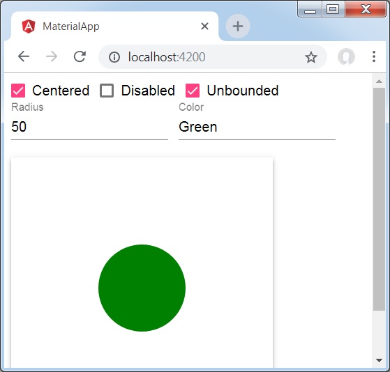
<mat-checkbox [(ngModel)] = "centered" class = "tp-ripple-checkbox">Centered</mat-checkbox>
<mat-checkbox [(ngModel)] = "disabled" class = "tp-ripple-checkbox">Disabled</mat-checkbox>
<mat-checkbox [(ngModel)] = "unbounded" class = "tp-ripple-checkbox">Unbounded</mat-checkbox>
<section>
   <mat-form-field class = "tp-ripple-form-field">
      <input matInput [(ngModel)] = "radius" type = "number" placeholder = "Radius">
   </mat-form-field>
   <mat-form-field class = "tp-ripple-form-field">
      <input matInput [(ngModel)] = "color" type = "text" placeholder = "Color">
   </mat-form-field>
</section>
<div class = "tp-ripple-container mat-elevation-z4"
   matRipple
   [matRippleCentered] = "centered"
   [matRippleDisabled] = "disabled"
   [matRippleUnbounded] = "unbounded"
   [matRippleRadius] = "radius"
   [matRippleColor] = "color">
   Click me
</div>
変更されたCSSファイルの内容は次のとおりです app.component.css。
.tp-ripple-container {
   cursor: pointer;
   text-align: center;
   width: 300px;
   height: 300px;
   line-height: 300px;
   user-select: none;
   -webkit-user-select: none;
   -moz-user-select: none;
   -ms-user-select: none;
   -webkit-user-drag: none;
   -webkit-tap-highlight-color: transparent;
}
.tp-ripple-checkbox {
   margin: 6px 12px 6px 0;
}
.tp-ripple-form-field {
   margin: 0 12px 0 0;
}
以下は、変更されたtsファイルの内容です。 app.component.ts。
import { Component } from '@angular/core';
@Component({
   selector: 'app-root',
   templateUrl: './app.component.html',
   styleUrls: ['./app.component.css']
})
export class AppComponent {
   title = 'materialApp';
   centered = false;
   disabled = false;
   unbounded = false;
   radius: number;
   color: string;
}
結果
結果を確認します。
詳細
最初に、mat-checkboxを使用してチェックボックスを作成し、ngModelと変数を使用してそれらをバインドしました。これらのプロパティは、リップルをカスタマイズするために使用されます。
次に、リップルを作成し、.tsファイルの変数にバインドされたさまざまな属性を紹介しました。
ザ・ <MatSnackBar>Angular Directiveは、ダイアログ/ポップアップの代わりにモバイルデバイスに表示する通知バーを表示するために使用されます。
この章では、AngularMaterialを使用してスナックバーを表示するために必要な構成を紹介します。
変更されたモジュール記述子の内容は次のとおりです app.module.ts。
import { BrowserModule } from '@angular/platform-browser';
import { NgModule } from '@angular/core';
import { AppComponent } from './app.component';
import {BrowserAnimationsModule} from '@angular/platform-browser/animations';
import {MatButtonModule,MatSnackBarModule} from '@angular/material'
import {FormsModule, ReactiveFormsModule} from '@angular/forms';
@NgModule({
   declarations: [
      AppComponent
   ],
   imports: [
      BrowserModule,
      BrowserAnimationsModule,
      MatButtonModule,MatSnackBarModule,
      FormsModule,
      ReactiveFormsModule
   ],
   providers: [],
   bootstrap: [AppComponent]
})
export class AppModule { }
以下は、変更されたHTMLホストファイルの内容です。 app.component.html。
<button mat-button (click)="openSnackBar('Party', 'act')">Show snack-bar</button>以下は、変更されたtsファイルの内容です。 app.component.ts。
import {Component, Injectable} from '@angular/core';
import { MatSnackBar } from "@angular/material";
@Component({
   selector: 'app-root',
   templateUrl: 'app.component.html',
   styleUrls: ['app.component.css']
})
export class AppComponent {
   constructor(public snackBar: MatSnackBar) {}
   openSnackBar(message: string, action: string) {
      this.snackBar.open(message, action, {
         duration: 2000,
      });
   }
}
結果
結果を確認します。

詳細
- ここでは、マットボタンを使用してボタンを作成しました。ボタンをクリックすると、スナックバーが表示されます。
ザ・ <MatTooltip>角度ディレクティブは、マテリアルスタイルのツールチップを表示するために使用されます。
この章では、AngularMaterialを使用してツールチップを表示するために必要な構成を紹介します。
変更されたモジュール記述子の内容は次のとおりです app.module.ts。
import { BrowserModule } from '@angular/platform-browser';
import { NgModule } from '@angular/core';
import { AppComponent } from './app.component';
import {BrowserAnimationsModule} from '@angular/platform-browser/animations';
import {MatButtonModule,MatTooltipModule} from '@angular/material'
import {FormsModule, ReactiveFormsModule} from '@angular/forms';
@NgModule({
   declarations: [
      AppComponent
   ],
   imports: [
      BrowserModule,
      BrowserAnimationsModule,
      MatButtonModule,MatTooltipModule,
      FormsModule,
      ReactiveFormsModule
   ],
   providers: [],
   bootstrap: [AppComponent]
})
export class AppModule { }
以下は、変更されたHTMLホストファイルの内容です。 app.component.html。
<button mat-raised-button
   matTooltip = "Sample Tooltip"
   aria-label = "Sample Tooltip">
   Click Me!
</button>
結果
結果を確認します。
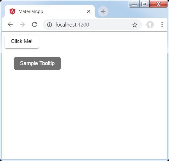
詳細
- ここでは、ホバー時にマットボタンを使用してボタンを作成しました。ツールチップを表示します。
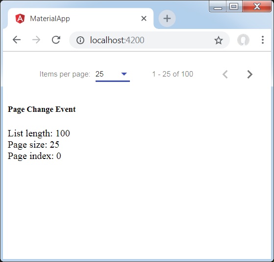
ザ・ <mat-paginator>Angular Directiveは、ページ情報を含むナビゲーターを表示するために使用されます。
この章では、AngularMaterialを使用してページネーションを表示するために必要な構成を紹介します。
変更されたモジュール記述子の内容は次のとおりです app.module.ts。
import { BrowserModule } from '@angular/platform-browser';
import { NgModule } from '@angular/core';
import { AppComponent } from './app.component';
import {BrowserAnimationsModule} from '@angular/platform-browser/animations';
import {MatPaginatorModule} from '@angular/material'
import {FormsModule, ReactiveFormsModule} from '@angular/forms';
@NgModule({
   declarations: [
      AppComponent
   ],
   imports: [
      BrowserModule,
      BrowserAnimationsModule,
      MatPaginatorModule,
      FormsModule,
      ReactiveFormsModule
   ],
   providers: [],
   bootstrap: [AppComponent]
})
export class AppModule { }
以下は、変更されたHTMLホストファイルの内容です。 app.component.html。
<mat-paginator [length] = "100"
   [pageSize] = "10"
   [pageSizeOptions] = "[5, 10, 25, 100]"
   (page) = "pageEvent = $event">
</mat-paginator>
<div *ngIf = "pageEvent">
   <h5>Page Change Event</h5>
   <div>List length: {{pageEvent.length}}</div>
   <div>Page size: {{pageEvent.pageSize}}</div>
   <div>Page index: {{pageEvent.pageIndex}}</div>
</div>
結果
結果を確認します。
詳細
- ここでは、mat-paginatorを使用してページネーションを作成し、その変更イベントを処理します。
ザ・ <mat-sort-header> そして matSortAngularディレクティブは、テーブルヘッダーに並べ替え機能を追加するために使用されます。
この章では、AngularMaterialを使用してソートヘッダーを表示するために必要な構成を紹介します。
変更されたモジュール記述子の内容は次のとおりです app.module.ts。
import { BrowserModule } from '@angular/platform-browser';
import { NgModule } from '@angular/core';
import { AppComponent } from './app.component';
import {BrowserAnimationsModule} from '@angular/platform-browser/animations';
import {MatSortModule} from '@angular/material'
import {FormsModule, ReactiveFormsModule} from '@angular/forms';
@NgModule({
   declarations: [
      AppComponent
   ],
   imports: [
      BrowserModule,
      BrowserAnimationsModule,
      MatSortModule,
      FormsModule,
      ReactiveFormsModule
   ],
   providers: [],
   bootstrap: [AppComponent]
})
export class AppModule { }
以下は、変更されたHTMLホストファイルの内容です。 app.component.html。
<table matSort (matSortChange) = "sortFood($event)">
   <tr>
      <th mat-sort-header = "name">Dessert (100g)</th>
      <th mat-sort-header = "calories">Calories</th>
      <th mat-sort-header = "fat">Fat (g)</th>
      <th mat-sort-header = "carbs">Carbs (g)</th>
      <th mat-sort-header = "protein">Protein (g)</th>
   </tr>
   <tr *ngFor = "let food of sortedFood">
      <td>{{food.name}}</td>
      <td>{{food.calories}}</td>
      <td>{{food.fat}}</td>
      <td>{{food.carbs}}</td>
      <td>{{food.protein}}</td>
   </tr>
</table>
以下は、変更されたtsファイルの内容です。 app.component.ts。
import {Component, Injectable} from '@angular/core';
import {Sort} from '@angular/material';
export interface Food {
   calories: number;
   carbs: number;
   fat: number;
   name: string;
   protein: number;
}
@Component({
   selector: 'app-root',
   templateUrl: 'app.component.html',
   styleUrls: ['app.component.css']
})
export class AppComponent {
   foods: Food[] = [
      {name: 'Yogurt', calories: 159, fat: 6, carbs: 24, protein: 4},
      {name: 'Sandwich', calories: 237, fat: 9, carbs: 37, protein: 4},
      {name: 'Eclairs', calories: 262, fat: 16, carbs: 24, protein: 6},
      {name: 'Cupcakes', calories: 305, fat: 4, carbs: 67, protein: 4},
      {name: 'Gingerbreads', calories: 356, fat: 16, carbs: 49, protein: 4},
   ];
   sortedFood: Food[];
   constructor() {
      this.sortedFood = this.foods.slice();
   }
   sortFood(sort: Sort) {
      const data = this.foods.slice();
      if (!sort.active || sort.direction === '') {
         this.sortedFood = data;
         return;
      }
      this.sortedFood = data.sort((a, b) => {
         const isAsc = sort.direction === 'asc';
         switch (sort.active) {
            case 'name': return compare(a.name, b.name, isAsc);
            case 'calories': return compare(a.calories, b.calories, isAsc);
            case 'fat': return compare(a.fat, b.fat, isAsc);
            case 'carbs': return compare(a.carbs, b.carbs, isAsc);
            case 'protein': return compare(a.protein, b.protein, isAsc);
            default: return 0;
         }
      });
   }
}
function compare(a: number | string, b: number | string, isAsc: boolean) {
   return (a < b ? -1 : 1) * (isAsc ? 1 : -1);
}
結果
結果を確認します。
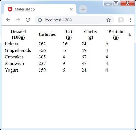
詳細
- ここでは、テーブルを作成しました。matSortを追加し、そのmatSortChangeイベントを処理します。
ザ・ <mat-table>Angular Directivesは、マテリアルデザインとスタイリングを備えたテーブルを作成するために使用されます。
この章では、AngularMaterialを使用してテーブルを表示するために必要な構成を紹介します。
変更されたモジュール記述子の内容は次のとおりです app.module.ts。
import { BrowserModule } from '@angular/platform-browser';
import { NgModule } from '@angular/core';
import { AppComponent } from './app.component';
import {BrowserAnimationsModule} from '@angular/platform-browser/animations';
import {MatTableModule} from '@angular/material'
import {FormsModule, ReactiveFormsModule} from '@angular/forms';
@NgModule({
   declarations: [
      AppComponent
   ],
   imports: [
      BrowserModule,
      BrowserAnimationsModule,
      MatTableModule,
      FormsModule,
      ReactiveFormsModule
   ],
   providers: [],
   bootstrap: [AppComponent]
})
export class AppModule { }
以下は、変更されたHTMLホストファイルの内容です。 app.component.html。
<table mat-table [dataSource] = "dataSource" class = "mat-elevation-z8">
   <ng-container matColumnDef = "name">
      <th mat-header-cell *matHeaderCellDef> Dessert (100g)</th>
      <td mat-cell *matCellDef = "let element"> {{element.name}} </td>
   </ng-container>
   <ng-container matColumnDef = "calories">
      <th mat-header-cell *matHeaderCellDef>Calories</th>
      <td mat-cell *matCellDef = "let element"> {{element.calories}} </td>
   </ng-container>
   <ng-container matColumnDef = "fat">
      <th mat-header-cell *matHeaderCellDef>Fat (g)</th>
      <td mat-cell *matCellDef = "let element"> {{element.fat}} </td>
   </ng-container>
   <ng-container matColumnDef = "carbs">
      <th mat-header-cell *matHeaderCellDef>Carbs (g)</th>
      <td mat-cell *matCellDef = "let element"> {{element.carbs}} </td>
   </ng-container>
   <ng-container matColumnDef = "protein">
      <th mat-header-cell *matHeaderCellDef>Protein (g)</th>
     <td mat-cell *matCellDef = "let element"> {{element.protein}} </td>
   </ng-container>
   <tr mat-header-row *matHeaderRowDef = "displayedColumns"></tr>
   <tr mat-row *matRowDef = "let row; columns: displayedColumns;"></tr>
</table>
以下は、変更されたtsファイルの内容です。 app.component.css。
table {
   width: 100%;
}
以下は、変更されたtsファイルの内容です。 app.component.ts。
import {Component, Injectable} from '@angular/core';
import {Sort} from '@angular/material';
export interface Food {
   calories: number;
   carbs: number;
   fat: number;
   name: string;
   protein: number;
}
@Component({
   selector: 'app-root',
   templateUrl: 'app.component.html',
   styleUrls: ['app.component.css']
})
export class AppComponent {
   dataSource: Food[] = [
      {name: 'Yogurt', calories: 159, fat: 6, carbs: 24, protein: 4},
      {name: 'Sandwich', calories: 237, fat: 9, carbs: 37, protein: 4},
      {name: 'Eclairs', calories: 262, fat: 16, carbs: 24, protein: 6},
      {name: 'Cupcakes', calories: 305, fat: 4, carbs: 67, protein: 4},
      {name: 'Gingerbreads', calories: 356, fat: 16, carbs: 49, protein: 4},
   ];
   displayedColumns: string[] = ['name', 'calories', 'fat', 'carbs','protein'];
}
結果
結果を確認します。
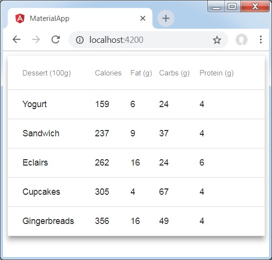
詳細
- ここでは、テーブルを作成しました。mat-Tableを追加し、mat-rowとmat-header-rowを使用してtrとthを処理します。