Angular Material7-ツールバー
ザ・ <mat-toolbar>、Angularディレクティブは、タイトル、ヘッダー、または任意のアクションボタンを表示するツールバーを作成するために使用されます。
<mat-toolbar> -メインコンテナを表します。
<mat-toolbar-row> -新しい行を追加します。
この章では、AngularMaterialを使用してツールバーコントロールを描画するために必要な構成を紹介します。
Angularアプリケーションを作成する
次の手順に従って、Angular 6で作成したAngularアプリケーションを更新します-プロジェクトセットアップの章-
| ステップ | 説明 |
|---|---|
| 1 | Angular 6-プロジェクトセットアップの章で説明されているように、materialAppという名前のプロジェクトを作成します。 |
| 2 | 変更app.module.ts、app.component.ts、app.component.cssをしてapp.component.htmlとして以下に説明します。残りのファイルは変更しないでください。 |
| 3 | アプリケーションをコンパイルして実行し、実装されたロジックの結果を確認します。 |
変更されたモジュール記述子の内容は次のとおりです app.module.ts。
import { BrowserModule } from '@angular/platform-browser';
import { NgModule } from '@angular/core';
import { AppComponent } from './app.component';
import {BrowserAnimationsModule} from '@angular/platform-browser/animations';
import {MatToolbarModule} from '@angular/material'
import {FormsModule, ReactiveFormsModule} from '@angular/forms';
@NgModule({
   declarations: [
      AppComponent
   ],
   imports: [
      BrowserModule,
      BrowserAnimationsModule,
      MatToolbarModule,
      FormsModule,
      ReactiveFormsModule
   ],
   providers: [],
   bootstrap: [AppComponent]
})
export class AppModule { }
変更されたCSSファイルの内容は次のとおりです app.component.css。
.filler {
   flex: 1 1 auto;
}
.gap {
   margin-right: 10px;
}
以下は、変更されたHTMLホストファイルの内容です。 app.component.html。
<mat-toolbar color = "primary">
<span class = "gap">File</span>
<span>Edit</span>
<span class = "filler"></span>
<span>About</span>
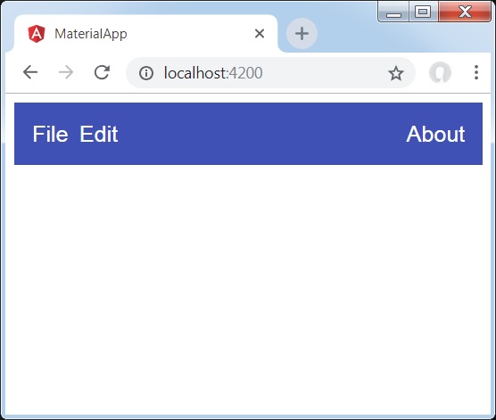
</mat-toolbar>結果
結果を確認します。
詳細
- 最初に、ページ全体にまたがるツールバーを作成しました。
- 次に、ラベルが追加されます。