Angular Material7-スライダー
ザ・ <mat-slider>Angular Directiveは、マテリアルデザインのスタイリングとアニメーション機能を備えた拡張範囲セレクターとして使用されます。
この章では、AngularMaterialを使用してスライダーコントロールを描画するために必要な構成を紹介します。
Angularアプリケーションを作成する
次の手順に従って、Angular 6で作成したAngularアプリケーションを更新します-プロジェクトセットアップの章-
| ステップ | 説明 |
|---|---|
| 1 | Angular 6-プロジェクトセットアップの章で説明されているように、materialAppという名前のプロジェクトを作成します。 |
| 2 | 変更app.module.ts、app.component.ts、app.component.cssをしてapp.component.htmlとして以下に説明します。残りのファイルは変更しないでください。 |
| 3 | アプリケーションをコンパイルして実行し、実装されたロジックの結果を確認します。 |
変更されたモジュール記述子の内容は次のとおりです app.module.ts。
import { BrowserModule } from '@angular/platform-browser';
import { NgModule } from '@angular/core';
import { AppComponent } from './app.component';
import {BrowserAnimationsModule} from '@angular/platform-browser/animations';
import {MatSliderModule, MatCheckboxModule} from '@angular/material'
import {FormsModule, ReactiveFormsModule} from '@angular/forms';
@NgModule({
   declarations: [
      AppComponent
   ],
   imports: [
      BrowserModule,
      BrowserAnimationsModule,
      MatSliderModule, MatCheckboxModule,
      FormsModule,
      ReactiveFormsModule
   ],
   providers: [],
   bootstrap: [AppComponent]
})
export class AppModule { }
以下は、変更されたHTMLホストファイルの内容です。 app.component.html。
<mat-slider
   class = "tp-margin"
   [disabled] = "disabled"
   [invert] = "invert"
   [thumbLabel] = "thumbLabel"
   [(ngModel)] = "value"
   [vertical] = "vertical">
</mat-slider>
<section class = "tp-section">
   <mat-checkbox class = "tp-margin" [(ngModel)] = "thumbLabel">Show thumb label</mat-checkbox>
</section>
<section class = "tp-section">
   <mat-checkbox class = "tp-margin" [(ngModel)] = "vertical">Vertical</mat-checkbox>
   <mat-checkbox class = "tp-margin" [(ngModel)] = "invert">Inverted</mat-checkbox>
</section>
<section class = "tp-section">
   <mat-checkbox class = "tp-margin" [(ngModel)] = "disabled">Disabled</mat-checkbox>
</section>
変更されたCSSファイルの内容は次のとおりです app.component.css。
.tp-section {
   display: flex;
   align-content: center;
   align-items: center;
   height: 60px;
}
.tp-margin {
   margin: 30px;
}

.mat-slider-horizontal {
   width: 300px;
}
.mat-slider-vertical {
   height: 300px;
}
以下は、変更されたtsファイルの内容です。 app.component.ts。
import { Component } from '@angular/core';
@Component({
selector: 'app-root',
templateUrl: './app.component.html',
styleUrls: ['./app.component.css']
})
export class AppComponent {
title = 'materialApp';
disabled = false;
invert = false;
thumbLabel = false;
value = 0;
vertical = false;
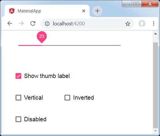
}結果
結果を確認します。
詳細
最初に、mat-checkboxを使用して4つのチェックボックスを作成し、ngModelと変数を使用してそれらをバインドしました。これらのプロパティは、スライダーをカスタマイズするために使用されます。
次に、スライダーを作成し、.tsファイルの変数にバインドされたさまざまな属性を紹介しました。