Google AMP - Schaltfläche
Tasten sind ein weiteres Merkmal von AMP. Beachten Sie, dass sich die Schaltflächen in AMP nicht ändern und wie ein Standard-HTML-Schaltflächen-Tag verwendet werden. Der einzige Unterschied zu Schaltflächen auf der AMP-Seite besteht in der Bearbeitung von Ereignissen.
In diesem Kapitel werden einige Beispiele gezeigt, die die Funktionsweise von Schaltflächen und deren Verwendung mit AMP-Komponenten zeigen.
Beispielcode für Lightbox
Das folgende Beispiel zeigt, wie Sie mit der Schaltfläche den Amp-Leuchtkasten wie unten gezeigt ein- / ausblenden können.
<!doctype html>
<html amp lang = "en">
   <head>
      <meta charset = "utf-8">
      <script async src = "https://cdn.ampproject.org/v0.js"></script>
      <title>Google AMP - Amp Lightbox</title>
      <link rel = "canonical" href = "http://example.ampproject.org/article-metadata.html">

      <meta name = "viewport" content ="width = device-width,minimum-scale = 1,initial-scale = 1">

      <style amp-boilerplate>
         body{
            -webkit-animation:-amp-start 8s steps(1,end) 0s 1 normal both;-moz-animation:
            -amp-start 8s steps(1,end) 0s 1 normal both;-ms-animation:
            -amp-start 8s steps(1,end) 0s 1 normal both;animation:
            -amp-start 8s steps(1,end) 0s 1 normal both
         }
         @-webkit-keyframes
         -amp-start{from{visibility:hidden}to{visibility:visible}}@-moz-keyframes
         -amp-start{from{visibility:hidden}to{visibility:visible}}@-ms-keyframes
         -amp-start{from{visibility:hidden}to{visibility:visible}}@-o-keyframes
         -amp-start{from{visibility:hidden}to{visibility:visible}}@keyframes
         -amp-start{from{visibility:hidden}to{visibility:visible}}
      </style>
      <noscript>
         <style amp-boilerplate>
            body{
               -webkit-animation:none;-moz-animation:none;-ms-an
               imation:none;animation:none
            }
         </style>
      </noscript>

      <script async custom-element = "amp-lightbox"
         src = "https://cdn.ampproject.org/v0/amp-lightbox-0.1.js">
      </script>

      <style amp-custom>
         amp-img {
            border: 1px solid #ddd;
            border-radius: 4px;
            padding: 5px;
         }
         button{
            background-color:
            #ACAD5C; color: white;
            padding: 12px 20px;
            border: none;
            border-radius: 4px;
            cursor: pointer;
            float: left;
         }

         .lightbox {
            background: rgba(211,211,211,0.8);
            width: 100%;
            height: 100%;
            position: absolute;
            display: flex;
            align-items: center;
            justify-content: center;
         }
      </style>
   </head>
   <body>
      <h3>Google AMP - Amp Lightbox</h3>
      <button on = "tap:my-lightbox">
         Show LightBox
      </button>
      <amp-lightbox id = "my-lightbox" layout = "nodisplay">
         <div class = "lightbox" on = "tap:my-lightbox.close" tabindex = "0">
            <amp-img alt = "Beautiful Flower"
               src = "images/flower.jpg"
               width = "246"
               height = "205">
            </amp-img>
         </div>
      </amp-lightbox>
   </body>
</html>
Ausgabe
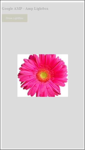
Jetzt können Sie auf eine beliebige Stelle auf dem Bildschirm klicken, um den Leuchtkasten zu schließen.
Im obigen Beispiel haben wir eine Schaltfläche verwendet, die den unten gezeigten Code verwendet.
<button on = "tap:my-lightbox">
   Show LightBox
</button>
Next, we have added action on the button using on attribute as shown:
on = "tap:my-lightbox"
Die Aktion wird ausgeführt, wenn Sie auf die Schaltfläche tippen. Beachten Sie, dass die ID des Leuchtkastens angegeben wird. Wenn der Benutzer auf die Schaltfläche tippt, wird der Leuchtkasten geöffnet. Ebenso können Sie die Schaltfläche mit einer Aktion mit einer beliebigen Komponente verwenden, um mit ihr zu interagieren.