Google AMP - Datumsauswahl
AMP Datepicker ist eine Verstärkerkomponente, die den Kalender auf der Seite anzeigt, auf der der Benutzer Datumsangaben auswählen kann. AMP Datepicker kann wie ein statischer Kalender oder basierend auf der Eingabeauswahl angezeigt werden, dh mit einem Klick auf eine Schaltfläche.
Damit Amp-Date-Picker funktioniert, müssen wir der Seite das folgende Skript hinzufügen:
<script async custom-element = "amp-date-picker"
   src = "https://cdn.ampproject.org/v0/amp-date-picker-0.1.js">
</script>
Amp-Date-Picker-Tag
Das Tag von Amp-Date-Picker sieht wie folgt aus:
<amp-date-picker layout = "fixed-height" height = "360"></amp-date-picker>Unterstützte Attribute
Die folgenden Attribute werden für die Amp-Datumsauswahl unterstützt:
| Sr.Nr. | Attribut & Beschreibung |
|---|---|
| 1 | mode Die verfügbaren Optionen sind statisch und Overlay. Bei statischer Aufladung wird der Kalender standardmäßig auf der Seite geöffnet. Bei Überlagerung wird der Kalender bei Interaktion geöffnet. |
| 2 | mode Die verfügbaren Optionen sind Single und Range. Mit Single können Sie nur ein Datum im Kalender auswählen. Mit Bereich können Sie mehr als ein Datum auswählen, jedoch in einem kontinuierlichen Bereich. |
| 3 | input-selector Dies kann ein Abfrageselektor für die Datumseingabe sein. Zum Beispiel ist für id #nameoftheid für die Klasse, die es ist. Name der Klasse. Das Datum wird für das Tag aktualisiert, dem die ID zugewiesen ist. |
| 4 | start-input-selector Dies kann ein Abfrageselektor für die Datumseingabe sein. Beispiel: Die ID ist #nameoftheid für die Klasse .nameoftheclass. Das Datum wird für das Tag aktualisiert, dem die ID zugewiesen ist. |
| 5 | end-input-selector Dies kann ein Abfrageselektor für die Datumseingabe sein. Beispiel: id ist #nameoftheid für class is .nameoftheclass. Das Datum wird für das Tag aktualisiert, dem die ID zugewiesen ist. |
| 6 | min Das früheste Datum, das der Benutzer auswählen kann. Dies muss als ISO 8601-Datum formatiert sein. Wenn kein min-Attribut vorhanden ist, ist das aktuelle Datum das Mindestdatum. |
| 7 | max Das späteste Datum, das der Benutzer auswählen kann. Dies muss als ISO 8601-Datum formatiert sein. Wenn kein max-Attribut vorhanden ist, hat die Datumsauswahl kein maximales Datum. |
| 8 | month-format Das Monatsformat, in dem Sie das ausgewählte Datum anzeigen müssen. Standardmäßig lauten die Werte "MMMM JJJJ". |
| 9 | format Das Format, in dem das Datum im Eingabefeld oder in einem HTML-Element angezeigt werden soll, dessen Selektor verwendet wird. Standardmäßig ist es "JJJJ-MM-TT" |
| 10 | week-day-format Format zur Anzeige des Wochentags. |
| 11 | locale Gebietsschema zur Anzeige der Kalenderansicht. Standardmäßig ist es en. |
| 12 | minimum-nights Die Anzahl der Nächte, die der Benutzer in einem Datumsbereich auswählen muss. Der Standardwert ist "1". Mit dem Wert "0" können Benutzer dasselbe Datum für das Start- und Enddatum auswählen. |
| 13 | number-of-months Die Anzahl der Monate, die gleichzeitig in der Kalenderansicht angezeigt werden sollen. Der Standardwert ist "1". |
| 14 | first-day-of-week Der Tag, der als erster Wochentag angegeben werden soll (0-6). Der Standardwert ist "0" (Sonntag). |
| 15 | day-size Die Größe in px der Datumszellen in der Kalenderansichtstabelle. Der Standardwert ist 39. |
Die Hauptattribute sind type und mode. Zummode, wir haben static und overlayTyp Kalender. Zumtype wir können haben single und rangeOptionen. Mittype = ”single” Wir können nur ein Datum aus dem Kalender und für auswählen type = ”range” Wir können mehr als eine Daten in einem Bereich auswählen.
Lassen Sie uns nun anhand einiger Arbeitsbeispiele die Amp-Datumsauswahl für statische Kalender und Kalender vom Typ Overlay verstehen.
AMP Statische Datumsauswahl
Für die Datumsauswahl vom statischen Typ müssen wir den Modus = statisch angeben, wie im folgenden Beispiel gezeigt.
Beispiel
<!doctype html>
<html amp lang = "en">
   <head>
      <meta charset = "utf-8">
      <script async src = "https://cdn.ampproject.org/v0.js"></script>
      <title>Google AMP - Amp Date-Picker Static </title>
      <link rel = "canonical" href = " http://example.ampproject.org/article-metadata.html">
      <meta name = "viewport" content = "width = device-width, minimum-scale = 1,initial-scale = 1">

      <style amp-boilerplate>
         body{
            -webkit-animation:
            -amp-start 8s steps(1,end) 0s 1 normal both;-moz-animation:
            -amp-start 8s steps(1,end) 0s 1 normal both;-ms-animation:
            -amp-start 8s steps(1,end) 0s 1 normal both;animation:
            -amp-start 8s steps(1,end) 0s 1 normal both
         }
         @-webkit-keyframes
         -amp-start{from{visibility:hidden}to{visibility:visible}}@-moz-keyframes
         -amp-start{from{visibility:hidden}to{visibility:visible}}@-ms-keyframes
         -amp-start{from{visibility:hidden}to{visibility:visible}}@-o-keyframes
         -amp-start{from{visibility:hidden}to{visibility:visible}}@keyframes
         -amp-start{from{visibility:hidden}to{visibility:visible}}
      </style>
      <noscript>
         <style amp-boilerplate>
            body{-webkit-animation:
            none;-moz-animation:none;-ms-animation:none;animation:none}
         </style>
      </noscript>

      <script async custom-element = "amp-date-picker"
         src = "https://cdn.ampproject.org/v0/amp-date-picker-0.1.js">
      </script>

      <script async custom-element = "amp-bind"
         src = "https://cdn.ampproject.org/v0/amp-bind-0.1.js">
      </script>
      <script async custom-template = "amp-mustache"
         src = "https://cdn.ampproject.org/v0/amp-mustache-0.1.js">
      </script>

      <style>
         input[type = text]{
            width: 50%;
            padding: 12px;
            border: 1px
            solid #ccc;
            border-radius: 4px;
            resize: vertical;
         }
         label {
            padding: 12px 12px 12px 0;display: inline-block;
         }
         .col-label {
            float: left;width: 25%;margin-top: 6px;
         }
         .col-content {
            float: left;width: 75%;margin-top: 6px;
         }
         .row:after {
            content: "";display: table;clear: both;
         }
         .amp_example {
            background-color: #f1f1f1;
            padding: 0.01em 16px;
            margin: 20px 0;
            box-shadow: 0 2px 4px 0
            rgba(0,0,0,0.16),0 2px 10px 0
            rgba(0,0,0,0.12)!important;
         }
         h3{font-family: "Segoe UI",Arial,sans-serif;
         font-weight: 400;margin: 10px 0;}
      </style>
   </head>
   <body>
      <div class = "amp_example">
         <h3>Google AMP - Amp Date-Picker using type = single</h3>
         <amp-date-picker
            id = "static-date"
            type = "single"
            mode = "static"
            layout = "fixed-height"
            height = "600"
            format = "YYYY-MM-DD"
            input-selector = "#date">

            <div class = "row">
               <div class = "col-label">
                  <label for = "start">
                     Date is:
                  </label>
               </div>
               <div class = "col-content">
                  <input type = "text" id = "date" name = "date"
                     placeholder = "Date Selected Is...">
               </div>
            </div>
         </amp-date-picker>
      <div>
   </body>
</html>
Beachten Sie, dass in diesem Beispiel standardmäßig der Kalender, dh die Datumsauswahl, auf dem Bildschirm angezeigt wird.
Das vom Benutzer ausgewählte Datum wird im Textfeld angezeigt, wie im folgenden Demobildschirm gezeigt.
Ausgabe
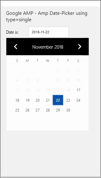
Wie wird das Datum aus der Amp-Datumsauswahl ausgewählt?
Wenn Sie das obige Beispiel überprüfen, wird ein Attribut namens aufgerufen input-selectorwelches die ID des Textfeldes erhält. Wenn der Benutzer das Datum auswählt, wird es im Eingabefeld angezeigt.
<amp-date-picker
   id = "static-date"
   type = "single"
   mode = "static"
   layout = "fixed-height"
   height = "600"
   format = "YYYY-MM-DD"
   input-selector = "#date"

   <div class = "row">
      <div class = "col-label">
         <label for = "start">Date is:</label>
      </div>
      <div class = "col-content">
         <input type = "text" id = "date" name = "date"
         placeholder = "Date Selected Is...">
      </div>
   </div>

</amp-date-picker>
Sie können dem Eingabeauswahlattribut auch die folgende Eigenschaft geben:
<amp-date-picker
   type = "single"
   mode = "static"
   layout = "container"
   input-selector = "[name = date]">
   <input type = "text" id = "date" name = "date" placeholder = "Date Selected Is...">
</amp-date-picker>
Falls der Eingangswähler nicht angegeben ist, erstellt die Amp-Datumsauswahl ein verstecktes Eingabefeld und gibt ihm den Namen date or ${id}-date unter Verwendung der ID des Amp-Date Pickers.
Wir werden einige weitere Beispiele mit verschiedenen Attributen diskutieren, die mit der Datumsauswahl verfügbar sind. Oben können wir das einzelne Datum wie erwähnt auswählentype=”single”und Modus als statisch. Wir können auch einen Datumsbereich auswählen, indem wir den Typ als angebentype=”range”.
Beispiel
<!doctype html>
<html amp lang = "en">
   <head>
      <meta charset = "utf-8">
      <script async src = "https://cdn.ampproject.org/v0.js"></script>
      <title>Google AMP - Amp Date-Picker Static </title>
      <link rel = "canonical" href = "http://example.ampproject.org/article-metadata.html">
      <meta name = "viewport" content = "width = device-width, minimum-scale = 1,initial-scale = 1">

      <style amp-boilerplate>
         body{-webkit-animation:
            -amp-start 8s steps(1,end) 0s 1 normal both;-moz-animation:
            -amp-start 8s steps(1,end) 0s 1 normal both;-ms-animation:
            -amp-start 8s steps(1,end) 0s 1 normal both;animation:
            -amp-start 8s steps(1,end) 0s 1 normal both
         }
         @-webkit-keyframes
         -amp-start{from{visibility:hidden}to{visibility:visible}}@-moz-keyframes
         -amp-start{from{visibility:hidden}to{visibility:visible}}@-ms-keyframes
         -amp-start{from{visibility:hidden}to{visibility:visible}}@-o-keyframes
         -amp-start{from{visibility:hidden}to{visibility:visible}}@keyframes
         -amp-start{from{visibility:hidden}to{visibility:visible}}
      </style>
      <noscript>
         <style amp-boilerplate>
            body{
            -webkit-animation:
            none;-moz-animation:none;-ms-animation:none;animation:none}
         </style>
      </noscript>

      <script async custom-element = "amp-date-picker"
         src = "https://cdn.ampproject.org/v0/amp-date-picker-0.1.js">
      </script>

      <script async custom-element = "amp-bind"
         src = "https://cdn.ampproject.org/v0/amp-bind-0.1.js">
      </script>

      <script async custom-template = "amp-mustache"
         src = "https://cdn.ampproject.org/v0/amp-mustache-0.1.js">
      </script>

      <style>
         input[type = text]{
            width: 50%;
            padding: 12px;
            border: 1px solid #ccc;
            border-radius: 4px;
            resize: vertical;
         }
         label {padding: 12px 12px 12px 0;display: inline-block;}
         .col-label {float: left;width: 25%;margin-top: 6px;}
         .col-content {float: left;width: 75%;margin-top: 6px;}
         .row:after {content: "";display: table;clear: both;}
         .amp_example {
            background-color: #f1f1f1;
            padding: 0.01em 16px;
            margin: 20px 0;
            box-shadow: 0 2px 4px 0
            rgba(0,0,0,0.16),0 2px 10px 0
            rgba(0,0,0,0.12)!important;
         }
         h3{
            font-family: "Segoe UI",Arial,sans-serif;
            font-weight: 400;margin: 10px 0;
         }
      </style>
   </head>
   <body>
      <div class = "amp_example">
         <h3>Google AMP - Amp Date-Picker Static Multi Select Dates using type = range</h3>
         <amp-date-picker
            id = "static-date"
            type = "range"
            mode = "static"
            layout = "fixed-height"
            height = "600"
            start-input-selector = "#start"
            end-input-selector = "#end"
            format = "YYYY-MM-DD"
            input-selector = "#static-date-input">

            <div class = "row">
               <div class = "col-label">
                  <label for = "start">Start Date:</label>
               </div>
               <div class = "col-content">
                  <input type = "text" id = "start"
                  name = "start" placeholder = "Start Date">
               </div>
            </div>
            <div class = "row">
               <div class = "col-label">
                  <label for = "end">End Date:</label>
               </div>
               <div class = "col-content">
                  <input type = "text" id = "end"
                  name = "end" placeholder = "End Date">
               </div>
            </div>
         </amp-date-picker>
      </div>
   </body>
</html>
Ausgabe
Die Ausgabe des oben gezeigten Codes ist wie folgt:
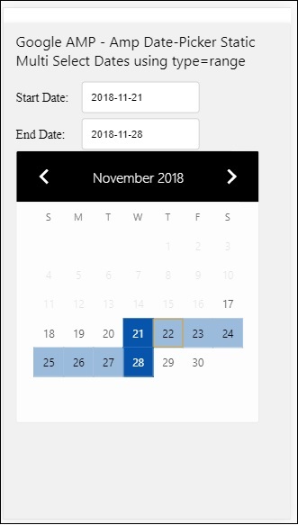
How to get the start and end date using type= ”range” selected from amp-date-picker?
Um das Start- und Enddatum zu erhalten, haben wir das Amp-Date-Picker-Attribut verwendet start-input-selector und end-input-selector.
Die Details der Syntax werden hier angezeigt -
<amp-date-picker
   id = "static-date"
   type = "range"
   mode = "static"
   layout = "fixed-height"
   height = "600"
   start-input-selector = "#start"
   end-input-selector="#end"
   format = "YYYY-MM-DD"
   input-selector = "#static-date-input">

   <input type = "text" id = "start" name = "start" placeholder="Start Date">
   <input type = "text" id = "end" name = "end" placeholder = "End Date">
</amp-date-picker>
Beide Selektoren haben eine Eingabefeld-ID, in der das Start- und Enddatum angezeigt werden soll. Sie können auch den Namen des Eingabefelds angeben, wie hier beschrieben.
AMP Overlay Date Picker
Bei der Datumsauswahl im Überlagerungsmodus wird der Kalender als Antwort auf das Eingabefeld angezeigt. Wir können eine Überlagerung mit type = "single" und type = "range" haben, wie wir für die statische Datumsauswahl gesehen haben.
Lassen Sie uns nun ein funktionierendes Beispiel für die Auswahl des Datumsbereichs für die Datumsauswahl vom Typ Überlagerung sehen.
Beispiel
<!doctype html>
<html amp lang = "en">
   <head>
      <meta charset = "utf-8">
      <script async src = "https://cdn.ampproject.org/v0.js"></script>
      <itle>Google AMP - Amp Date-Picker Static</title>
      <link rel = "canonical" href = "http://example.ampproject.org/article-metadata.html">
      <meta name = "viewport" content = "width = device-width,minimum-scale = 1,initial-scale = 1">
      <style amp-boilerplate>
         body{
            -webkit-animation:
            -amp-start 8s steps(1,end) 0s 1 normal both;-moz-animation:
            -amp-start 8s steps(1,end) 0s 1 normal both;-ms-animation:
            -amp-start 8s steps(1,end) 0s 1 normal both;animation:
            -amp-start 8s steps(1,end) 0s 1 normal both
         }
         @-webkit-keyframes
         -amp-start{from{visibility:hidden}to{visibility:visible}}@-moz-keyframes
         -amp-start{from{visibility:hidden}to{visibility:visible}}@-ms-keyframes
         -amp-start{from{visibility:hidden}to{visibility:visible}}@-o-keyframes
         -amp-start{from{visibility:hidden}to{visibility:visible}}@keyframes
         -amp-start{from{visibility:hidden}to{visibility:visible}}
      </style>
      <noscript>
         <style amp-boilerplate>
            body{
            -webkit-animation:
            none;-moz-animation:none;-ms-animation:none;animation:none}
         </style>
      </noscript>

      <script async custom-element = "amp-date-picker"
         src = "https://cdn.ampproject.org/v0/amp-date-picker-0.1.js">
      </script>
      <script async custom-element = "amp-bind"
         src = "https://cdn.ampproject.org/v0/amp-bind-0.1.js">
      </script>
      <script async custom-template = "amp-mustache"
         src = "https://cdn.ampproject.org/v0/amp-mustache-0.1.js">
      </script>

      <style>
         input[type=text]{
            width: 50%;
            padding: 12px;border:
            1px solid #ccc;
            border-radius: 4px;resize: vertical;
         }
         label {
            padding: 12px 12px 12px 0;
            display: inline-block;
            font-family: "Segoe UI",Arial,sans-serif;
            font-weight: 400;
         }
         .col-label {float: left;width: 25%;margin-top: 6px;}
         .col-content {float: left;width: 75%;margin-top: 6px;}
         .row:after {content: "";display: table;clear: both;}
         .amp_example {
            background-color: #f1f1f1;
            padding: 0.01em 16px;
            margin: 20px 0;
            box-shadow: 0 2px 4px 0
            rgba(0,0,0,0.16),0 2px 10px 0
            rgba(0,0,0,0.12)!important;
         }
         h3{font-family: "Segoe UI",Arial,sans-serif;font-weight: 400;margin: 10px 0;}
         button { background-color: #ACAD5C;
            color: white;
            padding: 12px 20px;
            border: none;
            border-radius: 4px;
            cursor: pointer;
            float: right;
         }
      </style>
   </head>
   <body>
      <div class = "amp_example">
         <h3>Google AMP - Amp Date-Picker Overlay Multi Select Dates using type = rangelt;/h3>
         <amp-date-picker id = "overlay-date"
            type = "range"
            mode = "overlay"
            start-input-selector = "#start"
            end-input-selector = "#end"
            format = "YYYY-MM-DD"
            open-after-select
            input-selector = "#start">

            <div class = "row">
               <div class = "col-label">
                  <label for = "start">Start Date:lt;/label>
               </div>
               <div class = "col-content">
                  <input type = "text" id = "start"
                     name = "start" placeholder = "Start Date">
               </div>
            </div>
            <div class = "row">
               <div class = "col-label">
                  <label for = "end">End Date:lt;/label>
               </div>
               <div class = "col-content">
                  <input type = "text" id="end" name = "end"
                     placeholder = "End Date">
               </div>
            </div>
            <div class = "row">
               <div class = "col-label">
               </div>
               <div class = "col-content">
                  <button class = "ampstart-btn caps" on = "tap:overlay-date.clear">
                     Clear
                  </button>
               </div>
            </div>
        </amp-date-picker>
     </div>
  </body>
</html>
Ausgabe
Die Ausgabe des oben gezeigten Codes ist wie folgt:
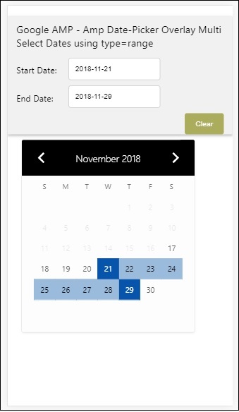
Wir haben bereits gesehen, wie man das Start- und Enddatum erhält. Beachten Sie, dass wir hier ein weiteres Attribut verwendet habenopen-after-select. Dieses Attribut lässt die Überlagerung nach der Auswahl offen. Wenn Sie außerhalb der Datumsauswahl klicken, wird diese geschlossen. Es gibt auch eine Schaltfläche namens clear. Durch Klicken auf die Schaltfläche Löschen werden die ausgewählten Daten gelöscht. Die Syntax, um dies auszuführen, lautet wie folgt:
<button class = "ampstart-btn caps" on = "tap:overlay-date.clear">
   Clear
</button>
Um ein Ereignis hinzuzufügen, müssen wir verwenden onAttribut. Weitere Details zu Veranstaltungen werden in der besprochenEventsKapitel dieses Tutorials. Wir haben das Tag-Verhalten verwendet und dazu wird die ID des Datepickers angegeben und ein Ereignis gelöscht, das sich um das Löschen des ausgewählten Datumsbereichs kümmert.
Lassen Sie uns als Nächstes sehen, wie Sie die Amp-Datumsauswahl als Leuchtkasten verwenden.
AMP Lightbox Datumsauswahl
Die Datumsauswahl kann in einem modalen Fenster verwendet werden. Wir können auch die Lightbox-Datumsauswahl verwenden. Lassen Sie uns dies anhand eines Arbeitsbeispiels verstehen.
Um die Datumsauswahl in der Lightbox zu verwenden, müssen Sie das Lightbox-Skript wie unten gezeigt hinzufügen.
<script async custom-element = "amp-lightbox"
   src = "https://cdn.ampproject.org/v0/amp-lightbox-0.1.js">
</script>
Beispiel
<!doctype html>
<html amp lang = "en">
   <head>
      <meta charset = "utf-8">
      <script async src = "https://cdn.ampproject.org/v0.js"></script>
      <title>Google AMP - Amp Date-Picker Static </title>
      <link rel = "canonical" href = "http://example.ampproject.org/article-metadata.html">
      <meta name = "viewport" content = "width=device-width,minimum-scale = 1,initial-scale = 1">

      <style amp-boilerplate>
         body{
            -webkit-animation:
            -amp-start 8s steps(1,end) 0s 1 normal both;-moz-animation:
            -amp-start 8s steps(1,end) 0s 1 normal both;-ms-animation:
            -amp-start 8s steps(1,end) 0s 1 normal both;animation:
            -amp-start 8s steps(1,end) 0s 1 normal both
         }
         @-webkit-keyframes
         -amp-start{from{visibility:hidden}to{visibility:visible}}@-moz-keyframes
         -amp-start{from{visibility:hidden}to{visibility:visible}}@-ms-keyframes
         -amp-start{from{visibility:hidden}to{visibility:visible}}@-o-keyframes
         -amp-start{from{visibility:hidden}to{visibility:visible}}@keyframes
         -amp-start{from{visibility:hidden}to{visibility:visible}}
      </style>
      <noscript>
         <style amp-boilerplate>
            body{
               -webkit-animation:none;
               -moz-animation:none;
               -ms-animation:none;
               animation:none}
         </style>
      </noscript>

      <script async custom-element = "amp-date-picker"
         src = "https://cdn.ampproject.org/v0/amp-date-picker-0.1.js">
      </script>

      <script async custom-element = "amp-bind" src = "
      https://cdn.ampproject.org/v0/amp-bind-0.1.js">
      <script>

      <script async custom-template = "amp-mustache"
         src = "https://cdn.ampproject.org/v0/amp-mustache-0.1.js">
      </script>

      <script async custom-element = "amp-lightbox"
         src = "https://cdn.ampproject.org/v0/amp-lightbox-0.1.js">
      </script>

      <style>
         input[type=text]{
            width: 50%;
            padding: 12px;
            border: 1px solid #ccc;
            border-radius: 4px;
            resize: vertical;
         }
         label {
            padding: 12px 12px 12px 0;
            display: inline-block;
            font-family: "Segoe UI",Arial,sans-serif;
            font-weight: 400;
         }
         .col-label {
            float: left;width: 25%;
            margin-top: 6px;
         }
         .col-content {
            float: left;
            width: 75%;
            margin-top: 6px;
         }
         .row:after {
            content: "";
            display: table;clear: both;
         }
         .amp_example {
            background-color: #f1f1f1;
            padding: 0.01em 16px;
            margin: 20px 0;
            box-shadow: 0 2px 4px 0 rgba(0,0,0,0.16),0 2px 10px 0rgba(0,0,0,0.12)!important;
         }
         h3{font-family: "Segoe UI",Arial,sans-serif;
            font-weight: 400;
            margin: 10px 0;
         }
         button {
            background-color: #ACAD5C;
            color: white;
            padding: 12px 20px;
            border: none;
            border-radius: 4px;
            cursor: pointer;
            float: right;
         }
         .lightbox {background-color: rgba(100, 100, 100, 0.5);}
      </style>
   </head>
   <body>
      <div class = "amp_example">
         <h3>Google AMP - Amp Date-Picker Overlay Multi Select Dates using type = range</h3>
         <div class = "row">
            <div class = "col-label">
               <label for = "start">Start Date:</label>
            <div>
            <div class = "col-content">
               <input type = "text" id = "start" name =
               "start" placeholder = "Start Date" on = "tap:lightbox.open">
            </div>
         </div>
         <div class = "row">
            <div class = "col-label">
               <label for = "end">End Date:</label>
            </div>
            <div class = "col-content">
               <input type = "text" id = "end" name =
                  "end" placeholder = "End Date" on = "tap:lightbox.open">
            </div>
         </div>
         <div class = "row">
            <div class = "col-label"></div>
            <div class = "col-content">
            <button class = "ampstart-btn caps" on =
               "tap:overlay-date.clear">Clear</button>
            </div>
         </div>
         <amp-lightbox id = "lightbox" layout = "nodisplay" class = "lightbox">
            <amp-date-picker id = "overlay-date"
               type = "range"
               layout = "fill"
               start-input-selector = "#start"
               end-input-selector = "#end"
               format = "YYYY-MM-DD"
               on = "activate: lightbox.open;deactivate: lightbox.close">
            </amp-date-picker>
         </amp-lightbox>
      </div>
   </body>
</html>
Ausgabe
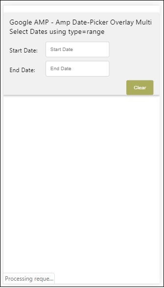
Wenn ein Benutzer auf das Eingabefeld klickt, wird die Datumsauswahl im Leuchtkasten wie unten gezeigt geöffnet.

Um dies durchzuführen, wird dem Eingabefeld ein Ereignis hinzugefügt, wie unten gezeigt -
<input type = "text" id = "start" name = "start"
   placeholder = "Start Date" on = "tap:lightbox.open">

<input type = "text" id = "end" name = "end"
   placeholder = "End Date" on = "tap:lightbox.open">
Beachten Sie, dass “on” ist das Ereignis, das tap - lightbox.open aufruft, um den Leuchtkasten zu öffnen.
Hier ist Lightbox die ID, die Amp-Lightbox wie unten gezeigt gegeben wird. Die Amp-Datumsauswahl wird in der Amp-Lightbox aufgerufen und durch Tippen auf die Eingabefelder aktiviert.
<amp-lightbox id = "lightbox" layout = "nodisplay" class = "lightbox">
   <amp-date-picker id = "overlay-date"
      type = "range"
      layout = "fill"
      start-input-selector = "#start"
      end-input-selector = "#end"
      format = "YYYY-MM-DD"
      on = "activate: lightbox.open;deactivate: lightbox.close">
   </amp-date-picker>
</amp-lightbox>