Google AMP - Layout
AMP-Layout ist eine der wichtigsten Funktionen von Google-Amp. Das Amp-Layout stellt sicher, dass die Amp-Komponenten beim Laden der Seite ordnungsgemäß gerendert werden, ohne dass es zu Flimmern oder Scrollen kommt. Google AMP stellt sicher, dass das Layout-Rendering auf der Seite erfolgt, bevor andere Remote-Ressourcen wie http-Anforderungen für Bilder oder Datenanrufe ausgeführt werden.
Die Liste der Layoutattribute ist unten angegeben.
Breite und Höhe
layout
sizes
heights
media
placeholder
fallback
noloading
Wir werden das berücksichtigen layoutAttribut im Detail in diesem Kapitel. Die restlichen Attribute werden im Kapitel - ausführlich erläutert.Google AMP – Attributes dieses Tutorials.
Layoutattribut
Wir können das Layout-Attribut für eine Amp-Komponente verwenden, das entscheidet, wie die Komponente innerhalb der Seite gerendert wird. Eine Liste der von Amp unterstützten Layouts finden Sie unten -
Nicht anwesend
Container
fill
fixed
fixed-height
flex-item
intrinsic
nodisplay
Responsive
Für jedes dieser Layouts sehen wir ein Arbeitsbeispiel, das zeigt, wie das Layoutattribut die Amp-Komponente anders darstellt. Wir werden davon Gebrauch machenamp-img Komponente in unseren Beispielen.
Nicht vorhandenes Beispiel
<!doctype html>
<html amp lang = "en">
<head>
<meta charset = "utf-8">
<script async src="https://cdn.ampproject.org/v0.js"></script>
<title>Google AMP - Image</title>
<link rel = "canonical" href =
"http://example.ampproject.org/article-metadata.html">
<meta name = "viewport" content = "width = device-width,
minimum-scale = 1,initial-scale = 1">
<style amp-boilerplate>
body{
-webkit-animation:
-amp-start 8s steps(1,end) 0s 1 normal both;-moz-animation:
-amp-start 8s steps(1,end) 0s 1 normal both;-ms-animation:
-amp-start 8s steps(1,end) 0s 1 normal both;animation:
-amp-start 8s steps(1,end) 0s 1 normal both
}
@-webkit-keyframes
-amp-start{from{visibility:hidden}to{visibility:visible}}@-moz-keyframes
-amp-start{from{visibility:hidden}to{visibility:visible}}@-ms-keyframes
-amp-start{from{visibility:hidden}to{visibility:visible}}@-o-keyframes
-amp-start{from{visibility:hidden}to{visibility:visible}}@keyframes
-amp-start{from{visibility:hidden}to{visibility:visible}}
</style>
<noscript>
<style amp-boilerplate>
body{
-webkit-animation:none;
-moz-animation:none;
-ms-animation:none;
animation:none
}
</style>
</noscript>
<style amp-custom>
amp-img {
border: 1px solid black;
border-radius: 4px;
padding: 5px;
}
</style>
</head>
<body>
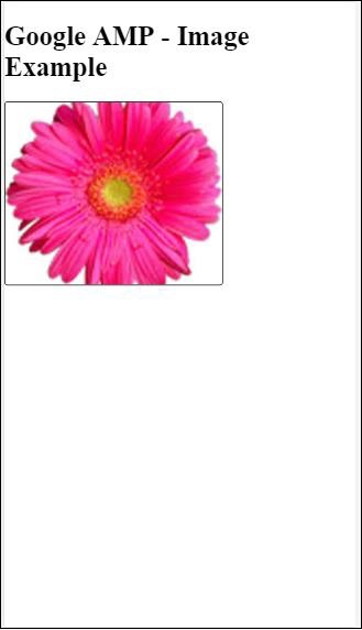
<h1>Google AMP - Image Example</h1>
<amp-img
alt = "Beautiful
Flower"src = "images/flower.jpg"
width = "246"
height = "205">
</amp-img>
</body>
</html>Ausgabe
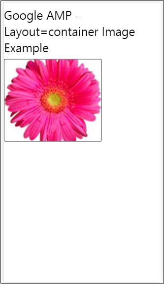
Container Beispiel
Layout = "Container" wird meistens dem übergeordneten Element zugewiesen, und das untergeordnete Element nimmt die definierten Größen an.
<!doctype html>
<html amp lang = "en">
   <head>
      <meta charset = "utf-8">
      <script async src = "https://cdn.ampproject.org/v0.js"></script>
      <title>Google AMP - Image</title>
      <link rel = "canonical" href =
         "http://example.ampproject.org/article-metadata.html">
      <meta name = "viewport" content = "width = device-width,
         minimum-scale = 1,initial-scale = 1">
      <style amp-boilerplate>
         body{
            -webkit-animation:
            -amp-start 8s steps(1,end) 0s 1 normal both;-moz-animation:
            -amp-start 8s steps(1,end) 0s 1 normal both;-ms-animation:
            -amp-start 8s steps(1,end) 0s 1 normal both;animation:
            -amp-start 8s steps(1,end) 0s 1 normal both
         }@-webkit-keyframes
         -amp-start{from{visibility:hidden}to{visibility:visible}}@-moz-keyframes
         -amp-start{from{visibility:hidden}to{visibility:visible}}@-ms-keyframes
         -amp-start{from{visibility:hidden}to{visibility:visible}}@-o-keyframes
         -amp-start{from{visibility:hidden}to{visibility:visible}}@keyframes
         -amp-start{from{visibility:hidden}to{visibility:visible}}
      </style>
      <noscript>
         <style amp-boilerplate>
            body{
               -webkit-animation:none;
               -moz-animation:none;
               -ms-animation:none;
               animation:none
            }
         </style>
      </noscript>
      <style amp-custom>
         amp-img {
            border: 1px solid black;
            border-radius: 4px;
            padding: 5px;
         }
         h1{
            font-family: "Segoe UI",Arial,sans-serif;
            font-weight: 400;margin: 10px 0;
         }
      </style>
   </head>
   <body>
      <h1>Google AMP - Layout = container Image Example</h1>
      <amp-accordion layout = "container">
         <amp-img alt = "Beautiful Flower"
            src = "images/flower.jpg"
            width = "246"
            height = "205">
         </amp-img>
      </amp-accordion>
   </body>
</html>
Ausgabe
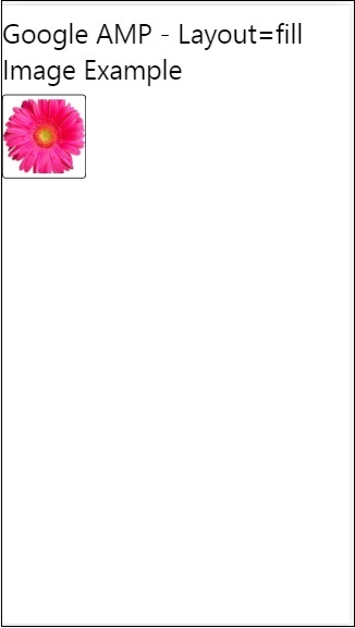
Beispiel füllen
Layout = "füllen" nimmt die Breite und Höhe des übergeordneten Elements an.
<!doctype html>
<html amp lang = "en">
   <head>
      <meta charset = "utf-8">
      <script async src = "https://cdn.ampproject.org/v0.js"></script>
      <title>
      Google AMP - Image
      <title>
      <link rel = "canonical" href =
         "http://example.ampproject.org/article-metadata.html">
      <meta name = "viewport" content = "width = device-width,
         minimum-scale = 1,initial-scale = 1">
      <style amp-boilerplate>
         body{
            -webkit-animation:
            -amp-start 8s steps(1,end) 0s 1 normal both;-moz-animation:
            -amp-start 8s steps(1,end) 0s 1 normal both;-ms-animation:
            -amp-start 8s steps(1,end) 0s 1 normal both;animation:
            -amp-start 8s steps(1,end) 0s 1 normal both
         }
         @-webkit-keyframes
         -amp-start{from{visibility:hidden}to{visibility:visible}}@-moz-keyframes
         -amp-start{from{visibility:hidden}to{visibility:visible}}@-ms-keyframes
         -amp-start{from{visibility:hidden}to{visibility:visible}}@-o-keyframes
         -amp-start{from{visibility:hidden}to{visibility:visible}}@keyframes
         -amp-start{from{visibility:hidden}to{visibility:visible}}
      </style>
      <noscript>
         <style amp-boilerplate>
            body{
               -webkit-animation:none;
               -moz-animation:none;
               -ms-animation:none;
               animation:none
            }
         </style>
      </noscript>
      <style amp-custom>
         amp-img {
            border: 1px solid black;
            border-radius: 4px;
            padding: 5px;
         }
         h1{font-family: "Segoe UI",Arial,sans-serif;
         font-weight: 400;margin: 10px 0;}
      </style>
   </head>
   <body>
      <h1>Google AMP - Layout = fill Image Example</h1>
      <div style = "position:relative;width:100px;height:100px;">
         <amp-img alt = "Beautiful Flower"
            src = "images/flower.jpg"
            width = "246"
            height = "205"
            layout = "fill">
         </amp-img>
      </div>
   </body>
</html>
Ausgabe
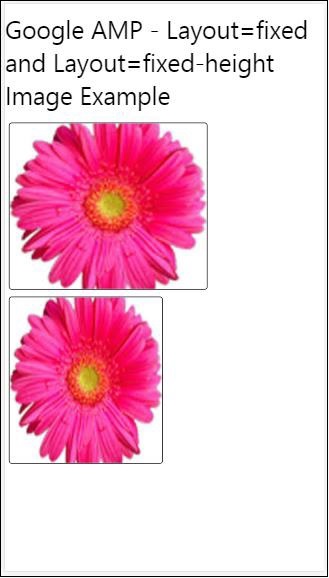
Beispiel mit fester und fester Höhe
Beachten Sie die folgenden zwei Punkte, bevor Sie die Verwendung von fester und fester Höhe verstehen:
layout=”fixed” muss Breite und Höhe haben und die Amp-Komponente wird darin gezeigt.
layout=”fixed-height” Für die Komponente muss die Höhe angegeben werden. Dadurch wird sichergestellt, dass die Höhe nicht geändert wird. Bei Verwendung der festen Höhe darf die Breite nicht angegeben werden, oder sie kann automatisch erfolgen.
<!doctype html>
<html amp lang = "en">
   <head>
      <meta charset = "utf-8">
      <script async src = "https://cdn.ampproject.org/v0.js"></script>
      <title>Google AMP - Image</title>
      <link rel = "canonical" href =
         "http://example.ampproject.org/article-metadata.html">
      <meta name = "viewport" content = "width = device-width,
         minimum-scale = 1,initial-scale = 1">
      <style amp-boilerplate>
         body{
            -webkit-animation:
            -amp-start 8s steps(1,end) 0s 1 normal both;-moz-animation:
            -amp-start 8s steps(1,end) 0s 1 normal both;-ms-animation:
            -amp-start 8s steps(1,end) 0s 1 normal both;animation:
            -amp-start 8s steps(1,end) 0s 1 normal both
         }
         @-webkit-keyframes
         -amp-start{from{visibility:hidden}to{visibility:visible}}@-moz-keyframes
         -amp-start{from{visibility:hidden}to{visibility:visible}}@-ms-keyframes
         -amp-start{from{visibility:hidden}to{visibility:visible}}@-o-keyframes
         -amp-start{from{visibility:hidden}to{visibility:visible}}@keyframes
         -amp-start{from{visibility:hidden}to{visibility:visible}}
      </style>
      <noscript>
         <style amp-boilerplate>
            body{
               -webkit-animation:none;
               -moz-animation:none;
               -ms-animation:none;
               animation:none
            }
         </style>
      </noscript>
      <style amp-custom>
         amp-img {
            border: 1px solid black;
            border-radius: 4px;
            padding: 5px;
         }
         div{
            display: inline-block;
            width: 200px;
            height:200px;
            margin: 5px;
         }
         h1{font-family: "Segoe UI",Arial,sans-serif;
         font-weight: 400;margin: 10px 0;}
      </style>
   </head>
   <body>
      <h1>Google AMP - Layout = fixed and
         Layout = fixed-height Image Example
      </h1>
      <div>
         <amp-img alt = "Beautiful Flower"
            src = "images/flower.jpg"
            width = "246"
            height = "205"
            layout = "fixed">
         </amp-img>
      </div>
      <div>
         <amp-img alt = "Beautiful Flower"
            src = "images/flower.jpg"
            height = "205"
            layout = "fixed-height">
         </amp-img>
      </div>
   </body>
</html>
Ausgabe
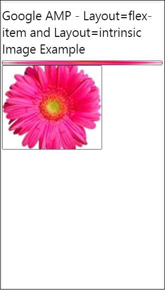
Flex-Item und intrinsisch
<!doctype html>
<html amp lang = "en">
   <head>
      <meta charset = "utf-8">
      <script async src ="https://cdn.ampproject.org/v0.js"></script>
      <title>Google AMP - Image</title>
      <link rel = "canonical" href ="
         http://example.ampproject.org/article-metadata.html">
      <meta name = "viewport" content = "width = device-width,
         minimum-scale = 1,initial-scale = 1">
      <style amp-boilerplate>
         body{
            -webkit-animation:
            -amp-start 8s steps(1,end) 0s 1 normal both;-moz-animation:
            -amp-start 8s steps(1,end) 0s 1 normal both;-ms-animation:
            -amp-start 8s steps(1,end) 0s 1 normal both;animation:
            -amp-start 8s steps(1,end) 0s 1 normal both
         }
         @-webkit-keyframes
         -amp-start{from{visibility:hidden}to{visibility:visible}}@-moz-keyframes
         -amp-start{from{visibility:hidden}to{visibility:visible}}@-ms-keyframes
         -amp-start{from{visibility:hidden}to{visibility:visible}}@-o-keyframes
         -amp-start{from{visibility:hidden}to{visibility:visible}}@keyframes
         -amp-start{from{visibility:hidden}to{visibility:visible
      <style>
         <noscript>
      <style amp-boilerplate>
      body{
         -webkit-animation:none;
         -moz-animation:none;
         -ms-animation:none;
         animation:none
      }
      </style>
      </noscript>
      <style amp-custom>
         amp-img {
            border: 1px solid black;
            border-radius: 4px;
            padding: 5px;
         }
         displayitem {
            display: inline-block;
            width: 200px;
            height:200px;
            margin: 5px;
         }
         h1{font-family: "Segoe UI",Arial,sans-serif;
         font-weight: 400;margin: 10px 0;}
      </style>
   </head>
   <body>
      <h1>Google AMP - Layout = flex-item and
         Layout = intrinsic Image Example
      </h1>
      <div class = "displayitem">
         <amp-img alt = "Beautiful Flower"
            src = "images/flower.jpg"
            layout = "flex-item">
         </amp-img>
      </div>
      <div class = "displayitem">
         <amp-img alt = "Beautiful Flower"
            src = "images/flower.jpg"
            width = "246"
            height = "205"
            layout = "intrinsic">
         </amp-img>
      </div>
   </body>
</html>
Ausgabe
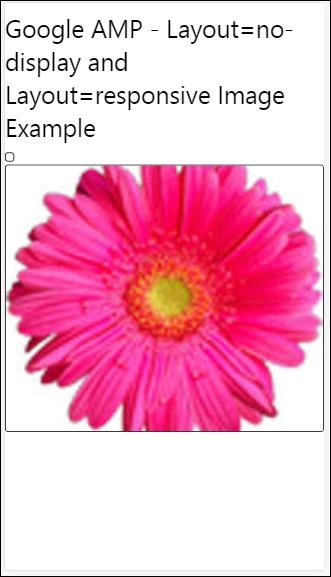
nodisplay und reaktionsschnell
Die Amp-Komponente mit layout = nodisplay nimmt keinen Platz auf der Seite ein, genau wie die Anzeige: keine. Es ist nicht erforderlich, einem solchen Layout eine Eigenschaft für Breite und Höhe hinzuzufügen.
Eine Amp-Komponente mit Layout = Responsive nimmt den verfügbaren Platz oder die Breite der Seite ein und die Größe wird unter Beibehaltung des Seitenverhältnisses des Elements geändert.
<!doctype html>
<html amp lang = "en">
   <head>
      <meta charset = "utf-8">
      <script async src = "https://cdn.ampproject.org/v0.js">
      </script>
      <title>Google AMP - Image</title>
      <link rel = "canonical" href =
      "http://example.ampproject.org/article-metadata.html">
      <meta name = "viewport" content="width=device-width,
      minimum-scale = 1,initial-scale = 1">

      <style amp-boilerplate>
         body{
            -webkit-animation:
            -amp-start 8s steps(1,end) 0s 1 normal both;-moz-animation:
            -amp-start 8s steps(1,end) 0s 1 normal both;-ms-animation:
            -amp-start 8s steps(1,end) 0s 1 normal both;animation:
            -amp-start 8s steps(1,end) 0s 1 normal both}
         @-webkit-keyframes
         -amp-start{from{visibility:hidden}to{visibility:visible}}@-moz-keyframes
         -amp-start{from{visibility:hidden}to{visibility:visible}}@-ms-keyframes
         -amp-start{from{visibility:hidden}to{visibility:visible}}@-o-keyframes
         -amp-start{from{visibility:hidden}to{visibility:visible}}@keyframes
         -amp-start{from{visibility:hidden}to{visibility:visible}}
      </style>

      <noscript>
         <style amp-boilerplate>
            body{
               -webkit-animation:none;
               -moz-animation:none;
               -ms-animation:none;
               animation:none}
         </style>
      </noscript>
      <style amp-custom>
         amp-img {
            border: 1px solid black;
            border-radius: 4px;
            padding: 5px;
         }
         displayitem {
            display: inline-block;
            width: 200px;
            height:200px;
            margin: 5px;
         }
         h1{font-family: "Segoe UI",Arial,sans-serif;
         font-weight: 400;margin: 10px 0;}
      </style>
   </head>
   <body>
      <h1>Google AMP - Layout=no-display and
      Layout = responsive Image Example</h1>
      <div class = "displayitem">
         <amp-img alt = "Beautiful Flower"
            src = "images/flower.jpg"
            layout = "no-display">
         </amp-img>
      </div>
      <div class = "displayitem">
         <amp-img alt = "Beautiful Flower"
            src = "images/flower.jpg"
            width = "246"
            height = "205"
            layout = "responsive">
         </amp-img>
      </div>
   </body>
</html>
Ausgabe
Die Liste der in Google AMP unterstützten Layouts lautet wie folgt
Accordion
Carousel
Lightbox
Slider
Sidebar
Amp-Akkordeon
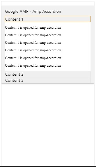
Amp-Akkordeon ist eine Amp-Komponente, mit der der Inhalt im Expand-Collapse-Format angezeigt wird. Benutzer können es problemlos auf Mobilgeräten anzeigen, wo sie den Abschnitt nach ihrer Wahl aus dem Akkordeon auswählen können.
Um mit Amp-Akkordeon zu arbeiten, müssen Sie das folgende Skript hinzufügen:
<script async custom-element = "amp-accordion"
   src = "https://cdn.ampproject.org/v0/amp-accordion-0.1.js">
</script>
Amp-Akkordeon-Tag
<amp-accordion>
   <section class = "seca">
      <h3>Content 1</h3>
      <div>
         <p>Content 1 is opened for amp-accordion</p>
         <p>Content 1 is opened for amp-accordion</p>
         <p>Content 1 is opened for amp-accordion</p>
         <p>Content 1 is opened for amp-accordion</p>
         <p>Content 1 is opened for amp-accordion</p>
         <p>Content 1 is opened for amp-accordion</p>
      </div>
   </section>
   …
</amp-accordion>
Lassen Sie uns ein funktionierendes Beispiel für Amp-Akkordeon sehen.
<!doctype html>
<html amp lang = "en">
   <head>
      <meta charset = "utf-8">
      <script async src = "https://cdn.ampproject.org/v0.js">
      </script>
      <title>Google AMP - Amp Accordion </title>
      <link rel = "canonical" href=
      "http://example.ampproject.org/article-metadata.html">
      <meta name = "viewport" content = "width = device-width,
      minimum-scale = 1,initial-scale = 1">

      <style amp-boilerplate>
         body{
            -webkit-animation:
            -amp-start 8s steps(1,end) 0s 1 normal both;-moz-animation:
            -amp-start 8s steps(1,end) 0s 1 normal both;-ms-animation:
            -amp-start 8s steps(1,end) 0s 1 normal both;animation:
            -amp-start 8s steps(1,end) 0s 1 normal both
         }
         @-webkit-keyframes
         -amp-start{from{visibility:hidden}to{visibility:visible}}@-moz-keyframes
         -amp-start{from{visibility:hidden}to{visibility:visible}}@-ms-keyframes
         -amp-start{from{visibility:hidden}to{visibility:visible}}@-o-keyframes
         -amp-start{from{visibility:hidden}to{visibility:visible}}@keyframes
         -amp-start{from{visibility:hidden}to{visibility:visible}}
      </style>

      <noscript>
         <style amp-boilerplate>
            body{
               -webkit-animation:none;
               -moz-animation:none;
               -ms-animation:none;
               animation:none}
         </style>
      </noscript>
      <script async custom-element = "amp-accordion" src =
         "https://cdn.ampproject.org/v0/amp-accordion-0.1.js">
      </script>
      <style>
         input[type = text]{
            width: 50%;
            padding: 12px;
            border: 1px solid #ccc;
            border-radius: 4px;
            resize: vertical;
         }
         label {
            padding: 12px 12px 12px 0;
            display: inline-block;
            font-family: "Segoe UI",Arial,sans-serif;
            font-weight: 400;
         }
         .col-label {
            float: left;
            width: 25%;
            margin-top: 6px;
         }
         .col-content {
            float: left;
            width: 75%;
            margin-top: 6px;
         }
         .row:after {
            content: "";
            display: table;
            clear: both;
         }
         .amp_example {
            background-color: #f1f1f1;
            padding: 0.01em 16px;
            margin: 20px 0;
            box-shadow: 0 2px 4px 0
            rgba(0,0,0,0.16),0 2px 10px 0
            rgba(0,0,0,0.12)!important;
         }
         h3{
            font-family: "Segoe UI",Arial,sans-serif;
            font-weight: 400;margin: 10px 0;
         }
         input[type=submit] {
            background-color: #ACAD5C;
            color: white;
            padding: 12px 20px;
            border: none;
            border-radius: 4px;
            cursor: pointer;
            float: right;
         }
         .lightbox {background-color: rgba(100, 100, 100, 0.5);}
         .seca {background-color:#fff;}
      </style>
   </head>
   <body>
      <div class = "amp_example">
         <h3>Google AMP - Amp Accordion</h3>
         <amp-accordion>
            <section class = "seca">
               <h3>Content 1</h3>
               <div>
                  <p>Content 1 is opened for amp-accordion</p>
                  <p>Content 1 is opened for amp-accordion</p>
                  <p>Content 1 is opened for amp-accordion</p>
                  <p>Content 1 is opened for amp-accordion</p>
                  <p>Content 1 is opened for amp-accordion</p>
                  <p>Content 1 is opened for amp-accordion</p>
               </div>
            </section>
            <section expanded class = "seca">
               <h3>Content 2</h3>
               <div>
                  <p>Content 2 is opened for amp-accordion</p>
                  <p>Content 2 is opened for amp-accordion</p>
                  <p>Content 2 is opened for amp-accordion</p>
                  <p>Content 2 is opened for amp-accordion</p>
                  <p>Content 2 is opened for amp-accordion</p>
               </div>
            </section>
            <section class="seca">
               <h3>Content 3</h3>
               <div>
                  <p>Content 3 is opened for amp-accordion</p>
                  <p>Content 3 is opened for amp-accordion</p>
                  <p>Content 3 is opened for amp-accordion</p>
                  <p>Content 3 is opened for amp-accordion</p>
                  <p>Content 3 is opened for amp-accordion</p>
               </div>
            </section>
         </amp-accordion>
      </div>
   </body>
</html>
Ausgabe
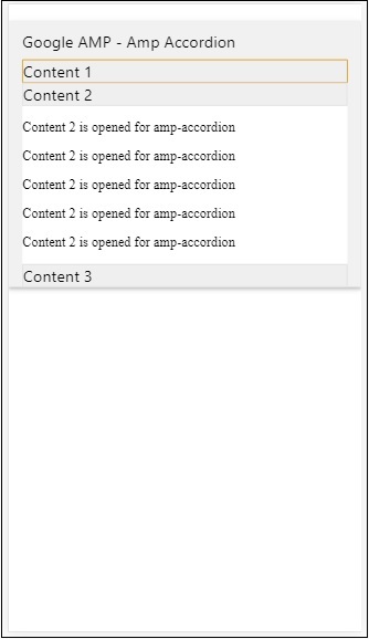
Das Amp-Akkordeon enthält Abschnitte. Jeder Abschnitt kann 2 untergeordnete Elemente haben und mehr als 2 zeigen einen Fehler in der Browserkonsole an. Sie können einen Container im Abschnitt hinzufügen und mehrere Elemente enthalten.
Standardmäßig haben wir einen Abschnitt mit dem auf den Abschnitt erweiterten Attribut in einem erweiterten Modus gehalten.
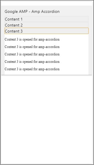
Automatisch kollabierende Akkordeons
Für das automatische Reduzieren verwenden wir ein Attribut expand-single-section auf Amp-Akkordeon wie im Beispiel gezeigt. Der Abschnitt, den der Benutzer öffnet, bleibt nur in erweiterter Ruhe, andere werden mit schließen expand-single-section Attribut.
<!doctype html>
<html amp lang = "en">
   <head>
      <meta charset = "utf-8">
      <script async src = "https://cdn.ampproject.org/v0.js">
      </script>
      <title>Google AMP - Amp Accordion </title>
      <link rel = "canonical" href=
      "http://example.ampproject.org/article-metadata.html">
      <meta name = "viewport" content = "width = device-width,
      minimum-scale = 1,initial-scale = 1">

      <style amp-boilerplate>
         body{
            -webkit-animation:
            -amp-start 8s steps(1,end) 0s 1 normal both;-moz-animation:
            -amp-start 8s steps(1,end) 0s 1 normal both;-ms-animation:
            -amp-start 8s steps(1,end) 0s 1 normal both;animation:
            -amp-start 8s steps(1,end) 0s 1 normal both
         }
         @-webkit-keyframes
         -amp-start{from{visibility:hidden}to{visibility:visible}}@-moz-keyframes
         -amp-start{from{visibility:hidden}to{visibility:visible}}@-ms-keyframes
         -amp-start{from{visibility:hidden}to{visibility:visible}}@-o-keyframes
         -amp-start{from{visibility:hidden}to{visibility:visible}}@keyframes
         -amp-start{from{visibility:hidden}to{visibility:visible}}
      </style>

      <noscript>

         <style amp-boilerplate>
            body{
               -webkit-animation:none;
               -moz-animation:none;
               -ms-animation:none;
               animation:none}
         </style>
      </noscript>
      <script async custom-element = "amp-accordion" src =
         "https://cdn.ampproject.org/v0/amp-accordion-0.1.js">
      </script>
      <style>
         input[type = text]{
            width: 50%;
            padding: 12px;
            border: 1px solid #ccc;
            border-radius: 4px;
            resize: vertical;
         }
         label {
            padding: 12px 12px 12px 0;
            display: inline-block;
            font-family: "Segoe UI",Arial,sans-serif;
            font-weight: 400;
         }
         .col-label {
            float: left;
            width: 25%;
            margin-top: 6px;
         }
         .col-content {
            float: left;
            width: 75%;
            margin-top: 6px;
         }
         .row:after {
            content: "";
            display: table;
            clear: both;
         }
         .amp_example {
            background-color: #f1f1f1;
            padding: 0.01em 16px;
            margin: 20px 0;
            box-shadow: 0 2px 4px 0
            rgba(0,0,0,0.16),0 2px 10px 0
            rgba(0,0,0,0.12)!important;
         }
         h3{
            font-family: "Segoe UI",Arial,sans-serif;
            font-weight: 400;
            margin: 10px 0;
         }
         input[type=submit] {
            background-color: #ACAD5C;
            color: white;
            padding: 12px 20px;
            border: none;
            border-radius: 4px;
            cursor: pointer;
            float: right;}
         .lightbox {background-color: rgba(100, 100, 100, 0.5);}
         .seca {background-color:#fff;}
      </style>
   <head>
   <body>
      <div class = "amp_example">
         <h3>Google AMP - Amp Accordion</h3>
         <amp-accordion expand-single-section>
            <section class = "seca">
               <h3>Content 1</h3>
               <div>
                  <p>Content 1 is opened for amp-accordion</p>
                  <p>Content 1 is opened for amp-accordion</p>
                  <p>Content 1 is opened for amp-accordion</p>
                  <p>Content 1 is opened for amp-accordion</p>
                  <p>Content 1 is opened for amp-accordion</p>
                  <p>Content 1 is opened for amp-accordion</p>
               </div>
            </section>
            <section class = "seca">
               <h3>Content 2</h3>
               <div>
                  <p>Content 2 is opened for amp-accordion</p>
                  <p>Content 2 is opened for amp-accordion</p>
                  <p>Content 2 is opened for amp-accordion</p>
                  <p>Content 2 is opened for amp-accordion</p>
                  <;p>Content 2 is opened for amp-accordion</p>
               </div>
            </section>
            <section class = "seca">
               <h3>Content 3</h3>
               <div>
                  <p>Content 3 is opened for amp-accordion</p>
                  <p>Content 3 is opened for amp-accordion</p>
                  <p>Content 3 is opened for amp-accordion</p>
                  <p>Content 3 is opened for amp-accordion</p>
                  <p>Content 3 is opened for amp-accordion</p>
               </div>
            </section>
         </amp-accordion>
      </div>
   </body>
</html>
Ausgabe
Animation auf Akkordeons
Verwendung der animateAttribut können wir Animation für das Erweitern-Zusammenbrechen des Akkordeons hinzufügen. Schauen Sie sich das folgende Beispiel an -
<!doctype html>
<html amp lang = "en">
   <head>
      <meta charset = "utf-8">
      <script async src = "https://cdn.ampproject.org/v0.js">
      </script>
      <title>Google AMP - Amp Accordion </title>
      <link rel = "canonical" href = "http://example.ampproject.org/article-metadata.html>
      <meta name = "viewport" content = "width = device-width,minimum-scale = 1,initial-scale = 1">

      <style amp-boilerplate>
         body{
            -webkit-animation:
            -amp-start 8s steps(1,end) 0s 1 normal both;-moz-animation:
            -amp-start 8s steps(1,end) 0s 1 normal both;-ms-animation:
            -amp-start 8s steps(1,end) 0s 1 normal both;animation:
            -amp-start 8s steps(1,end) 0s 1 normal both
         }
         @-webkit-keyframes
         -amp-start{from{visibility:hidden}to{visibility:visible}}@-moz-keyframes
         -amp-start{from{visibility:hidden}to{visibility:visible}}@-ms-keyframes
         -amp-start{from{visibility:hidden}to{visibility:visible}}@-o-keyframes
         -amp-start{from{visibility:hidden}to{visibility:visible}}@keyframes
         -amp-start{from{visibility:hidden}to{visibility:visible}}
      </style>

      <noscript>
         <style amp-boilerplate>
            body{
               -webkit-animation:none;
               -moz-animation:none;
               -ms-animation:none;animation:none
            }
         </style>
      </noscript>
      <script async custom-element = "amp-accordion" src =
         "https://cdn.ampproject.org/v0/amp-accordion-0.1.js">
      </script>
      <style>
         input[type = text]{
            width: 50%;
            padding: 12px;
            border: 1px solid #ccc;
            border-radius: 4px;
            resize: vertical;
         }
         label {
            padding: 12px 12px 12px 0;
            display: inline-block;
            font-family: "Segoe UI",Arial,sans-serif;
            font-weight: 400;
         }
         .col-label {
            float: left;
            width: 25%;
            margin-top: 6px;
         }
         .col-content {
            float: left;
            width: 75%;
            margin-top: 6px;
         }
         .row:after {
            content: "";
            display: table;
            clear: both;
         }
         .amp_example {
            background-color: #f1f1f1;
            padding: 0.01em 16px;
            margin: 20px 0;
            box-shadow: 0 2px 4px 0 rgba(0,0,0,0.16),
            0 2px 10px 0 rgba(0,0,0,0.12)!important;
         }
         h3{
            font-family: "Segoe UI",Arial,sans-serif;
            font-weight: 400;margin: 10px 0;
         }
         input[type=submit] {
            background-color: #ACAD5C;
            color: white;
            padding: 12px 20px;
            border: none;
            border-radius: 4px;
            cursor: pointer;
            float: right;
         }
         .lightbox {background-color: rgba(100, 100, 100, 0.5);}
         .seca {background-color:#fff;}
      </style>
   </head>
   <body>
      <div class = "amp_example">
         <h3>Google AMP - Amp Accordion</h3>
         <amp-accordion animate expand-single-section>
            <section class = "seca">
               <h3>Content 1</h3>
               <div>
                  <p>Content 1 is opened for amp-accordion</p>
                  <p>Content 1 is opened for amp-accordion</p>
                  <p>Content 1 is opened for amp-accordion</p>
                  <p>Content 1 is opened for amp-accordion</p>
                  <p>Content 1 is opened for amp-accordion</p>
                  <p>Content 1 is opened for amp-accordion</p>
               </div>
            </section>
            <section class = "seca">
               <h3>Content 2</h3>
               <div>
                  <p>Content 2 is opened for amp-accordion</p>
                  <p>Content 2 is opened for amp-accordion</p>
                  <p>Content 2 is opened for amp-accordion</p>
                  <p>Content 2 is opened for amp-accordion</p>
                  <p>Content 2 is opened for amp-accordion</p>
               </div>
            </section>
            <section class="seca">
               <h3>Content 3</h3>
               <div>
                  <p>Content 3 is opened for amp-accordion</p>
                  <p>Content 3 is opened for amp-accordion</p>
                  <p>Content 3 is opened for amp-accordion</p>
                  <p>Content 3 is opened for amp-accordion</p>
                  <p>Content 3 is opened for amp-accordion</p>
               </div>
            </section>
         </amp-accordion>
      </div>
   </body>
</html>
Ausgabe
AMP Karussell
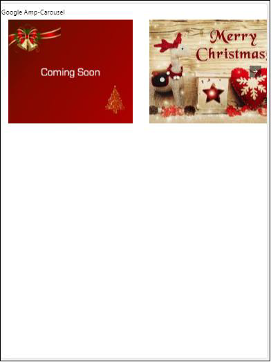
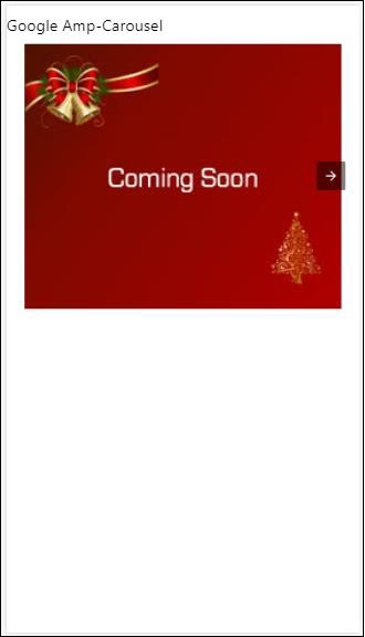
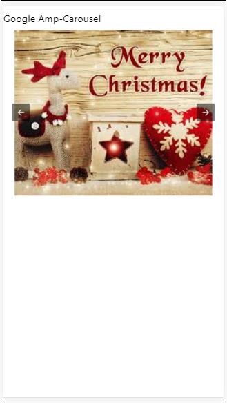
Amp-Karussell ist eine Amp-Komponente, die eine Reihe ähnlicher Inhalte auf dem Bildschirm anzeigt und mit den Pfeilen zwischen den Inhalten wechselt.
Um mit Amp-Karussell arbeiten zu können, müssen wir das folgende Skript hinzufügen:
<script async custom-element = "amp-carousel" src = "https://cdn.ampproject.org/v0/amp-carousel-0.1.js"></script>Amp-Karussell-Tag
Das Amp-Karussell-Tag ist wie unten gezeigt -
<amp-carousel height="300" layout="fixed-height" type="carousel">
      <amp-img src="images/christmas1.jpg" width="400" height="300" alt="a sample image"></amp-img>
   ….
</amp-carousel>
Attribute für Amp-Karussell verfügbar
Die für Amp-Karussell verfügbaren Attribute sind in der folgenden Tabelle aufgeführt:
| Sr.Nr. | Attribut & Beschreibung |
|---|---|
| 1 | type Wir können Karussellartikel als Karussell und Folien anzeigen |
| 2 | height Karussellhöhe in Pixel |
| 3 | controls (optional) Auf dem Bildschirm wird der Pfeil nach links / rechts angezeigt. Auf Geräten verschwindet es nach einigen Sekunden. Mit CSS können die Pfeile jederzeit sichtbar gemacht werden. |
| 4 | data-next-button-aria-label (optional) Verwenden Sie diese Option, um das Etikett für das nächste Karussell festzulegen. |
| 5 | data-prev-button-aria-label (optional) Verwenden Sie diese Option, um das Etikett für das vorherige Karussell festzulegen. |
| 6 | autoplay (optional) Verwenden Sie diese Option, um die nächste Folie nach 5000 ms anzuzeigen. Sie kann mit dem Verzögerungsattribut ohne Meilen im Ampere-Karussell überschrieben werden. Sie fügt dem Karussell ein Schleifenattribut hinzu und die Folien werden erneut abgespielt, sobald sie das Ende erreicht haben. Wird nur für Typ = Folien verwendet und benötigen mindestens 2 Folien, damit die automatische Wiedergabe funktioniert. |
Lassen Sie uns nun an Beispielen arbeiten, um Karussells auf unterschiedliche Weise anzuzeigen.
Amp Karusselltyp als Karussell
Beim Karusselltyp können die Elemente horizontal gescrollt werden.
Example
<!doctype html>
<html amp lang = "en">
   <head>
      <meta charset = "utf-8">
      <title>amp-carousel</title>
      <script async src = "https://cdn.ampproject.org/v0.js">
      </script>
      <!-- ## Setup -->
      <!-- Import the carousel component in the header. -->
      <script async custom-element = "amp-carousel" src =
         "https://cdn.ampproject.org/v0/amp-carousel-0.1.js">
      </script>
      <link rel = "canonical" href="
      https://ampbyexample.com/components/amp-carousel/">
      <meta name = "viewport" content = "width = device-width,
      minimum-scale = 1,initial-scale = 1">

      <style amp-boilerplate>
         body{
            -webkit-animation:
            -amp-start 8s steps(1,end) 0s 1 normal both;-moz-animation:
            -amp-start 8s steps(1,end) 0s 1 normal both;-ms-animation:
            -amp-start 8s steps(1,end) 0s 1 normal both;animation:
            -amp-start 8s steps(1,end) 0s 1 normal both
         }
         @-webkit-keyframes
         -amp-start{from{visibility:hidden}to{visibility:visible}}@-moz-keyframes
         -amp-start{from{visibility:hidden}to{visibility:visible}}@-ms-keyframes
         -amp-start{from{visibility:hidden}to{visibility:visible}}@-o-keyframes
         -amp-start{from{visibility:hidden}to{visibility:visible}}@keyframes
         -amp-start{from{visibility:hidden}to{visibility:visible}}
      </style>

      <noscript>
         <style amp-boilerplate>
            body{
               -webkit-animation:none;
               -moz-animation:none;
               -ms-animation:none;
               animation:none
            }
         </style>
      </noscript>
      <style amp-custom>
         h3{
            font-family: "Segoe UI",Arial,sans-serif;
            font-weight: 400;
            margin: 10px 0;
         }
      </style>
   </head>
   <body>
      <h3>Google Amp-Carousel</h3>
      <amp-carousel height = "300" layout = "fixed-height" type = "carousel">
         <amp-img
            src = "images/christmas1.jpg"
            width = "400"
            height = "300"
            alt = "a sample image">
         </amp-img>
         <amp-img src = "images/christmas2.jpg"
            width = "400"
            height = "300"
            alt = "another sample image">
         </amp-img>
         <amp-img
            src = "images/christmas3.jpg"
            width = "400"
            height = "300"
            alt = "and another sample image">
         </amp-img>
      </amp-carousel>
   </body>
</html>
Ausgabe
Amp Karusselltyp als Folien
Amp Karussell type = ”slides” Zeigt das einzelne Element gleichzeitig an. Sie können das Layout als Füll-, Fest-, Festhöhen-, Flex-Element-, Nodisplay- und Responsive-Element verwenden.
Example
<!doctype html>
<html amp lang = "en">
   <head>
      <meta charset = "utf-8">
      <title>amp-carousel</title>
      <script async src = "https://cdn.ampproject.org/v0.js">
      </script>
      <!-- ## Setup -->
      <!-- Import the carousel component in the header. -->
      <script async custom-element = "amp-carousel" src =
         "https://cdn.ampproject.org/v0/amp-carousel-0.1.js">
      </script>
      <link rel = "canonical" href=
      "https://ampbyexample.com/components/amp-carousel/">
      <meta name = "viewport" content = "width = device-width,
      minimum-scale = 1,initial-scale = 1">

      <style amp-boilerplate>
         body{
            -webkit-animation:
            -amp-start 8s steps(1,end) 0s 1 normal both;-moz-animation:
            -amp-start 8s steps(1,end) 0s 1 normal both;-ms-animation:
            -amp-start 8s steps(1,end) 0s 1 normal both;animation:
            -amp-start 8s steps(1,end) 0s 1 normal both
         }
         @-webkit-keyframes
         -amp-start{from{visibility:hidden}to{visibility:visible}}@-moz-keyframes
         -amp-start{from{visibility:hidden}to{visibility:visible}}@-ms-keyframes
         -amp-start{from{visibility:hidden}to{visibility:visible}}@-o-keyframes
         -amp-start{from{visibility:hidden}to{visibility:visible}}@keyframes
         -amp-start{from{visibility:hidden}to{visibility:visible}}
      </style>

      <noscript>
         <style amp-boilerplate>
            body{
               -webkit-animation:none;
               -moz-animation:none;
               -ms-animation:none;
               animation:none}
         </style>
      </noscript>
      <style amp-custom>
         h3{
            font-family: "Segoe UI",Arial,sans-serif;
            font-weight: 400;margin: 10px 0;}
      </style>
   </head>
   <body>
      <h3>Google Amp-Carousel</h3>
         <amp-carousel
            width = "400"
            height = "300"
            layout = "responsive"
            type = "slides">
               <amp-img
                  src = "images/christmas1.jpg"
                  width = "400"
                  height = "300"
                  layout = "responsive"
                  alt = "a sample image">
               </amp-img>
               <amp-img
                  src = "images/christmas2.jpg"
                  width = "400"
                  height = "300"
                  layout = "responsive"
                  alt="another sample image">
               </amp-img>
               <amp-img
                  src = "images/christmas3.jpg"
                  width = "400"
                  height = "300"
                  layout = "responsive"
                  alt = "and another sample image">
               </amp-img>
      </amp-carousel>
   </body>
</html>
Ausgabe
Amp Karussell mit Autoplay
Im folgenden Beispiel haben wir das Autoplay-Attribut mit einer Verzögerung von 2000 Millisekunden (2 Sekunden) hinzugefügt. Dadurch werden die Folien nach einer Verzögerung von 2 Sekunden geändert. Standardmäßig beträgt die Verzögerung 5000 Millisekunden (5 Sekunden).
Example
<!doctype html>
<html amp lang = "en">
   <head>
      <meta charset = "utf-8">
      <title>amp-carousel</title>
      <script async src = "https://cdn.ampproject.org/v0.js">
      </script>
      <!-- ## Setup -->
      <!-- Import the carousel component in the header. -->
      <script async custom-element = "amp-carousel" src =
         "https://cdn.ampproject.org/v0/amp-carousel-0.1.js">
      </script>
      <link rel = "canonical" href =
      "https://ampbyexample.com/components/amp-carousel/">
      <meta name = "viewport" content = "width = device-width,
      minimum-scale = 1,initial-scale = 1">

      <style amp-boilerplate>
         body{
            -webkit-animation:
            -amp-start 8s steps(1,end) 0s 1 normal both;-moz-animation:
            -amp-start 8s steps(1,end) 0s 1 normal both;-ms-animation:
            -amp-start 8s steps(1,end) 0s 1 normal both;animation:
            -amp-start 8s steps(1,end) 0s 1 normal both
         }
         @-webkit-keyframes
         -amp-start{from{visibility:hidden}to{visibility:visible}}@-moz-keyframes
         -amp-start{from{visibility:hidden}to{visibility:visible}}@-ms-keyframes
         -amp-start{from{visibility:hidden}to{visibility:visible}}@-o-keyframes
         -amp-start{from{visibility:hidden}to{visibility:visible}}@keyframes
         -amp-start{from{visibility:hidden}to{visibility:visible}}
      </style>

      <noscript>
         <style amp-boilerplate>
            body{
               -webkit-animation:none;
               -moz-animation:none;
               -ms-animation:none;
               animation:none}
         </style>
      </noscript>
      <style amp-custom>
         h3{
            font-family: "Segoe UI",Arial,sans-serif;
            font-weight: 400;
            margin: 10px 0;
         }
      </style>
   </head>
   <body>
      <h3>Google Amp-Carousel</h3>
      <amp-carousel
         width = "400"
         height = "300"
         layout = "responsive"
         type = "slides"
         autoplay delay = "2000">
            <amp-img
               src = "images/christmas1.jpg"
               width = "400"
               height = "300"
               layout = "responsive"
               alt = "a sample image">
            </amp-img>
            <amp-img
               src = "images/christmas2.jpg"
               width = "400"
               height = "300"
               layout = "responsive"
               alt = "another sample image">
            </amp-img>
            <amp-img
               src = "images/christmas3.jpg"
               width = "400"
               height = "300"
               layout = "responsive"
               alt = "and another sample image">
            </amp-img>
      </amp-carousel>
   </body>
</html>
Ausgabe
AMP Lightbox
Amp-Lightbox ist eine Amp-Komponente, die das gesamte Ansichtsfenster einnimmt und wie ein Overlay angezeigt wird.
Fügen Sie das folgende Skript hinzu, um mit Amp-Lightbox zu arbeiten:
<script async custom-element = "amp-lightbox" src = "https://cdn.ampproject.org/v0/amp-lightbox-0.1.js">
</script>
Für Amp-Lightbox verfügbare Attribute
Die Liste der Attribute für Amp-Lightbox ist unten angegeben -
| Sr.no. | Attribute & Beschreibung |
|---|---|
| 1 | animate-in (optional) Hier können Sie den Animationsstil zum Öffnen des Leuchtkastens festlegen. Standardmäßig ist dies der Fall einblenden Zum Verstecken unterstützte Werte sind Einblenden, Fly-In-Bottom und Fly-In-Top |
| 2 | close-button (required on AMPHTML ads) Bei Verwendung für Amphtmlads können wir die Schaltfläche zum Schließen für den Leuchtkasten angeben. |
| 3 | id (required) Eindeutige Kennung für Leuchtkasten |
| 4 | layout (required) Der Wert für das Layout ist nodisplay |
| 5 | Scrollable (optional) Mit diesem Attribut bei Amp-Lightbox kann der Inhalt der Lightbox gescrollt werden, wobei die Höhe der Lightbox überläuft. |
Beispiel eines Leuchtkastens
<!doctype html>
<html amp lang = "en">
<head>
<meta charset = "utf-8">
<script async src = "https://cdn.ampproject.org/v0.js">
</script>
<title>Google AMP - Amp Lightbox</title>
<link rel = "canonical" href =
"http://example.ampproject.org/article-metadata.html">
<meta name = "viewport" content = "width = device-width,
minimum-scale = 1,initial-scale = 1">
<style amp-boilerplate>
body{
-webkit-animation:
-amp-start 8s steps(1,end) 0s 1 normal both;-moz-animation:
-amp-start 8s steps(1,end) 0s 1 normal both;-ms-animation:
-amp-start 8s steps(1,end) 0s 1 normal both;animation:
-amp-start 8s steps(1,end) 0s 1 normal both
}
@-webkit-keyframes
-amp-start{from{visibility:hidden}to{visibility:visible}}@-moz-keyframes
-amp-start{from{visibility:hidden}to{visibility:visible}}@-ms-keyframes
-amp-start{from{visibility:hidden}to{visibility:visible}}@-o-keyframes
-amp-start{from{visibility:hidden}to{visibility:visible}}@keyframes
-amp-start{from{visibility:hidden}to{visibility:visible}}
</style>
<noscript>
<style amp-boilerplate>
body{
-webkit-animation:none;
-moz-animation:none;
-ms-animation:none;
animation:none}
</style>
</noscript>
<script async custom-element = "amp-lightbox" src =
"https://cdn.ampproject.org/v0/amp-lightbox-0.1.js">
</script>
<style amp-custom>
amp-img {
border: 1px solid #ddd;
border-radius: 4px;
padding: 5px;
}
button{
background-color: #ACAD5C;
color: white;
padding: 12px 20px;
border: none;
border-radius: 4px;
cursor: pointer;
float: left;
}
.lightbox {
background: rgba(211,211,211,0.8);
width: 100%;
height: 100%;
position: absolute;
display: flex;
align-items: center;
justify-content: center;
}
</style>
</head>
<body>
<h3>Google AMP - Amp Lightbox</h3>
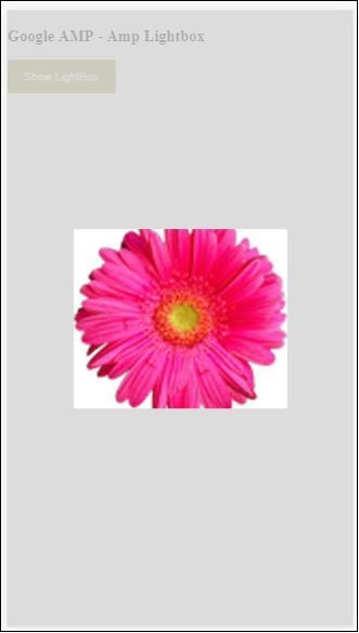
<button on = "tap:my-lightbox">
Show LightBox
</button>
<amp-lightbox id = "my-lightbox" layout = "nodisplay">
<div class = "lightbox" on="tap:my-lightbox.close" tabindex = "0">
<amp-img
alt = "Beautiful Flower"
src = "images/flower.jpg"
width = "246"
height = "205">
</amp-img>
</div>
</amp-lightbox>
</body>
</html>Ausgabe
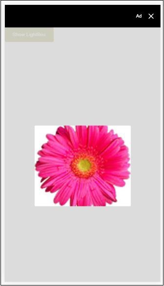
Klicken Sie auf eine beliebige Stelle auf dem Bildschirm, um den Leuchtkasten zu schließen.
Sie können dem Leuchtkasten eine Schaltfläche zum Schließen hinzufügen, die hauptsächlich verwendet wird, wenn Anzeigen vom Overlay-Typ angezeigt werden. Beachten Sie das folgende Beispiel -
Beispiel
<!doctype html>
<html amp lang = "en">
   <head>
      <meta charset = "utf-8">
      <script async src = "https://cdn.ampproject.org/v0.js">
      </script>
      <title>Google AMP - Amp Lightbox</title>
      <link rel = "canonical" href =
      "http://example.ampproject.org/article-metadata.html">
      <meta name = "viewport" content = "width = device-width,
      minimum-scale = 1,initial-scale = 1">

      <style amp-boilerplate>
         body{
            -webkit-animation:
               -amp-start 8s steps(1,end) 0s 1 normal both;-moz-animation:
               -amp-start 8s steps(1,end) 0s 1 normal both;-ms-animation:
               -amp-start 8s steps(1,end) 0s 1 normal both;animation:
            -amp-start 8s steps(1,end) 0s 1 normal both
         }
         @-webkit-keyframes
         -amp-start{from{visibility:hidden}to{visibility:visible}}@-moz-keyframes
         -amp-start{from{visibility:hidden}to{visibility:visible}}@-ms-keyframes
         -amp-start{from{visibility:hidden}to{visibility:visible}}@-o-keyframes
         -amp-start{from{visibility:hidden}to{visibility:visible}}@keyframes
         -amp-start{from{visibility:hidden}to{visibility:visible}}
      </style>
      <noscript>
         <style amp-boilerplate>
            body{
               -webkit-animation:none;
               -moz-animation:none;
               -ms-animation:none;
               animation:none}
         </style>
      </noscript>
      <script async custom-element = "amp-lightbox" src =
         "https://cdn.ampproject.org/v0/amp-lightbox-0.1.js">
      </script>
      <style amp-custom>
         amp-img {
            border: 1px solid #ddd;
            border-radius: 4px;
            padding: 5px;
         }
         button{
            background-color: #ACAD5C;
            color: white;
            padding: 12px 20px;
            border: none;
            border-radius: 4px;
            cursor: pointer;
            float: left;
         }
         .lightbox {
            background: rgba(211,211,211,0.8);
            width: 100%;
            height: 100%;
            position: absolute;
            display: flex;
            align-items: center;
            justify-content: center;
         }
      </style>
   </head>
   <body>
      <h3>Google AMP - Amp Lightbox</h3>
      <button on = "tap:my-lightbox">
         Show LightBox
      </button>
      <amp-lightbox id = "my-lightbox" layout = "nodisplay" close-button>
         <div class = "lightbox" on = "tap:my-lightbox.close">
            <amp-img
               alt = "Beautiful Flower"
               src = "images/flower.jpg"
               width = "246"
               height = "205">
            </amp-img>
         </div>
      </amp-lightbox>
   </body>
</html>
Ausgabe
Amp Sidebar
Die Amp-Seitenleiste ist eine Amp-Komponente, mit der Inhalte angezeigt werden, die auf Knopfdruck von den Seiten des Fensters verschoben werden.
Um mit der Amp-Sidebar zu arbeiten, müssen wir folgendes Skript hinzufügen:
<script async custom-element = "amp-sidebar" src = "
   https://cdn.ampproject.org/v0/amp-sidebar-0.1.js">
</script>
Amp-Sidebar-Tag
<amp-sidebar id = "sidebar" layout = "nodisplay" side = "right">
   <span on = "tap:sidebar.close">X</span>
   Html content here..
</amp-sidebar>
Die Liste der in der Amp-Seitenleiste verfügbaren Attribute finden Sie unten -
| Sr.no. | Attribute & Beschreibung |
|---|---|
| 1 | side Dieses Attribut öffnet die Seitenleiste in der angegebenen Richtung. Beispiel links / rechts |
| 2 | layout Nodisplay wird für das Seitenleistenlayout verwendet |
| 3 | open Dieses Attribut wird hinzugefügt, wenn die Seitenleiste geöffnet ist. |
| 4 | data-close-button-aria-label Dient zum Festlegen der Beschriftung für die Schaltfläche zum Schließen. |
Wir werden mit der Seitenleiste unter Verwendung der obigen Attribute arbeiten. Beachten Sie das unten gezeigte Beispiel -
Beispiel
<!doctype html>
<html amp lang = "en">
   <head>
      <meta charset = "utf-8">
      <script async src = "https://cdn.ampproject.org/v0.js">
      </script>
      <title>Google AMP - Amp Sidebar</title>
      <link rel = "canonical" href="
      http://example.ampproject.org/article-metadata.html">
      <meta name = "viewport" content = "width = device-width,
      minimum-scale = 1,initial-scale = 1">

      <style amp-boilerplate>
         body{
            -webkit-animation:
            -amp-start 8s steps(1,end) 0s 1 normal both;-moz-animation:
            -amp-start 8s steps(1,end) 0s 1 normal both;-ms-animation:
            -amp-start 8s steps(1,end) 0s 1 normal both;animation:
            -amp-start 8s steps(1,end) 0s 1 normal both
         }
         @-webkit-keyframes
         -amp-start{from{visibility:hidden}to{visibility:visible}}@-moz-keyframes
         -amp-start{from{visibility:hidden}to{visibility:visible}}@-ms-keyframes
         -amp-start{from{visibility:hidden}to{visibility:visible}}@-o-keyframes
         -amp-start{from{visibility:hidden}to{visibility:visible}}@keyframes
         -amp-start{from{visibility:hidden}to{visibility:visible}}
      </style>
      <noscript>
         <style amp-boilerplate>
            body{
               -webkit-animation:none;
               -moz-animation:none;
               -ms-animation:none;
               animation:none}
         </style>
      </noscript>
      <script async custom-element = "amp-sidebar" src =
         "https://cdn.ampproject.org/v0/amp-sidebar-0.1.js">
      </script>
      <style amp-custom>
         amp-img {
            border: 1px solid #ddd;
            border-radius: 4px;
            padding: 5px;
         }
         button{
            background-color: #ACAD5C;
            color: white;
            padding: 12px 20px;
            border: none;
            border-radius: 4px;
            cursor: pointer;
            float: left;
         }
      </style>
   </head>
   <body>
      <h3>Google AMP - Amp Sidebar</h3>
      <button on = "tap:sidebar">
         Show Sidebar
      </button>
      <amp-sidebar id = "sidebar" layout = "nodisplay" side = "right">
         <span on = "tap:sidebar.close">X</span>
         <ul>
            <li><a href = "/">About</a></li>
            <li><a href = "/">Services</a></li>
            <li><a href = "/">Contact US</a></li>
         </ul>
      </amp-sidebar>
   </body>
</html>
Ausgabe
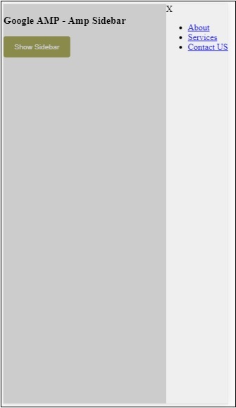
Wir haben benutzt sideAttribut zum Öffnen der Seitenleiste auf der rechten Seite. Sie können den linken Wert verwenden, umsideAttribut, um es auf der linken Seite zu öffnen. Daslayout Attribut muss nodisplay.Open Das Attribut ist vorhanden, wenn die Seitenleiste geöffnet wird.
Daten-Close-Button-Aria-Label
Amp Image Slider
Amp-Image-Slider ist eine Amp-Komponente, mit der zwei Bilder verglichen werden, indem ein Schieberegler hinzugefügt wird, wenn sie vertikal über das Bild bewegt werden.
Um mit amp-img-slider zu arbeiten, fügen Sie folgendes Skript hinzu:
<script async custom-element = "amp-image-slider" src = "
   https://cdn.ampproject.org/v0/amp-image-slider-0.1.js">
</script>
Amp-img-Slider-Tag
<amp-image-slider width = "300" height = "200" layout = "responsive">
   <amp-img src = "images/christmas1.jpg" layout = "fill">
   </amp-img>
   <amp-img src = "images/christmas2.jpg" layout = "fill">
   </amp-img>
</amp-image-slider>
Ein Beispiel für einen Amp-Img-Slider wird hier gezeigt. Hier haben wir 2 Bilder im amp-img-Schieberegler hinzugefügt, wobei das erste Bild wie ein Schieberegler wirkt und Sie oben im zweiten Bild hineinschieben können.
Beispiel
<!doctype html>
<html amp lang = "en">
   <head>
      <meta charset = "utf-8">
      <script async src = "https://cdn.ampproject.org/v0.js">
      </script>
      <title>Google AMP - Amp Image Slider</title>
      <link rel = "canonical" href =
      "http://example.ampproject.org/article-metadata.html">
      <meta name = "viewport" content = "width = device-width,
      minimum-scale = 1,initial-scale = 1">

      <style amp-boilerplate>
         body{
            -webkit-animation:
            -amp-start 8s steps(1,end) 0s 1 normal both;-moz-animation:
            -amp-start 8s steps(1,end) 0s 1 normal both;-ms-animation:
            -amp-start 8s steps(1,end) 0s 1 normal both;animation:
            -amp-start 8s steps(1,end) 0s 1 normal both
         }
         @-webkit-keyframes
         -amp-start{from{visibility:hidden}to{visibility:visible}}@-moz-keyframes
         -amp-start{from{visibility:hidden}to{visibility:visible}}@-ms-keyframes
         -amp-start{from{visibility:hidden}to{visibility:visible}}@-o-keyframes
         -amp-start{from{visibility:hidden}to{visibility:visible}}@keyframes
         -amp-start{from{visibility:hidden}to{visibility:visible}}
      </style>
      <noscript>
         <style amp-boilerplate>
            body{
               -webkit-animation:none;
               -moz-animation:none;
               -ms-animation:none;
               animation:none}
         </style>
      </noscript>
      <script async custom-element = "amp-image-slider" src =
         "https://cdn.ampproject.org/v0/amp-image-slider-0.1.js">
      </script>
      <style amp-custom>
         amp-img {
            border: 1px solid #ddd;
            border-radius: 4px;
            padding: 5px;
         }
      </style>
   </head>
   <body>
      <h3>Google AMP - Amp Image Slider</h3>
      <amp-image-slider
         width = "300"
         height = "200"
         layout = "responsive">
            <amp-img
               src = "images/christmas1.jpg"
               layout = "fill">
            </amp-img>
            <amp-img
               src = "images/christmas2.jpg"
               layout = "fill">
            </amp-img>
      </amp-image-slider>
   </body>
</html>
Ausgabe

Der Amp-Image-Slider verfügt über eine Aktion namens seekTo, mit der Sie das Bild wie im folgenden Beispiel gezeigt ändern können.
Beispiel
<!doctype html>
<html amp lang = "en">
   <head>
      <meta charset = "utf-8">
      <script async src = "https://cdn.ampproject.org/v0.js">
      </script>
      <title>Google AMP - Amp Image Slider</title>
      <link rel = "canonical" href ="
      http://example.ampproject.org/article-metadata.html">
      <meta name = "viewport" content = "width = device-width,
      minimum-scale = 1,initial-scale = 1">

      <style amp-boilerplate>
         body{
            -webkit-animation:
            -amp-start 8s steps(1,end) 0s 1 normal both;-moz-animation:
            -amp-start 8s steps(1,end) 0s 1 normal both;-ms-animation:
            -amp-start 8s steps(1,end) 0s 1 normal both;animation:
            -amp-start 8s steps(1,end) 0s 1 normal both
         }
         @-webkit-keyframes
         -amp-start{from{visibility:hidden}to{visibility:visible}}@-moz-keyframes
         -amp-start{from{visibility:hidden}to{visibility:visible}}@-ms-keyframes
         -amp-start{from{visibility:hidden}to{visibility:visible}}@-o-keyframes
         -amp-start{from{visibility:hidden}to{visibility:visible}}@keyframes
         -amp-start{from{visibility:hidden}to{visibility:visible}}
      </style>
      <noscript>
         <style amp-boilerplate>
            body{
               -webkit-animation:none;
               -moz-animation:none;
               -ms-animation:none;
               animation:none}
         </style>
      </noscript>
      <script async custom-element = "amp-image-slider" src =
         "https://cdn.ampproject.org/v0/amp-image-slider-0.1.js">
      </script>
      <style amp-custom>
         amp-img {
            border: 1px solid #ddd;
            border-radius: 4px;
            padding: 5px;
         }
         button{
            background-color: #ACAD5C;
            color: white;
            padding: 12px 20px;
            border: none;
            border-radius: 4px;
            cursor: pointer;
            float: left;
         }
         .amp-sidebar-toolbar-target-shown {
            display: none;
         }
      </style>
   </head>
   <body>
      <h3>Google AMP - Amp Image Slider</h3>
      <amp-image-slider
         width = "300"
         id="slider1"
         height = "200"
         layout = "responsive">
         <amp-img src = "images/christmas1.jpg" layout = "fill">
         </amp-img>
         <amp-img src = "images/christmas2.jpg" layout = "fill">
         </amp-img>
      </amp-image-slider>
      <button on = "tap:slider1.seekTo(percent = 1)">
         Image 1
      </button>
      <button on = "tap:slider1.seekTo(percent = 0)">
         Image 2
      </button>
   </body>
</html>
Ausgabe
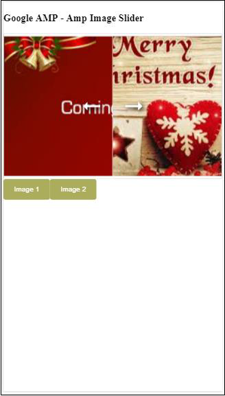
Sie können die Bilder ändern, indem Sie auf die Schaltfläche tippen.

<button on = "tap:slider1.seekTo(percent = 1)">Image 1</button>
<button on = "tap:slider1.seekTo(percent = 0)">Image 2</button>
</div>