Google AMP - Auswahl
Amp-Selector ist eine Amp-Komponente, die ein Menü mit Optionen anzeigt und der Benutzer kann zwischen den Optionen wählen. Die angezeigten Optionen können Text, Bilder oder andere Verstärkerkomponenten sein. Lassen Sie uns dies in diesem Kapitel ausführlich diskutieren.
Um mit Amp-Selector arbeiten zu können, müssen folgende Javascript-Dateien enthalten sein:
<script async custom-element = "amp-selector"
   src = "https://cdn.ampproject.org/v0/amp-selector-0.1.js">
</script>
Format des Amp-Selektors
Der folgende Code zeigt das Beispiel für das Format des Amp-Selektors -
<amp-selector layout = "container">
   <amp-img src = "images/christmas1.jpg"
      width = "60"
      height = "40"
      option = "1">
   <amp-img src = "images/christmas2.jpg"
      width = "60"
      height = "40"
      option = "2">
   </amp-img>
   <amp-img src = "images/christmas3.jpg"
      width = "60"
      height = "40"
      option = "3">
   </amp-img>
   <amp-img src = "images/christmas4.jpg"
      width = "60"
      height = "40"
      option = "4">
   </amp-img>
</amp-selector>
Sie können Standard-HTML-Tags oder Amp-Komponenten in der Amp-Auswahl verwenden. Der Inhalt wird wie ein Menü auf dem Bildschirm angezeigt und der Benutzer kann zwischen diesen auswählen. Die angezeigten Menüs können eine einzelne Auswahl oder eine Mehrfachauswahl sein.
Lassen Sie uns dies anhand eines Beispiels für Einzel- und Mehrfachauswahl verstehen, wie unten angegeben.
Amp Selector Single Select
Der folgende Code ist ein Beispiel für die Einzelauswahl von Amp-Selector -
<!doctype html>
<html amp lang = "en">
   <head>
      <meta charset = "utf-8">
      <script async src = "https://cdn.ampproject.org/v0.js"></script>
      <title>Google AMP - Amp Selector</title>
      <link rel = "canonical" href = "http://example.ampproject.org/article-metadata.html">
      <meta name="viewport" content="width=device-width,minimum-scale = 1,initial-scale = 1">

      <style amp-boilerplate>
         body{-
            webkit-animation:-amp-start 8s steps(1,end) 0s 1 normal both;-moz-animation:
            -amp-start 8s steps(1,end) 0s 1 normal both;-ms-animation:
            -amp-start 8s steps(1,end) 0s 1 normal both;animation:
            -amp-start 8s steps(1,end) 0s 1 normal both
         }
         @-webkit-keyframes
         -amp-start{from{visibility:hidden}to{visibility:visible}}@-moz-keyframes
         -amp-start{from{visibility:hidden}to{visibility:visible}}@-ms-keyframes
         -amp-start{from{visibility:hidden}to{visibility:visible}}@-o-keyframes
         -amp-start{from{visibility:hidden}to{visibility:visible}}@keyframes
         -amp-start{from{visibility:hidden}to{visibility:visible}}
      </style>
      <noscript>
         <style amp-boilerplate>
            body{
            -webkit-animation:none;-moz-animation:none;
            -ms-animation:none;animation:none}
         </style>
      </noscript>

      <script async custom-element="amp-selector"
         src = "https://cdn.ampproject.org/v0/amp-selector-0.1.js">
      </script>
      <style amp-custom>
         amp-selector:not([disabled])
         amp-img[option][selected]:not([disabled]) {
            outline-color: #b6A848;
            outline-width: 2px;
         }
      </style>
   </head>
   <body>
      <h3>Google AMP - Amp Selector</h3>
      <amp-selector layout = "container">
         <amp-img src = "images/christmas1.jpg"
            width = "60"
            height = "40"
            option="1">
         </amp-img>
         <amp-img src="images/christmas2.jpg"
            widt h = 60"
            height = "40"
            option = "2">
         </amp-img>
         <amp-img src = "images/christmas3.jpg"
            width = "60"
            height = "40"
            option = "3">
         </amp-img>
         <amp-img src = "images/christmas4.jpg"
            width = "60"
            height = "40"
            option = "4">
         </amp-img>
      </amp-selector>
   </body>
</html>
Ausgabe
Die Ausgabe des oben angegebenen Codes ist wie folgt:
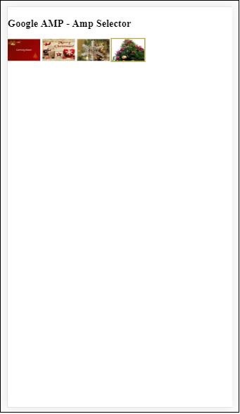
Beachten Sie, dass wir im obigen Beispiel den Amp-Selektor und die darin enthaltenen Bilder verwendet haben, um die Optionen anzuzeigen. Es handelt sich um eine einzelne Auswahlauswahl, mit der Sie ein beliebiges Bild auswählen können, wie in der Ausgabe gezeigt.
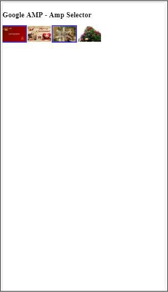
Amp Selector Multiple Select
In diesem Beispiel zeigen wir den Amp-Selektor mit Bildern an, die mehrere Attribute verwenden. Wir können mehrere Optionen aus dem Selektor auswählen.
Beispiel
<!doctype html>
<html amp lang = "en">
   <head>
      <meta charset = "utf-8 ">
      <script async src = "https://cdn.ampproject.org/v0.js"></script>
      <title>Google AMP - Amp Selector</title>
      <link rel = "canonical" href = "http://example.ampproject.org/article-metadata.html">
      <meta name = "viewport" content = "width = device-width,minimum-scale = 1,initial-scale =1">

      <style amp-boilerplate>
         body{-webkit-animation:
            -amp-start 8s steps(1,end) 0s 1 normal both;-moz-animation:
            -amp-start 8s steps(1,end) 0s 1 normal both;-ms-animation:
            -amp-start 8s steps(1,end) 0s 1 normal both;animation:
            -amp-start 8s steps(1,end) 0s 1 normal both}
         @-webkit-keyframes
         -amp-start{from{visibility:hidden}to{visibility:visible}}@-moz-keyframes
         -amp-start{from{visibility:hidden}to{visibility:visible}}@-ms-keyframes
         -amp-start{from{visibility:hidden}to{visibility:visible}}@-o-keyframes
         -amp-start{from{visibility:hidden}to{visibility:visible}}@keyframes
         -amp-start{from{visibility:hidden}to{visibility:visible}}
      </style>

      <noscript>
         <style amp-boilerplate>
            body{
               -webkit-animation:none;-moz-animation:none;
               -ms-animation:none;animation:none
            }
         </style>
      </noscript>

      <script async custom-element = "amp-selector"
         src = "https://cdn.ampproject.org/v0/amp-selector-0.1.js">
      </script>

      <style amp-custom>
         amp-selector:not([disabled])
         amp-img[option][selected]:not([disabled]) {
            outline-color: blue;
            outline-width: 2px;
         }
      </style>
   </head>
   <body>
      <h3>Google AMP - Amp Selector</h3>
      <amp-selector layout = "container" multiple>
         <amp-img src = "images/christmas1.jpg"
            width = "60"
            height ="40"
            option = "1">
         </amp-img>
         <amp-img src="images/christmas2.jpg"
            width = "60"
            height = "40"
            option = "2">
         </amp-img>
         <amp-img src ="images/christmas3.jpg"
            width = "60"
            height = "40"
            option = "3">
         </amp-img>
         <amp-img src = "images/christmas4.jpg"
            width = "60"
            height = "40"
            option = "4">
         </amp-img>
      </amp-selector>
   </body>
</html>
Ausgabe
Die Ausgabe des oben gezeigten Codes ist unten angegeben -
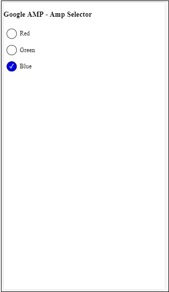
Wir können auch den Amp-Selektor verwenden, um Optionsfelder anzuzeigen, wie im folgenden Code gezeigt -
Beispiel
<!doctype html>
<html amp lang = "en">
   <head>
      <meta charset = "utf-8">
      <script async src = "https://cdn.ampproject.org/v0.js"></script>
      <title>Google AMP - Amp Selector</title>
      <link rel = "canonical" href = "http://example.ampproject.org/article-metadata.html">
      <meta name = "viewport" content ="width = device-width,minimum-scale = 1,initial-scale = 1">

      <style amp-boilerplate>
         body{
            -webkit-animation:
            -amp-start 8s steps(1,end) 0s 1 normal both;-moz-animation:
            -amp-start 8s steps(1,end) 0s 1 normal both;-ms-animation:
            -amp-start 8s steps(1,end) 0s 1 normal both;animation:
            -amp-start 8s steps(1,end) 0s 1 normal both
         }
         @-webkit-keyframes
         -amp-start{from{visibility:hidden}to{visibility:visible}}@-moz-keyframes
         -amp-start{from{visibility:hidden}to{visibility:visible}}@-ms-keyframes
         -amp-start{from{visibility:hidden}to{visibility:visible}}@-o-keyframes
         -amp-start{from{visibility:hidden}to{visibility:visible}}@keyframes
         -amp-start{from{visibility:hidden}to{visibility:visible}}
      </style>

      <noscript>
         <style amp-boilerplate>
            body{
               -webkit-animation:none;
               -moz-animation:none;
               -ms-animation:none;
               animation:none}
         </style>
      </noscript>
      <script async custom-element = "amp-selector"
         src = "https://cdn.ampproject.org/v0/amp-selector-0.1.js">
      </script>
      <style amp-custom>
         .radio-menu {
            list-style: none;
         }
         .radio-menu [option][selected] {
            outline: none;
         }
         .radio-menu [option] {
            display: flex;
            align-items: center;
         }
         .radio-menu [option]:before {
            transition: background 0.25s ease-in-out;
            content: "";
            display: inline-block;
            width: 24px;
            height: 24px;
            margin: 8px;
            border-radius: 100%;
            border: solid 1px black;
         }
         .radio-menu [option  = red][selected]:before {
            text-align: center;
            content: "✓";
            color: white;
            background: red;
         }
         .radio-menu [option  = green][selected]:before {
            text-align: center;
            content: "✓";
            color: white;
            background: green;
         }
         .radio-menu [option  = blue][selected]:before {
            text-align: center;
            content: "✓";
            color: white;
            background: blue;
         }
      </style>
   </head>
   <body>
      <h3>Google AMP - Amp Selector</h3>
      <amp-selector class = "radio-menu" layout = "container" name = "my-selector">
         <div option = "red">Red</div>
         <div option = "green">Green</div>
         <div option = "blue">Blue</div>
      </amp-selector>
   </body>
</html>
Ausgabe