날카로운 끝 / 그라데이션 선 / 플러터로 선을 그리는 방법?
Aug 20 2020
스트로크 방법을 사용하여 플러터에서 끝이 날카로운 그라디언트 선을 만드는 방법은 무엇입니까? 플러터로 아래와 같이 선을 그리고 싶습니다.

답변
4 sleepingkit Aug 20 2020 at 09:46
CustomPainter를 사용하여 다음을 그립니다.
import 'package:flutter/material.dart';

void main() => runApp(Example());

class Example extends StatefulWidget {
  @override
  _ExampleState createState() => _ExampleState();
}

class _ExampleState extends State<Example> {
  @override
  void initState() {
    super.initState();
  }

  @override
  Widget build(BuildContext context) {
    return MaterialApp(
        home: Scaffold(
            body: Center(
      child: CustomPaint(
        size: Size(200, 5),
        painter: CurvePainter(),
      ),
    )));
  }

  @override
  void dispose() {
    super.dispose();
  }
}

class CurvePainter extends CustomPainter {
  @override
  void paint(Canvas canvas, Size size) {
    var paint = Paint();
    paint.color = Colors.black;
    paint.style = PaintingStyle.fill; // Change this to fill

    var path = Path();

    path.moveTo(0, 0);
    path.quadraticBezierTo(size.width / 2, size.height / 2, size.width, 0);
    path.quadraticBezierTo(size.width / 2, -size.height / 2, 0, 0);

    canvas.drawPath(path, paint);
  }

  @override
  bool shouldRepaint(CustomPainter oldDelegate) {
    return true;
  }
}
jack Aug 20 2020 at 09:18
Ca n't see your picture. CustomPaint 위젯을 사용하여 선을 그리고 CustomPainter를 확장하는 클래스를 정의하고 canvas.drawLine () 메서드를 사용할 수 있습니다.
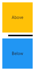
AbubakrElghazawy Aug 20 2020 at 12:19

디바이더 클래스
양쪽에 패딩이있는가는 수평선.
머티리얼 디자인 언어에서 이것은 구분선을 나타냅니다. 구분선은 목록, 서랍 및 다른 곳에서 콘텐츠를 구분하는 데 사용할 수 있습니다.
ListTile 항목간에 구분선을 만들려면이 경우에 최적화 된 ListTile.divideTiles를 사용하는 것이 좋습니다.
상자의 전체 높이는 높이로 제어됩니다. 적절한 패딩은 높이에서 자동으로 계산됩니다.
[
import 'package:flutter/material.dart';
void main() => runApp(MyApp());
/// This Widget is the main application widget.
class MyApp extends StatelessWidget {
static const String _title = 'Flutter Code Sample';
@override
Widget build(BuildContext context) {
return MaterialApp(
title: _title,
home: Scaffold(
appBar: AppBar(title: const Text(_title)),
body: MyStatelessWidget(),
),
);
}
}
/// This is the stateless widget that the main application instantiates.
class MyStatelessWidget extends StatelessWidget {
MyStatelessWidget({Key key}) : super(key: key);
@override
Widget build(BuildContext context) {
return Center(
child: Column(
children: <Widget>\[
Expanded(
child: Container(
color: Colors.amber,
child: const Center(
child: Text('Above'),
),
),
),
const Divider(
color: Colors.black,
height: 20,
thickness: 5,
indent: 20,
endIndent: 0,
),
Expanded(
child: Container(
color: Colors.blue,
child: const Center(
child: Text('Below'),
),
),
),
\],
),
);
}
}]
여기에 스타일 변경 방법 정보 여기에 링크 설명 입력